Hammondville
The Community Centre’s overall palette is an energetic creation with a mix of rich autumn tones paired with neutrals.
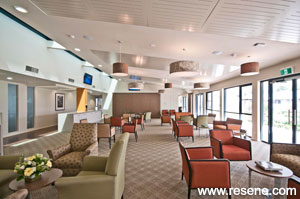
The Hammondville Community was established in the late 1940s following the Great Depression in 1932. Hammond’s Pioneer Homes was one of the first integrated aged care facilities developed in Australia and consisted of self-care units, nursing home and hostel accommodation for financially disadvantaged elderly people.
In 2010 HammondCare instigated its development program with scope for the new Village Community Centre. Gilmore Interior Design (GID) was commissioned to create colour palettes and design interiors suitable for the community who will utilise the centre and residents in the Independent Living Units.
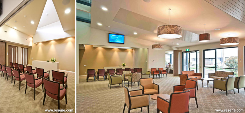
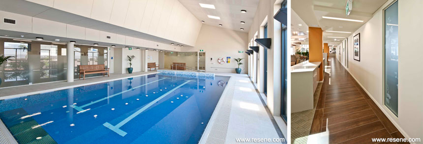
The Community Centre houses the facility administrative offices on Level 2. On Level 1 areas for the residents include activity and craft rooms, a combined lounge and dining area with a commercial café, a chapel, gymnasium, hair salon and an indoor swimming pool.
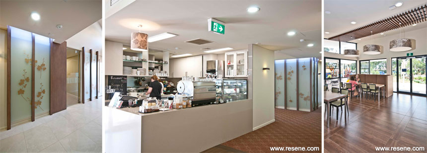
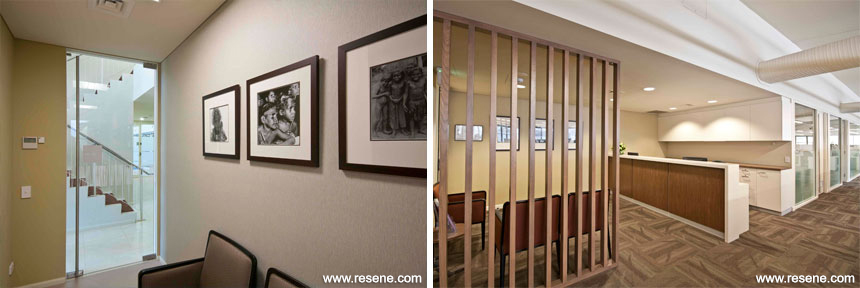
The main reception and the hairdressing areas are accentuated by customised timber screens with glazed panel inserts of subtle golden floral graphics. These are complemented by the neutral walls painted in Resene Coromandel and accented by the geometric patterns in the floor carpets. A timber look floor tile was installed in the hallways leading from the entrance to the combined lounge, activity, craft rooms and café area. These areas are flooded with natural light and, in reflecting this light, Resene Double Wheatfield is used on the walls to create a lovely contrast with the timber tile. The mix of furniture styles and rich fabrics creates a stylish and comfortable palette for this area. The library is painted in Resene Beachcomber creating a relaxed environment.

The administration area on Level 2 is painted in Resene Quarter Canterbury Clay which works well with the feature wall vinyl. The neutral walls highlight the graphic nature of the carpet floor tile. Feature colours in Resene Buffalo and Resene Double Colins Wicket were applied to multipurpose and craft rooms, while Resene Double Wheatfield is used on most general wall and skirting areas. The overall neutral palette offers a great working environment for the staff. The floorcoverings allow each area to be differentiated while lounge pillars stand proud in stimulating colours. The Community Centre’s overall palette is an energetic creation with a mix of rich autumn tones paired with neutrals.
Architectural Specifier: Allen Jack + Cottee Architects
Building Contractor: Grindley Construction
Colour Selection: Gilmore Interior Design
Photographer: Geoff Ambler
Project: Resene Total Colour Awards 2012
Resene case studies/awards project gallery
View case studies that have used Resene products including many from our Resene Total Colour Awards. We hope these projects provide inspiration for decorating projects of your own... view projects
Total Colour Award winners:
2023 |
2022 |
2021 |
2020 |
2019 |
2018 |
2017 |
2016 |
2015 |
2014 |
2013 |
2012 |
2011 |
2010 |
Entry info
Latest projects | Project archive | Resene news archive | Colour chart archive