Remuera
The intention was to create a sense of Zen rather than shouting out to the street, so there was never any intention to lose the softness of the raw sheet by painting over it.
To respect and celebrate the original architect’s overall look, the original colour design of this Claude Megson house, designed in 1974, was mostly maintained by retaining the unpainted compressed sheet panels, unpainted copper downpipes, and steel-grey steel joinery. The addition is treated using the same materials and colours as the rest of the house.
The existing colour scheme of unpainted compressed sheet panels and a very-red roof was recomposed to allow the building to settle back into the foliage.
The client loves bursts of strong colour but in a more personal way… and in the brief definitely did not want the bright roof colour originally specified and use, so this was softened to Resene Ceramic, a soft white, in Resene Hi-Glo roof paint. A pop of intense colour, Resene Bright Spark, was applied to the side door using Resene Super Gloss enamel. This door is in an almost secret position, allowing the subtly of the public view to be maintained.
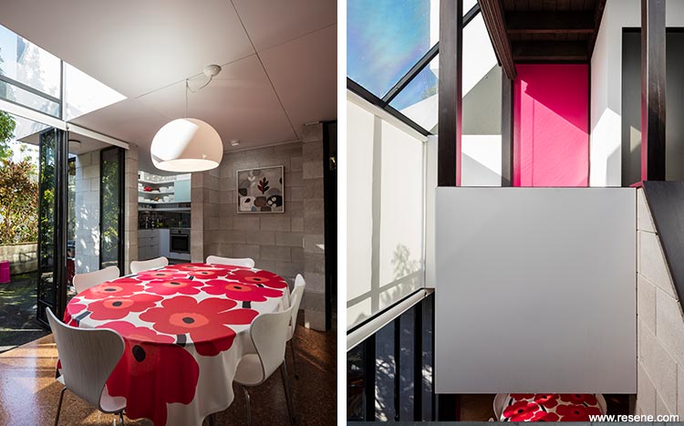
The intention was to have a bright red front door as a nod to the very original red splash on the roof top, but a need for light in the entrance-way called for a glass door to let light in.
The stained wood balustrade panels, steel window joinery and galvanised pipe railings and posts were repainted in existing colours of warm brown ebony and steely charcoal and soffits in Resene Lumbersider in Resene Half Black Squeeze. The wooden letterbox was finished in Resene Woodsman in Resene Pitch Black.
The intention was to create a sense of Zen rather than shouting out to the street, so there was never any intention to lose the softness of the raw sheet by painting over it.
For the interior, the brief was to provide a restful house, a haven. But they didn’t want “everything brown and shades of beige”. The original architect’s work, and the home’s history needed to be respected, but with a push back against Modernism in favour of providing something with a warm feel, with a genuine connection between the outside and the inside.
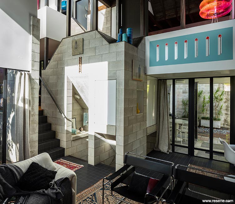
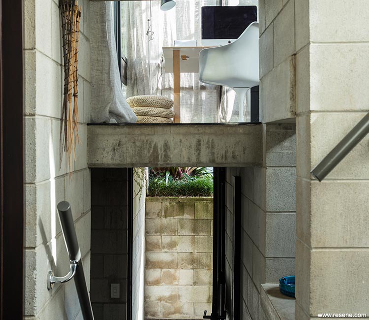
A complexity of space resides in this building. There is, therefore, a need to be careful or it could become overwhelming.
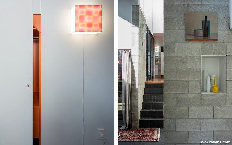
The decision was to take from what was there and re-compose, working with the robust palette of ‘raw’ materials (unpainted concrete block, a textural ceiling of rough sawn dark stained timber), and bring in some punches of colour to personalise the space, sometimes hidden (a technique of surprise Claude Megson had used in the bar cupboard originally). There were several different stain colours in the timbers that made the space feel busy, lots of fading from the light that pours in, and the lower flooring required a more practical treatment due the water damage and rusting of the steel joinery.
The other important consideration was to provide materials and surfaces that would transcend any age.
The original cork on the lower floor levels was replaced with hexagonal and 100mm square charcoal tiles to resolve the issue of water damage and to provide a tactile surface to walk on, and have a sense of very real permanence. Traditional rugs were then placed for warmth and layering of textures. In the kitchen and dining area the cork floor was replaced with a chunkier patterned one, and the cork flooring on the stairs and landings was replaced with a boucle type wool carpet in a similar grey to the charcoal tiles.
The current architect had updated the kitchen with a contemporary version of what it had been when first built, and designed a new spacious bathroom addition in keeping with the original design of the house. Bright blue floor tiles are used for this bathroom for a bold dash of colour and white wall tiles to connect with the white wall paint elsewhere in the house, grouted with blue grout matching the floor tile colour. The inside of the mirror cabinets are a blue laminate also matching the floor tiles.
The bathroom mirror cabinet’s theme of hidden colour is repeated in two of the bedrooms where the wardrobe cabinetry is bright orange and lime green respectively, behind the Resene Triple Dune or Resene Half Black Squeeze wardrobe doors.
The use of outrageous colour is most daring on the Resene Lipstick pink door of the second bedroom, glimpsed from the sitting room downstairs. Further brightness is employed with the intense yellow of the laundry/back door in Resene Bright Spark, the colour of which is repeated in a subtle way by grouting the little square mosaics in the laundry and the penny round mosaics of the powder room with bright yellow grout.
To create a ’Zen’ feeling canvas for the main spaces an ‘easy going’ white, Resene Half Black Squeeze, was chosen for all the hardboard panels, and Resene Triple Dune for the doors and hand rails. Resene Triple Dune is strong but blends into the wood stains well.
Architectural specifier: Dominic Glamuzina
Building contractor: James Donaldson Head Contractor
Interior designer: Peta Tearle, Peta Tearle Colour and Design
Painting contractor: Michel Zwerink
Other key contributor: Kevin Glamuzina Building Consultant
Photographer: Sam Hartnett
Project: Resene Total Colour Awards 2015
Resene case studies/awards project gallery
View case studies that have used Resene products including many from our Resene Total Colour Awards. We hope these projects provide inspiration for decorating projects of your own... view projects
Total Colour Award winners:
2023 |
2022 |
2021 |
2020 |
2019 |
2018 |
2017 |
2016 |
2015 |
2014 |
2013 |
2012 |
2011 |
2010 |
Entry info
Latest projects | Project archive | Resene news archive | Colour chart archive
![]()
![]() Get inspired ! Subscribe
Get inspired ! Subscribe ![]() Get saving ! Apply for a DIY card
Get saving ! Apply for a DIY card
![]()
Can't find what you're looking for? Ask us!
Company profile | Terms | Privacy policy | Quality and environmental policy | Health and safety policy
Colours shown on this website are a representation only. Please refer to the actual paint or product sample. Resene colour charts, testpots and samples are available for ordering online. See measurements/conversions for more details on how electronic colour values are achieved.
What's new | Specifiers | Painters | DIYers | Artists | Kids | Sitemap | Home | TOP ⇧