Newcastle
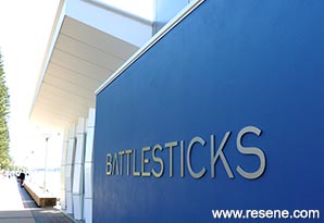
The colour scheme was to remain neutral and complementary to the exterior visual environment, borrowing from the passing ship steel hulls and water reflections.
Perched over the water on the Newcastle harbour, the project was to focus on environmental performance and the diner’s interaction with the harbour. ‘Scratchley’s on the Wharf’ was born in 1989, when the client opened a small seafood restaurant in a former brick ferry terminal on the newly opened Foreshore Promenade. In 1999, EJE Architecture designed an expansion at the eastern end of the building, focused on environmental performance and the diner's interaction with the harbour.
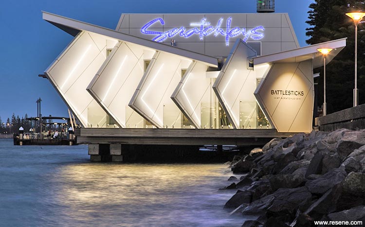
The success of the business prompted the client to again approach EJE. This third iteration was to nearly double the floor space with an expansion at the building's western end. The new tapas bar was to celebrate views of the harbour to the north and west, but also protect patrons from strong western sun and winds. The space was to be passively cooled, and had to span across existing wharf structures, with no new sea piles permitted. Alongside the dining room, a new commercial kitchen was to be installed, along with cold prep room, cool rooms, waste disposal, staff room and office, and new patron amenities.
A thorough historical analysis identified the area as a traditional place of food gathering for Indigenous Australians, where oysters and shellfish were collected from the harbour estuary. This seemed a fitting conceptual starting point both figuratively and literally given Scratchley’s seafood specialty. Further research investigated the site's colonial occupation, with 19th century photographs depicting sawtooth timber cargo wharfs spanning the edge of the harbour.
Existing site analysis noted the alignment of the foreshore promenade as a specific and unmistakeable opportunity for the project to both market itself in a distinctive ‘Newcastle’ context, and also give back an iconic postcard-image of a building in a city undergoing rejuvenation.
In collaboration with the client brief several objectives were defined for the project:
The combination of brief, site analysis and historical context merged to form a design solution that achieved the client's needs.

Blade walls oriented to the north-west allow visual connection to the harbour, ship loaders and Dyke Point while blocking the unforgiving western setting sun. Structural engineering input was sought early due to the nature of the building's position spanning the harbour, and the unique wind-loading conditions of the wall facade. The inputs of the Interior, Acoustic and Lighting Designers were also valued early to ensure the building's aesthetic presence was emboldened in its public foreshore context, and finessed in the interior dining room.
The existing ‘Scratchleys’ kitchen and dining room were re-fitted to provide a fresh and unified look throughout the entire building. With clever programming from the contractor, the client required only 3.5 days business shut-down during the entire build; two weeks had been allowed in the contract.
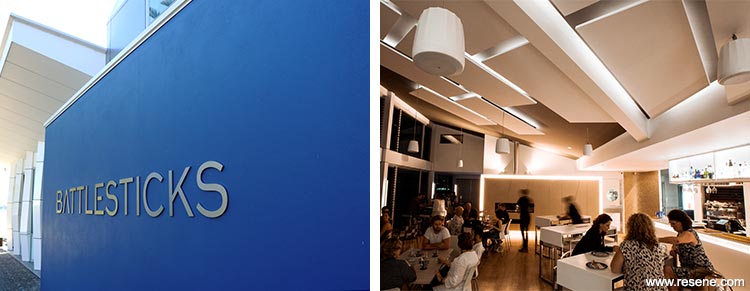
The client desired a name for the Tapas Bar that retained a connection to the history of Fort Scratchley. EJE's research found an anecdotal description of the first Colonial Fort on the headland above Newcastle, surrounded by a timber palisade wall known to the townspeople as Fort Battlesticks. The rest is history.
With wide openings on the harbour side of the building required for cooling and views, material selections were directed to those products with high levels of salt and UV resistance. The challenge was to use these robust materials in a lightweight, well detailed manner, and as a considered act of sculpture; an intention that provides visual and physical comfort, as well as dramatic intrigue, for guests in the evolution of an already iconic hospitality venue.
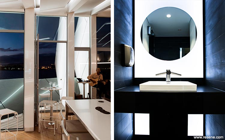
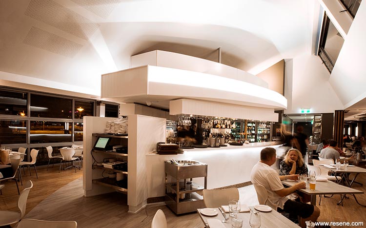
The interior designer and architect worked closely to craft the internal elements of the building and ensure they were as durable and sculptural as the external, with a clear visual continuity between the two. The interior of the building captures guests in a space where they never feel fully inside a building, but instead part of both the land and seascape. Lighting, controlled reflection, framed sightlines, and the aesthetic presence of the project on the shoreline draws the eye through and beyond the interior to the lights of the working harbour and city.
Referencing the reflections of the harbour and boat-like forms, the evening interior environment was designed around light and reflectivity. All illumination is indirect and diffuse so as to reduce reflection off the glazing, allowing the harbour lights outside to blend with the interior, creating a warm visual environment that maintains connection to the external environment and shipping and vessel movements on the harbour.
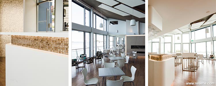
The re-use and refurbishment of existing furnishings and bar structures was implemented wherever possible, as these items had proven their durability and pragmatic requirements to the client. Most new furniture pieces required custom design to accommodate the marine environment, colour specificity and guest comfort.
The client asked that Resene be specified as our primary colour product as it had stood the test of time in the existing restaurant and he trusted the brand to perform for the next stage of the project. The depth of colour and pigment made it an easy choice. The colour scheme was to remain neutral and complementary to the exterior visual environment, borrowing from the passing ship steel hulls and water reflections, while expressing moments of drama and richness.
The lead interior designer on the project had a strong background in luxury marine design, allowing a cross influence of industries, knowledge and technologies within the interior. This borrowing of resources and knowledge from a specialty industry led to a richer, more resolved and durable outcome as well as a broader relationship to problem solving during the project. This enabled navigation of the harsh marine environment to satisfy the client’s brief as well ensure the long term protection of his investment and one that is already an iconic venue in the Newcastle landscape.
A dash of black in the Resene Alabaster dealt with water and sun glare and provided the perfect white canvas for sculptural architecture elements and interior installations. Resene Masala on the pitched ceiling gave the floating acoustic panelling a deep background and when lit at night took on a warm glow. Used on the vertical plane in Resene Lustacryl semi-gloss as a feature wall finish it retained its warmth in the direct sun without losing its striking modern look.
Resene Double Foundry also had a touch of warmth but was used to create a dark, dramatic retreat away from luminant restaurant and bar where you were able to concentrate on yourself and not the expanse of the exterior environment. Resene X-200 weathertight membrane in Resene True Blue was used on the exterior to freshen and modernise the existing colour scheme and to strengthen the visual identity on an already iconic venue. The floor was finished in Resene Beaten Track to refresh the colour.
Architectural specifier: EJE Architecture
Building contractor: PDA Building
Client: Neil Slater
Colour selection: Jodie Duddington
Painting contractor: Mark Leatham Painting
Photographer: Nathan Dawes
Project: Resene Total Colour Awards 2017
Resene case studies/awards project gallery
View case studies that have used Resene products including many from our Resene Total Colour Awards. We hope these projects provide inspiration for decorating projects of your own... view projects
Total Colour Award winners:
2023 |
2022 |
2021 |
2020 |
2019 |
2018 |
2017 |
2016 |
2015 |
2014 |
2013 |
2012 |
2011 |
2010 |
Entry info
Latest projects | Project archive | Resene news archive | Colour chart archive