Queens Arcade
A retail environment that fulfils Scarpa’s brand promise, is engaging and feminine, with an understated sense of luxury.
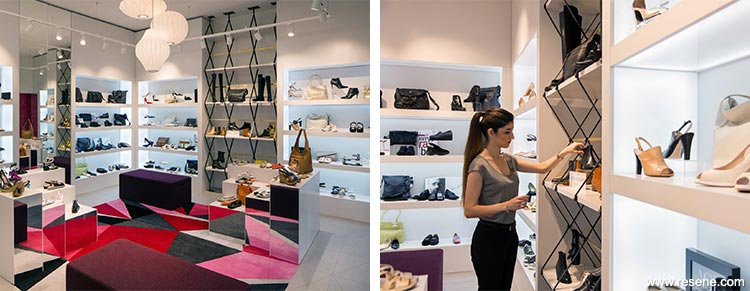
In Italian Scarpa means ‘shoe’ and just like Italian culture this retailer represents quality, attention to detail and style.
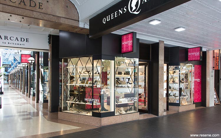
Situated at the entrance to Queens Arcade, RCG identified the need for the final design to complement the history of the site and the many high end luxury brands in the area.
They drew from mid-Century European design with custom brass detailing, a hand tufted wool rug and warm lighting. These modernist features create a feeling of timelessness and understated luxury. Rhomboid and diamond patterns are repeated throughout the store to create a visual rhythm. Scarpa’s brand colour is a vivid lipstick pink which highlights the counter and central area.
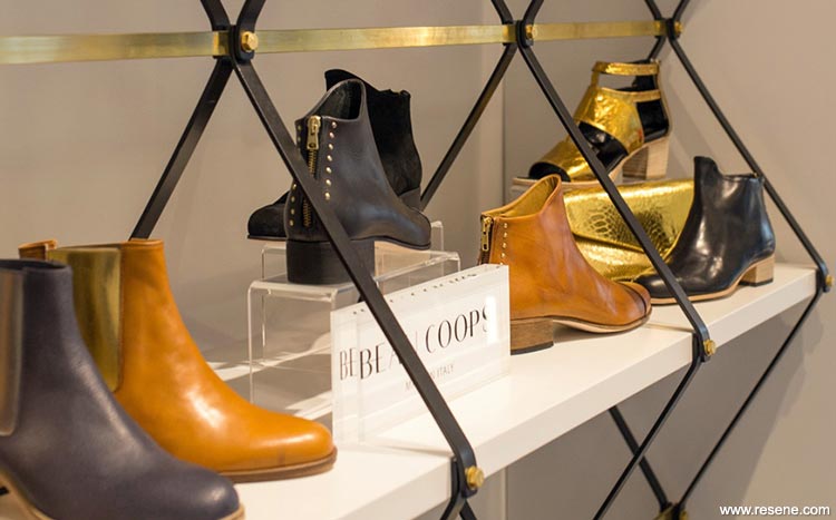
To attract customers into the store RCG created a unique optical display. As people move around the front of the store the shelving changes dramatically from being simple and open, to form a complex diamond pattern.
The ambition for the new store was straightforward says owner John Upton “We knew we wanted the store to feel like a luxury oasis, a space that could make our customers instantly feel good when they walk in the door.”
The result is a retail environment that fulfils Scarpa’s brand promise, is engaging and feminine, with an understated sense of luxury.
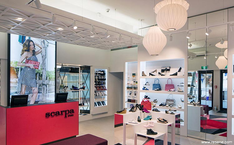
The thought behind the colour scheme for the Scarpa store was to create a graphic monochromatic palette utilising strong geometric shapes and forms. The only bold colour was chosen to relate to the Scarpa brand colour, which is a vivid, powerful, crimson pink used for the entire counter; Resene Knock Out was the perfect colour. The bright counter anchors the rest of the space, and pulls together the fitting area with its fragmented geometric rug in pinks and reds. Resene Knock Out was a real knock out.
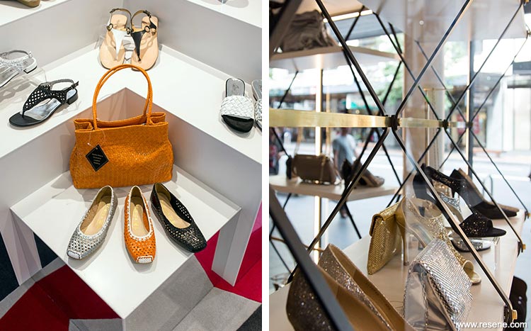
Some joinery is Resene Black, while the remainder uses Resene Quarter Cloud, all internally lit with lots of mirrors. It is a lovely soft colour that looks good against any coloured product that you sit on it allowing the beautiful shoes to be the star of the show. The ceiling keeps the look clean with Resene Alabaster.
Since the store has opened, owner John Upton says they’ve experienced positive results, particularly with staff performance and customer experience. “The customer feedback we receive is really positive. They love that the store feels bright and colourful, and yet intimate.”
Architectural specifier: Andy Florkowski, Ceili Murphy and John Lenihan, RCG
Client: Scarpa
Interior designer: Ceili Murphy
Photographer: Jeremy Toth
Projects: Resene Total Colour Awards 2015
Resene case studies/awards project gallery
View case studies that have used Resene products including many from our Resene Total Colour Awards. We hope these projects provide inspiration for decorating projects of your own... view projects
Total Colour Award winners:
2023 |
2022 |
2021 |
2020 |
2019 |
2018 |
2017 |
2016 |
2015 |
2014 |
2013 |
2012 |
2011 |
2010 |
Entry info
Latest projects | Project archive | Resene news archive | Colour chart archive
![]()
![]() Get inspired ! Subscribe
Get inspired ! Subscribe ![]() Get saving ! Apply for a DIY card
Get saving ! Apply for a DIY card
![]()
Can't find what you're looking for? Ask us!
Company profile | Terms | Privacy policy | Quality and environmental policy | Health and safety policy
Colours shown on this website are a representation only. Please refer to the actual paint or product sample. Resene colour charts, testpots and samples are available for ordering online. See measurements/conversions for more details on how electronic colour values are achieved.
What's new | Specifiers | Painters | DIYers | Artists | Kids | Sitemap | Home | TOP ⇧