Canterbury
In September 2010, the first of a number of major earthquakes hit the Canterbury region causing extensive damage to the Canterbury District Health Board’s facilities.
The initial scoping study for the project identified the options for the new outpatients building on the Christchurch Hospital campus.
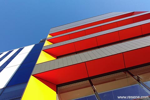
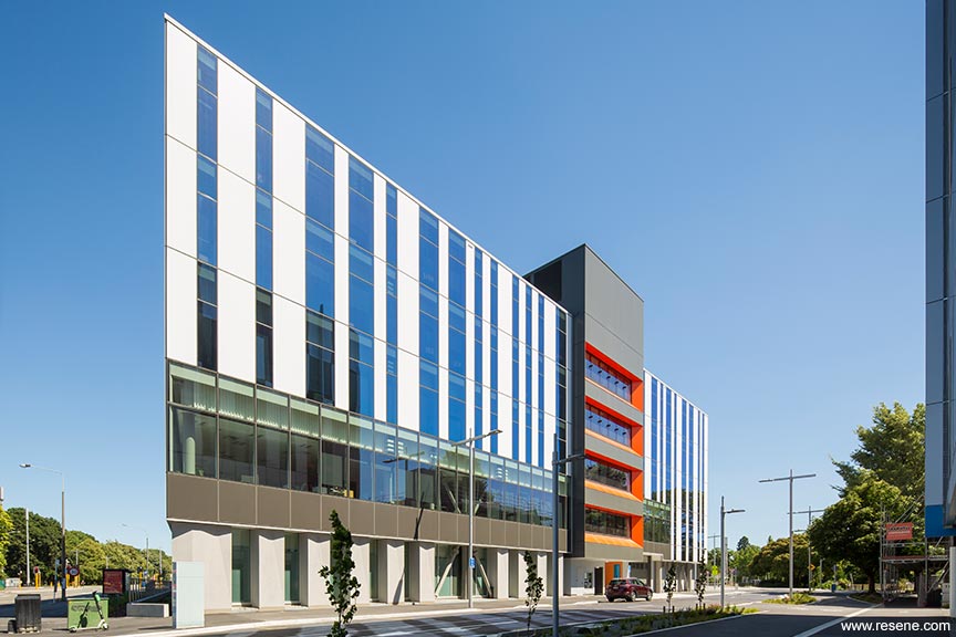
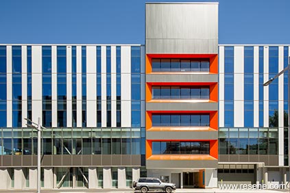
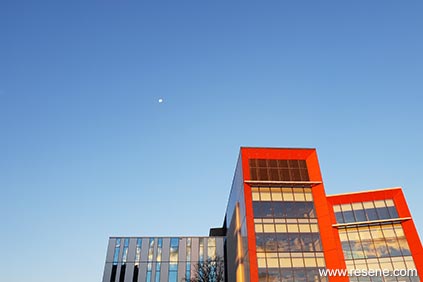
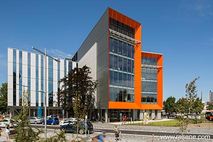
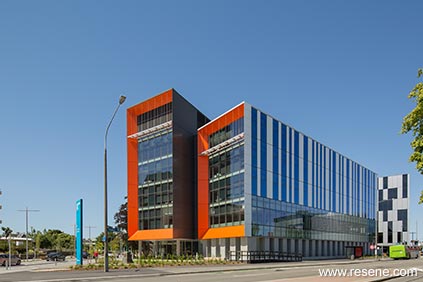
The 10,500 square metre, six storey building caters for 380,000 visitors annually. The aim of this project was the development of an ‘optimised’ and fit-for-purpose facility to house services including Dental, Diabetes and Endocrine, Allied Health Haematology, Vascular Genetics, Neurology and Ophthalmology.
The building required a high level of seismic resistance taking it to an IL3 (Importance Level 3) building. Taking this into consideration the safe movement of +/- 80 mm had a significant effect on the design of the building envelope and its interface with interior partitions, fire ratings, acoustics and building services.
This facility not only required to be a multi-purpose/service building, but also future-proofed to allow for the ever changing demands on these types of medical services.
The facility is a key piece of health infrastructure that brings to life the full integrated model of care the Canterbury District Health Board is working towards by re orientating its services and responding to the impacts of the earthquakes on its facilities.
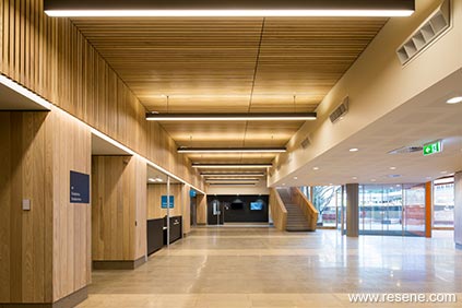
Taking inspiration from the bold and cheerful exterior, the interior of the facility is carefully designed to use bold colours, to help the patient find their way throughout the large complex. An aim of creating a less clinical space was a primary factor when designing the interior. Warm timbers, juxtaposition of dark and light, bright bold colours and a warm base of white help create an inviting and relaxing atmosphere for the patient. Deinstitutionalising a large health building with colour, materials and light.
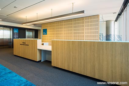
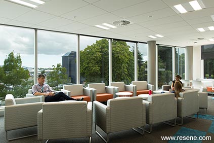
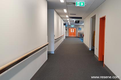
Each floor has a main waiting area with a reception, and numerous sub-waiting areas located within the floorplate. Patients are directed to the main waiting area by the use of bold colours located on the walls and the selection of carpet tiles. Patients that are directed to their sub-waiting areas, are confronted with a strong blue space, with Resene Viking painted on the walls and ceiling tiles.
Orange doors in Resene Rose Of Sharon is painted on emergency exit doors to the stairwells, to help patients familiarise themselves with the main point of entry and exits. Main walls throughout are painted in Resene Half Villa White.
The project being of clinical nature required careful consideration that bridged the specific requirements laid out in guidelines and standards for hospital accommodation. Clinical areas required specific lighting standards such as 4000k lighting which is cool white and light wall colours to provide good colour rendering. Where possible the lighting and colour palettes were warmed to provide clean crisp elements within the building that were patient focussed, such as in waiting areas and public foyers.
The result was to provide a building that although for those that visit it is not because they want to, the experience should be more uplifting and friendly.
The new outpatients building has been well received by patients and staff using the facility, and has won the NZIA 2019 Canterbury Architecture award for Public Architecture, NZ Master Builders Gold Award and the Property Council Industry award.
Architectural specifier: CCM Architects and Jacobs
Building contractor: Leighs Construction
Client: Canterbury District Health Board
Colour selection: Guy Cleverley, CCM Architects
Other key contributor: Jorge Anaya, Jacobs Health Planners
Other key contributor: Marcy Craigie
Other key contributor: Destravis
Painting contractor: Metropolitan Painters
Photographer: Sarah Rowlands
Project: Resene Total Colour Awards 2019
Resene case studies/awards project gallery
View case studies that have used Resene products including many from our Resene Total Colour Awards. We hope these projects provide inspiration for decorating projects of your own... view projects
Total Colour Award winners:
2023 |
2022 |
2021 |
2020 |
2019 |
2018 |
2017 |
2016 |
2015 |
2014 |
2013 |
2012 |
2011 |
2010 |
Entry info
Latest projects | Project archive | Resene news archive | Colour chart archive
![]()
![]() Get inspired ! Subscribe
Get inspired ! Subscribe ![]() Get saving ! Apply for a DIY card
Get saving ! Apply for a DIY card
![]()
Can't find what you're looking for? Ask us!
Company profile | Terms | Privacy policy | Quality and environmental policy | Health and safety policy
Colours shown on this website are a representation only. Please refer to the actual paint or product sample. Resene colour charts, testpots and samples are available for ordering online. See measurements/conversions for more details on how electronic colour values are achieved.
What's new | Specifiers | Painters | DIYers | Artists | Kids | Sitemap | Home | TOP ⇧