Petone
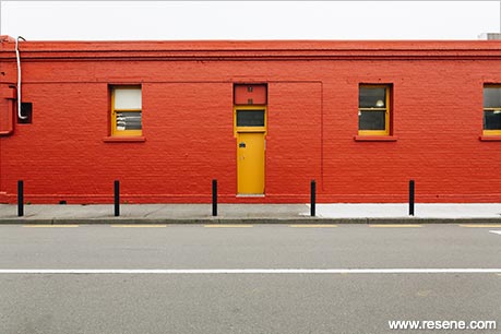
Reviving heritage colours through contemporary schemes brings character and celebration to a building's traditional architectural features.
These heritage inspired colours were carefully selected from the Resene colour range to find the perfect balance between proportion and tone against the exterior form of historic buildings.
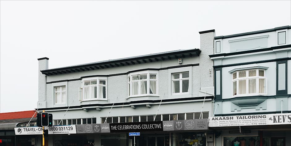
The Jackson Street Programme's aim is to promote, preserve and enhance Jackson Street as a successful heritage, retail and commercial area. The Hutt City Council expressed interest to invest in reviving the exterior of heritage buildings on Jackson Street in order to protect and enhance the remaining buildings and their value to their community.
From Stuff reporter Nicholas Boyack, "Australian-based economist… has helped draw up a plan to protect and enhance the remaining buildings. It involves treating the remaining buildings as "economic heroes" recognising the value they add to the regional economy and their significance as drawcards." "The council has invested $150,000 into Petone 2040, a group working on a spatial plan for Petone. Some of that money is going towards a makeover of four building in Petone which will serve as a trial to show building owners what can be achieved by smartened up facades, removing inappropriate features and rebuilding heritage features."
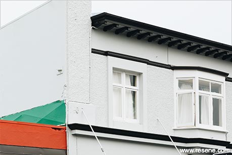
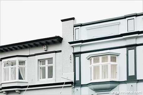
Rather than selecting colours for the pilot buildings as a stand alone exercise, Honour Creative proposed that they create a palette of colours that could have ongoing value. The intention was for a set of colours that had the breadth to cater to a wide range of applications but that facilitated consistency in sophistication and integrity through being presented as a system.
In short: create a Jackson Street of character buildings that are like a large family of interesting individuals. Creating character requires strength of effect, to be bold and to have courage in colour choices.
The intent with the colour palette is to inspire, not restrict or instruct. The range of colours should open eyes and minds to options and facilitate colour combinations that are sympathetic, interesting and tasteful.
Research was conducted into both traditional and heritage building colour schemes and colour allocations. Images were collected from a large range of heritage buildings to observe existing applications. A summary of the research (those with more successful colour schemes), was displayed in a Character Matrix showing that when there is a blend of contemporary and traditional, a building has the most character while also honouring the heritage architecture. When traditional colours are applied in traditional ways the effect is true to period but lacks personality or distinction (in the context of our aim to focus on character). When non-heritage colours are applied in ways that don't follow traditional application in terms of roof, trim, base building and highlights, the effect often fails to celebrate the architectural features of the building.
The approaches from the two corners of the matrix with the most character were illustrated through the Resene Heritage palette and brochure examples. An established approach to applying colour to the exteriors of heritage buildings is using four colours across four building elements: roof, trim, highlight, base. Character approach 1 changed the traditional weighting of colour across these elements and character approach 2 kept the allocations and proportions and changed out the colours to more contemporary hues.
There are a total of 60 colours in the palette. Resene provided a specification document that covers a range of substrates and material conditions and these are supplied to the various painting contractors.
As a base selection, Resene heritage colours were viewed in hue groups, a selection of contemporary, soft, grey-based colours were added from the Karen Walker Paints selection, popular and familiar colours with wide appeal were added from the Resene Classics collection then reviewed against 'Colour Trends' to ensure key hues are included, particularly in the highlights section. These were supplemented with colours from the whites and neutrals palettes and hues that were missing from early paint technologies – blues, blue-greens and grey-based neutrals. The palette was then refined and rearranged to establish the final colour palette. The colours are in mini 'colour gradient sets' to assist in colour selection. Each set contains at least four tones and shades that progress in similar steps. Each set has been chosen to allow a harmonious colour scheme from within a set or to mix and match across different sets.
The sets are:
Black greys:
Blue greys:
Blues:
Grey blues:
Grey greens:
Blue greens:
Olive greens:
Brown and buff:
Rusty Reds:
Heritage inspired highlights:
Whites:
Blacks:
Highlights:
When presented as colour cards rather than digital images, the colour palette comes to life and the extent of the collection and flexibility within it becomes more apparent. When presenting the concept to building owners all cards were laid out in sets across the floor and revealed – this process was wonderfully engaging. The individual building's colour set could be pulled from the range for a visualisation of their building in the proposed colour scheme. What could be a subjective process of colour selection was then seen to be a thorough and considered one where an individual building sat within a wider plan for the whole area.
Client: Hellen Swales, Jackson Street Programme
Interior designer: Honour Creative
Photographer: Bonny Beattie
Project: Resene Total Colour Awards 2020
Resene case studies/awards project gallery
View case studies that have used Resene products including many from our Resene Total Colour Awards. We hope these projects provide inspiration for decorating projects of your own... view projects
Total Colour Award winners:
2023 |
2022 |
2021 |
2020 |
2019 |
2018 |
2017 |
2016 |
2015 |
2014 |
2013 |
2012 |
2011 |
2010 |
Entry info
Latest projects | Project archive | Resene news archive | Colour chart archive