The colour scheme is derived from the narrative of the historic Johnson's clearing and acknowledges the original forest on the site.
Waitohi – the new community centre and library facility in Johnsonville, sets a precedent for suburban centres transitioning towards denser 'town' centres, consolidating and connecting existing facilities towards an engaging new community hub for Johnsonville.
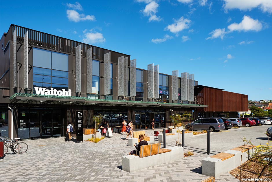
Launched as a design competition by Wellington City Council, the Waitohi brief required:
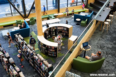
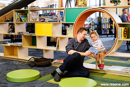
Johnsonville was originally dense forest, and Waitohi refers to the stream which ran through the area. The project acknowledges and celebrates historic vegetation, topography and geography of the site, by re-imagining the original forest setting in a new terraced architectural landscape.
The interior is imagined as a 'learning landscape', creating a journey of discovery as users experience spaces from lower to upper levels. The 'forest floor' with glulam columns like tree trunks connect to the articulated ceiling 'canopy' above. The 'Escarpment' mediates between levels, providing a place to sit, work and look out over the landscape.
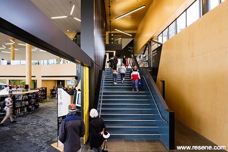
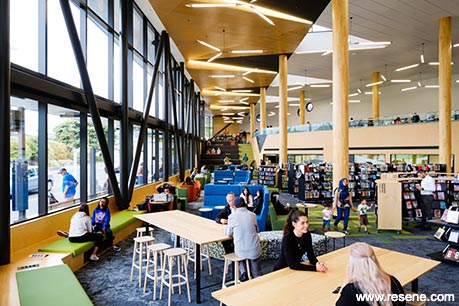
'The Link' extends through the building, joining the library to Keith Spry Pool, transport hub, and Memorial Park beyond. The café activates the edges, spilling into shared landscape to the west. The kindergarten, relocated and upgraded from part of the original site, occupies the level 1 and roof terrace.
Within the building opportunities for playful visual connections between the library and the kindergarten are encouraged and are connected by large porthole windows.
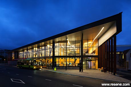
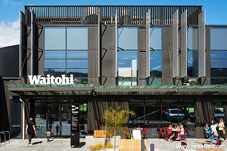
Traditional library thresholds are blurred and large flexible spaces allow for variation in library programme, including hosting community events. Maker space and recording studio acknowledge changing technological needs library users. Bookable community meeting rooms, staff workrooms and support spaces are provided throughout.
Wall colours are inspired by seasonal chances of flora and fauna – from fresh greens through to autumnal browns/reds – natural finish wall linings such as plywood and strandboard expressing the warmth of the timber – being the inside of the tree and the exterior cladding colours are the skin like the bark of a tree, protecting the interior.
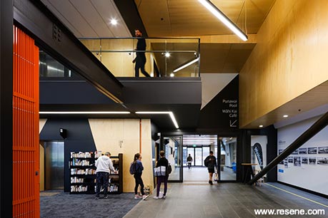
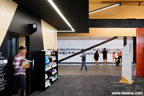
The colour scheme is derived from the narrative of the historic Johnson's clearing and acknowledges the original forest on the site and the scheme was realised with the support of Resene colours and products. The selected flooring tile and colourways relate to the forest floor, patterns of trail creation as well as leaf fall from the trees above which highlight the structural columns.
A palette of Resene Copper Canyon, Resene White Pointer, Resene Spanish Green, Resene Crisp Green, Resene Nocturnal and Resene Eureka is painted with care on interior surfaces, using Resene SpaceCote for walls and Resene Lustacryl on doors and trim. Steelwork is finished in Resene Uracryl 402.
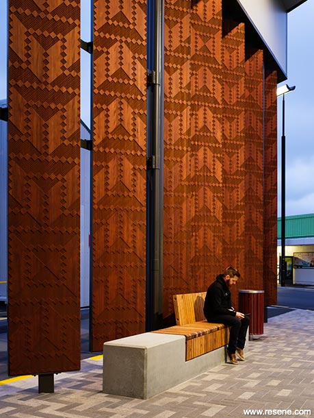
Resene waterborne enamels were specified for air quality low VOC reasons due to on site application but also for durability on walls. Resene Aquaclear Satin was used for appearance and protection to the plywood and strandboard surfaces.
Bright flooring acts as wayfinding signifiers but also acknowledge the subterranean stream – Waitohi. Sustainability considerations were inherent in the design of Waitohi. These included:
Location:
Material selection:
Accessibility and Inclusion:
Waitohi provides a modern facility that will serve the community well into the future. Since opening, Waitohi has seen 150% increase in issues and 500% increase in registrations from the same period the previous year.
This project won the Resene Total Colour Commercial Interior + Public Space Colour Maestro Award. The judges said "as the backdrop to a busy space, the palette is sensitively chosen and placed. Appropriate, welcoming and calm it is serene with just the right amount of colour to liven the senses while focusing attention on the collection within. A fitting backdrop to a public space where young and old can sit and enjoy the space at their own pace."
Architectural specifier: Athfield Architects Limited
Building contractor: Southbase
Client: Wellington City Council Libraries (WCC)
Painting contractor: Freer Philip
Photographer: Jason Mann
Services and structural: Aurecon
Fire consultants: Holmes Fire
Landscape: Boffa Miskell
Project managers: The Building Intelligence Group
Winner: Resene Total Colour Commercial Interior + Public Space Colour Maestro Award
Project: Resene Total Colour Awards 2020
Resene case studies/awards project gallery
View case studies that have used Resene products including many from our Resene Total Colour Awards. We hope these projects provide inspiration for decorating projects of your own... view projects
Total Colour Award winners:
2023 |
2022 |
2021 |
2020 |
2019 |
2018 |
2017 |
2016 |
2015 |
2014 |
2013 |
2012 |
2011 |
2010 |
Entry info
Latest projects | Project archive | Resene news archive | Colour chart archive