Waitara
The brief was to make this building noticeable but different, sophisticated but colourful.
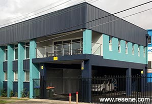
Camp Somerset provides outdoor programmes to schools and also to participants of the Duke of Edinburgh Award Scheme, and have been doing so for over 35 years. The outdoor facilities are located in the Colo River, which is part of the Hawkesbury-Nepean catchment area, in typical Australian bushland. Their head office building is located in an industrial section on the Waitara/Hornsby border in Sydney’s upper north shore, a location quite removed from the bushland areas and activities the business centres around.
The head office building is located in an industrial area around Hornsby on Sydney’s upper north shore, and was the same blonde brick and concrete exterior as when it was built around the late 1970s. Now home to four outdoor related businesses that had outgrown the space, the owner (of Camp Somerset and the building) undertook a major project to extend and revamp the building.
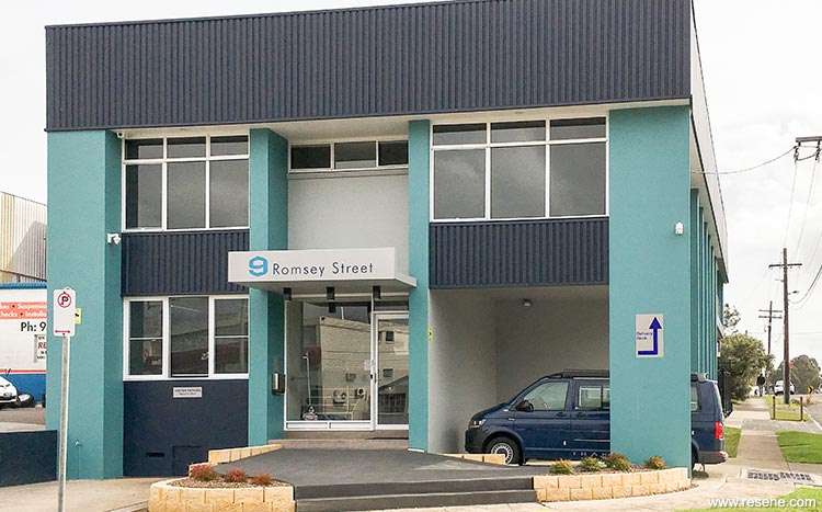
The plans were to extend the building at the northern end, providing additional office space, a kitchen and balcony on the first floor. The area underneath this was a covered car park for staff, since parking in the area during business hours is extremely difficult. It also included rendering all the brick sections of the exterior to update the look (with the exception of the long wall on the western side, which was left as brick), as well as the pillars and columns in the new garage. The same galvanised roof profile was also used on the new extension.
The materials used for the exterior meant that the entire building needed to be painted – the rendered sections, roof profile and sections under all the windows. That meant large expanses of colour and not something you want to get wrong. The rendered exterior drawings from the architects had a burnt orange and charcoal exterior colour scheme, but the owner wanted to enlist the help of a colour designer to “see what they would come up with” on a building that was essentially a blank canvas.
When discussing potential colour palettes the client said he wanted it to stand out from the surrounding commercial buildings, which are of a similar era and colour, or new ones in various shades of contemporary grey. There are also a lot of residential high rise buildings visible across the other side of the railway line, which have the standard primary coloured façade sections on them. The brief was to make this building noticeable but different, sophisticated but colourful.
The clichéd palette would have taken inspiration from bushland colours to pay homage to the nature of the businesses within the buildings, but a standard COLORBOND® palette would have been neither exciting nor sophisticated.
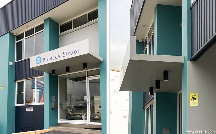
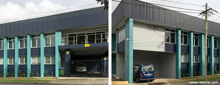
The new Resene Multi-finish range had just been released and the bright colours it contained provided just the inspiration needed. Bright sunlight saps a lot of colour from an exterior so the strength of colour used for the exterior could be quite high. The exterior is quite ‘boxy’ but a series of columns add vertical interest and repetition of line, while the galvanised profile around the top is repeated under the first floor windows, providing a horizontal contrast which also contains vertical elements in the direction of the ridging. There is also interest where some parts (the columns) stand out while others are a little recessed. Because the columns are quite narrow using a strong colour on them would not be too overwhelming, and it could be tempered by using a darker colour as a contrast.
The final palette was inspired by watery hues, but bright ones instead of muted bushland tones, with Resene Ming (turquoise) on the exterior vertical columns and Resene Indian Ink (dark navy) for the horizontal sections around the roof profile, under the windows, and on the horizontal parts of the structure. They were also used on the vertical columns in the car park. The final colour in the palette was Resene Half Stack (mid grey) used on some of the recessed sections to provide some neutral relief to the other two stronger colours. It was also used it on the walls in the underground parking area (for safety so all the surfaces were not dark navy) and on the vast expanse of plain brick wall on the western side of the building. This wall faces the neighbouring tyre business. Finally the eaves and soffits were done in Resene Eighth Black White to keep them as light as possible.
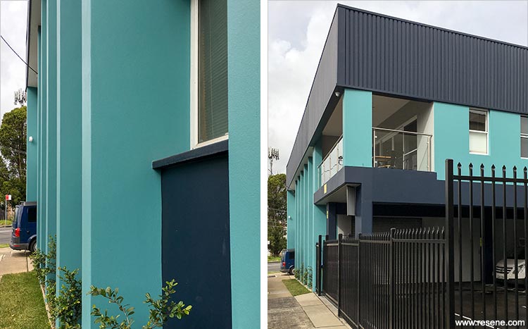
They colour palette is bright, sophisticated, and completely different to the reds and yellows of the residential buildings and the grey of nearby commercial buildings.
Before the renovation the building suffered at the hands of graffiti artists on a regular basis. With the renovation security cameras were installed which seems to provide a suitable deterrent. Those passing by think it is actually a residential building thanks to the new balcony outside the new kitchen on the first floor.
Time was critical, since the scaffolding being used for the rendering was also to stay in place for the painting, but was only to be up for a limited amount of time, so the render would not have long to cure. Resene Limelock was specified for the new render, which enabled painting to commence as soon as possible after the rendering was done.
For the general areas, Resene Lumbersider was specified for all the colours. Keeping it simple with the products meant the painters could concentrate on applying the specified colour in each area.
Architectural specifier: ADG Architects
Building contractor: JBP Construction
Client: Camp Somerset
Colour selection: Flow Colour and Design
Interior designer: Group D
Other key contributor – owner Camp Somerset and client for the entire project: Arthur Crichton
Painting contractor: Bill and Al’s Painting
Photographer: Fiona Saville
Project: Resene Total Colour Awards 2017
Resene case studies/awards project gallery
View case studies that have used Resene products including many from our Resene Total Colour Awards. We hope these projects provide inspiration for decorating projects of your own... view projects
Total Colour Award winners:
2023 |
2022 |
2021 |
2020 |
2019 |
2018 |
2017 |
2016 |
2015 |
2014 |
2013 |
2012 |
2011 |
2010 |
Entry info
Latest projects | Project archive | Resene news archive | Colour chart archive