Taupo
The project colour scheme was based on the natural colours of the site throughout the seasons.
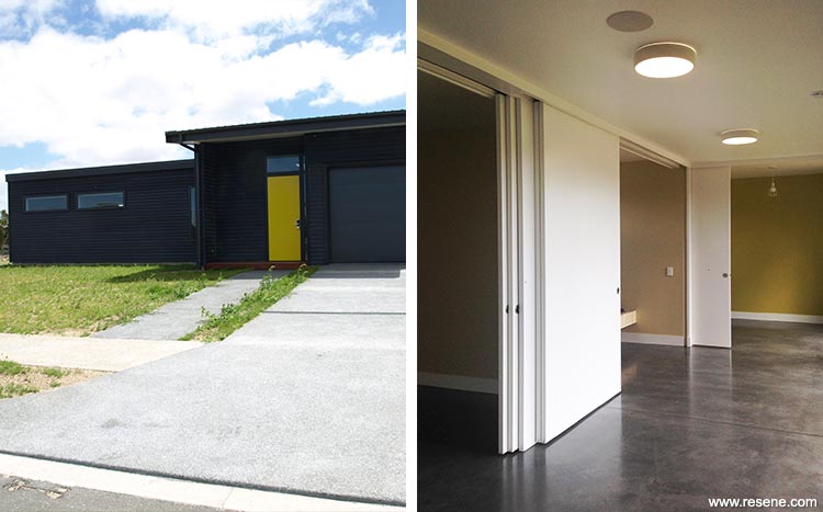
The house at Wharewaka is to be a meeting place for family from across the North Island. It is essentially a ‘bach’, but it also needs space – the brief was to accommodate an extended family made up of 18 people so far and still growing. It needed to be of good quality, but not fussy, raw materials forming the finished surface, rather than being polished and buffed by construction processes. Cracks and material imperfections were permitted, luxury was not.
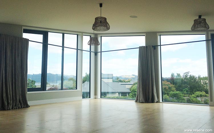
There were a number of iterations of the house. It started out larger with more extensive decking. The design was pared back. It needed to take advantage of the site and the covenant that prevented the adjacent houses closer to the lake from building above five metres. Therefore it needed to have an upstairs to watch the lake and the mountain. The children needed to be able to get outside to the cricket/football pitch.
The accommodation approach was marae-style sleeping. However comfortable the family were with that, the partners need their space. The exercise then became slicing up the sleeping quarters into flexible bed platforms that could be loaded with mattresses and children, or quickly rearranged to provide a comfortable double bed, with storage under for extra mattresses, and a space for bags and a ‘bedside table’ at the foot of the bed. Sliding screens then form adjustable walls, and ventilation ensures rooms are warm and dry year round.
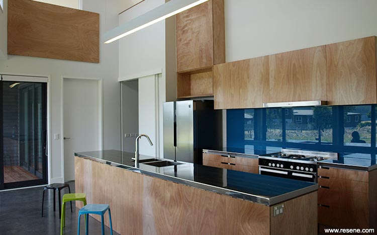
Upstairs is the meeting space. There is direct contact to the kitchen below which easily houses 5 or 6 occupants working together, and the volume opens up to accommodate the numbers around the dinner table.
The project colour scheme was based on the natural colours of the site throughout the seasons. The blue Resene Arapawa splashback in the kitchen speaks of Lake Taupo in summer, whole Resene Tiara in the bathrooms brings in the sky. The yellow, Resene Yuma, and greens, Resene Gimblet and Resene Beachcomber, are reminiscent of the flora on display both directly outside the house in the grass and trees but also mimic the tones of the pebbles on the lake edge bringing warmth to the bedrooms. Whites and greys – Resene Hint Of Grey, Resene Alabaster, Resene Ash, and Resene Half Ash – were introduced to spaces where colour was to take a back-seat to the life and interest that people bring to a space.
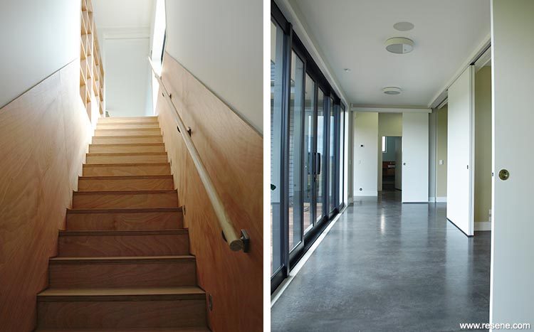
The whole project was about being true to the site, true to the materials, and true to purpose. Concrete stays in its unpolished form, exposed plywood injects warmth as it is implemented as a finish where a surface might be touched- whether in the act of opening a cupboard, leaning over a balustrade or holding onto a handrail.
Architectural specifier: Amanda Bulman, bbc architects ltd
Building contractor: Glencoe Construction
Project: Resene Total Colour Awards 2015
Resene case studies/awards project gallery
View case studies that have used Resene products including many from our Resene Total Colour Awards. We hope these projects provide inspiration for decorating projects of your own... view projects
Total Colour Award winners:
2023 |
2022 |
2021 |
2020 |
2019 |
2018 |
2017 |
2016 |
2015 |
2014 |
2013 |
2012 |
2011 |
2010 |
Entry info
Latest projects | Project archive | Resene news archive | Colour chart archive
![]()
![]() Get inspired ! Subscribe
Get inspired ! Subscribe ![]() Get saving ! Apply for a DIY card
Get saving ! Apply for a DIY card
![]()
Can't find what you're looking for? Ask us!
Company profile | Terms | Privacy policy | Quality and environmental policy | Health and safety policy
Colours shown on this website are a representation only. Please refer to the actual paint or product sample. Resene colour charts, testpots and samples are available for ordering online. See measurements/conversions for more details on how electronic colour values are achieved.
What's new | Specifiers | Painters | DIYers | Artists | Kids | Sitemap | Home | TOP ⇧