Sydney, New South Wales
The brief was to meet the desires of two homeowners, with differing visions for their home, while respecting the heritage of the house and creating interest in the elevations by using contrasting elements in the colour design.
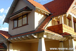
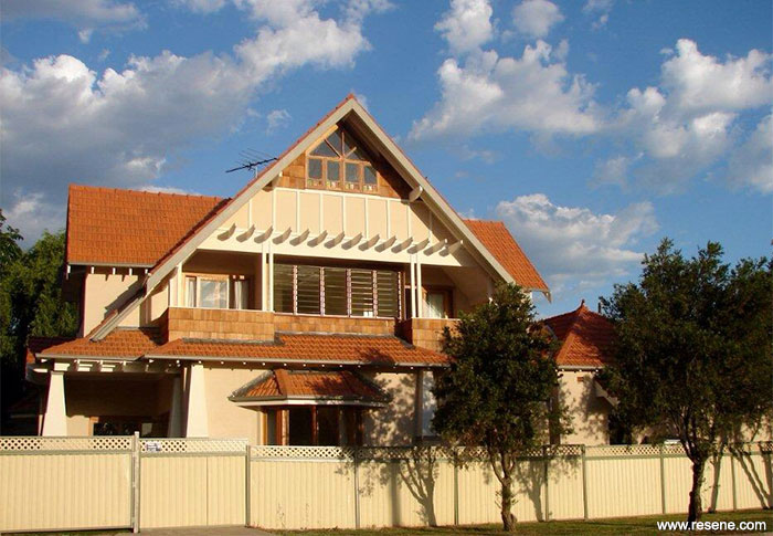
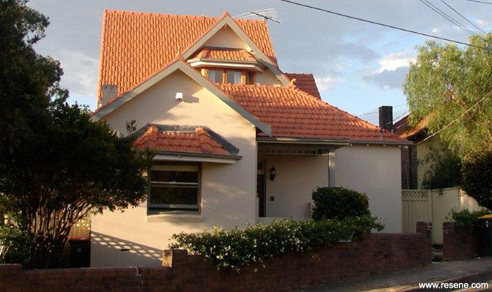
This beautiful upper addition to quite a plain federation home has been enhanced by a sympathetic architectural design. The dominant architectural feature of the design is the roof, with its many gables. The expansive roof was designed to take advantage of the environmental conditions, including sunlight and ventilation.
The huge gables have been complemented by the use of interesting windows, decorative timber work, exposed rafters and cedar shingles. This creates a dynamic, impressive streetscape, especially the feature area on the side view, while referencing the heritage of the home, and adding character to it.
The brief was to meet the desires of two homeowners, with differing visions for their home, while respecting the heritage of the house and creating interest in the elevations by using contrasting elements in the colour design. The desire was to use a complementary tone on tone feel in the palette, to ‘lighten’ the feel of the structure, given its dominant roof structure and extensive use of shingles and terracotta roofing, while respecting the heritage details of the building, but interpret the heritage palette in a new, fresh way.
The clients were clear they did not want a scheme they would tire of, so the aesthetic created needed to be classic, not ‘trendy’. It was important to maintain interest in the elevations and ensure the home did not appear to have large bland expanses, so colour needed to create interest, by providing contrast between the architectural elements. It was essential the colour selections complemented the architecture of the home and the detailing, which was integral to the design.
They wanted to respect the heritage and detail, yet did not like ‘traditional’ heritage colour schemes, and some colours, such as blues and greys were completely off the table.
The selected COLORBOND® guttering was taken into account and used as an accent colour matched on gable fascias and barge boards in Resene Hi-Glo. The beautiful Resene AquaShield in Resene Half Doeskin provided a great base colour, which worked with the COLORBOND® Bushland and was not too feminine. It is a colour with warmth and character and complements the cedar timberwork and selected terracotta tiles beautifully well. Resene Quarter Spanish White was the perfect contrasting white without being too stark, so maintaining a sense of warmth and homeliness.
The western aspect of the prominent side elevation was also important to consider, given that it is bathed in uninterrupted sunlight every afternoon. The colour palette had to be strong enough to maintain contrast on architectural features even under intense illumination from the west.
The main consideration for the paints used was durability and finish. Gloss was selected for the timber features to highlight them further and add to a sense of ‘lightness’ to the structure, by adding another layer of luminous reflectance to the contrasting elements. In this way, a low sheen was critical for the rendered walls, to heighten this contrast, while maintaining washability and ease of maintenance.
Architectural specifier:
Tony Rodi
Interior designer:
Vassoulla Francis
Project: Resene Total Colour Awards 2014
Resene case studies/awards project gallery
View case studies that have used Resene products including many from our Resene Total Colour Awards. We hope these projects provide inspiration for decorating projects of your own... view projects
Total Colour Award winners:
2023 |
2022 |
2021 |
2020 |
2019 |
2018 |
2017 |
2016 |
2015 |
2014 |
2013 |
2012 |
2011 |
2010 |
Entry info
Latest projects | Project archive | Resene news archive | Colour chart archive
![]()
![]() Get inspired ! Subscribe
Get inspired ! Subscribe ![]() Get saving ! Apply for a DIY card
Get saving ! Apply for a DIY card
![]()
Can't find what you're looking for? Ask us!
Company profile | Terms | Privacy policy | Quality and environmental policy | Health and safety policy
Colours shown on this website are a representation only. Please refer to the actual paint or product sample. Resene colour charts, testpots and samples are available for ordering online. See measurements/conversions for more details on how electronic colour values are achieved.
What's new | Specifiers | Painters | DIYers | Artists | Kids | Sitemap | Home | TOP ⇧