Auckland
The brief required a largely open plan office that would bring staff together, encouraging collaboration between staff and providing an attractive, exciting place to work.
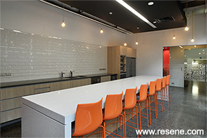
An open brief was offered in terms of the look and feel, as long as the kitchen was cool and the space was reflective of who they are as a company.
The basis of the concept is reflective of the client’s industry – Engineering, Surveying, Planning and Urban Development. We utilised natural finishes; concrete, rough sawn timber, steel and plants and neutral paint colours Resene Alabaster and Resene Double White Pointer to reflect the urban environment they work in. To add the flair and interest we called upon the bright colours they also experience; red – Resene Roadster, orange – Resene Mexican Wave, yellow, black – Resene Black and White – Resene Alabaster, all reflective of surveying equipment, road markings and diggers.
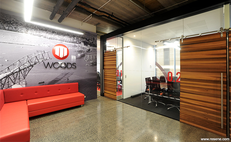
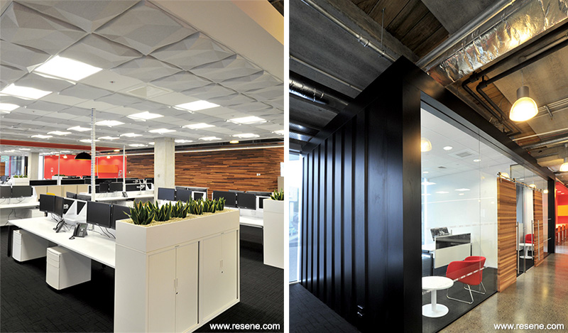
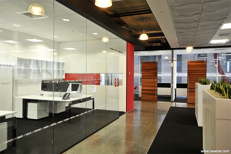
The meeting/office spaces were designed to resemble shipping containers which had frameless glass panels and exposed door sliding mechanisms, all assisting with creating a bold industrial statement.
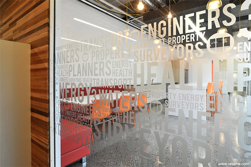
In the reception we used rust panels to provide colour and texture along with a large graphic of Auckland City infrastructure. Throughout the glass has graphic frosted elements, ensuring detail and concept was considered everywhere.
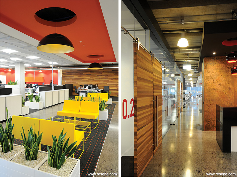
Acoustics were a careful consideration due to the size of the space and quantity of people. We designed a dropped ceiling that incorporated 3D acoustic tiles that imitated land/terrain. This was a standout feature in the space and provided acoustic functionality along with hiding a considerable amount of air-conditioning plant. All feature elements were custom designed. The individual slatted timber wall and doors with the industrial door systems all support the industrial urban concept reflective of their business.
Maximisation of light was a must, and initially they gave us the directive that they wanted to incorporate their corporate colours – red, black and white.
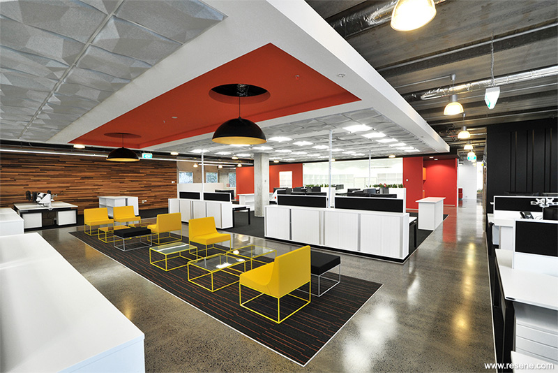
Their intention, as with others, was to reinforce their brand and they thought the solution was to use these colours as the palette. We said we could do better than that and that we would use a selection of colours that were complementary and enhanced their brand, which is how we chose to include orange and yellow. Strong colours and natural finishes were the key to this fit-out.
Strong colours bring out the character of timbers and concrete when used in close proximity. This project is a good balance of colours and vibrancy.
Architectural specifier: Spaceworks Design Group
Building contractor: Practec
Client: Woods
Photographer: Grant Southam Photography
Project: Resene Total Colour Awards 2013
Resene case studies/awards project gallery
View case studies that have used Resene products including many from our Resene Total Colour Awards. We hope these projects provide inspiration for decorating projects of your own... view projects
Total Colour Award winners:
2023 |
2022 |
2021 |
2020 |
2019 |
2018 |
2017 |
2016 |
2015 |
2014 |
2013 |
2012 |
2011 |
2010 |
Entry info
Latest projects | Project archive | Resene news archive | Colour chart archive
Order online now:
Testpots |
Paints |
Primers and Sealers |
Stains |
Clears |
Accessories
![]() Get inspired ! Subscribe
Get inspired ! Subscribe ![]() Get saving ! Apply for a DIY card
Get saving ! Apply for a DIY card
Can't find what you're looking for? Ask us!
Company profile | Terms | Privacy policy | Quality and environmental policy | Health and safety policy
Colours shown on this website are a representation only. Please refer to the actual paint or product sample. Resene colour charts, testpots and samples are available for ordering online. See measurements/conversions for more details on how electronic colour values are achieved.
What's new | Specifiers | Painters | DIYers | Artists | Kids | Sitemap | Home | TOP ⇧


