Voyager National Maritime Museum
The palette supports the rich tapestry of human stories the visitor is about to encounter...
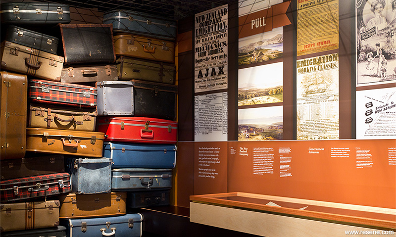
A permanent social history exhibition completed for the Voyager National Maritime Museum, The Immigrants utilises interactivity, props and museum objects to create a rich pictorial display exploring the complex forces that brought so many migrants to New Zealand shores. The key interpretive concept, to engage visitors and connect them emotionally with the heart of the immigration story, was the creation of a set of characters based on authentic immigrant stories. Each visitor rips a ticket from the stand at the beginning of the exhibition – this ticket tells the story of one of twelve characters.

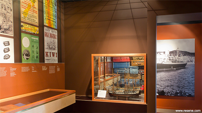
The visitor is guided through a visually rich experience, which includes a 19th century ship’s cabin, which rocks and creaks and a salon-hang picture gallery that examines the ideas of arriving in New Zealand as an immigrant. Stories of the voyage itself and the experience of arriving and settling in a new land are interwoven throughout the exhibition. The exhibition closes with the opportunity to spin a coloured wheel of fortune to discover the fate of the character on the ticket the visitor took at the beginning of the exhibit.
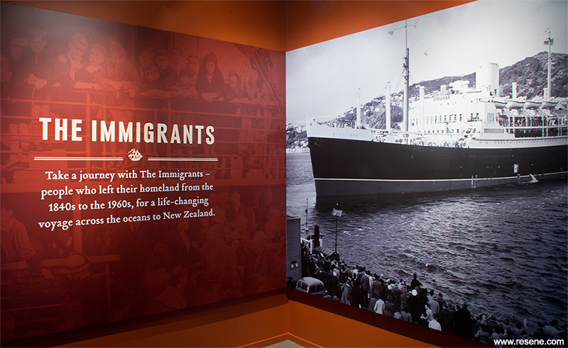
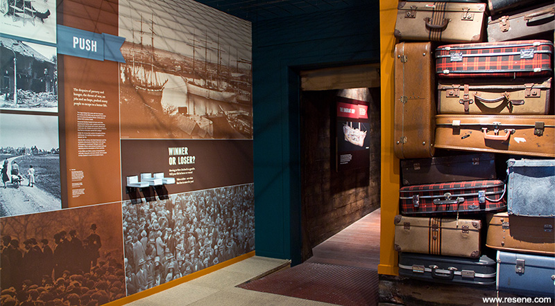
Resene Tia Maria (rich red orange), Resene Moroccan Spice (bitter brown orange) and Resene Bootleg (deep brown) were chosen for the ‘The Immigrants’ entrance and the first section of the exhibition, Push/Pull. Old suitcases, leather, wood, book cloth and printer’s ink (used in posters from the period on display in this section) inspired the colour selection. Alongside the need to select colours that would complement the black and white photographs and other imagery, they also needed to work as appropriate tints for colouring large-scale hero images. These are all rich, warm colours – used in combination they create an inviting, enveloping space with strong visual impact. The palette supports the rich tapestry of human stories the visitor is about to encounter.
Once the visitor passes through the 19th century rocking ship’s cabin – a dark, atmospheric rough-sawn timber-clad space – they move into a contrasting cabin from a 20th century immigrants’ voyage. Resene Dutch White (clean yellow) was selected as the paint finish for this space, as a slightly yellowed white – curatorial research into the likely colour used historically suggested this would evoke this period and create the right mood for the small second-class cabin space.
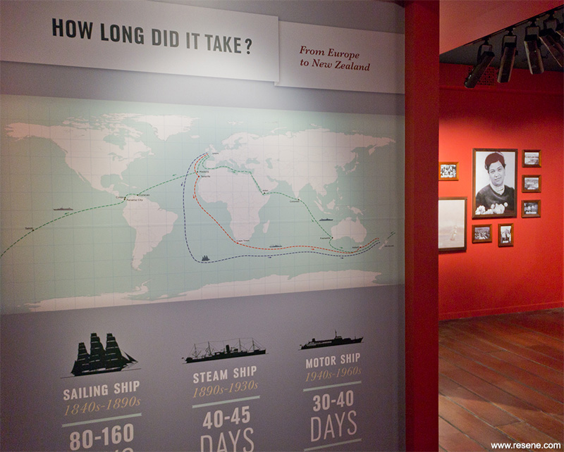
After exploring the two different cabins and thinking about the different types of voyages migrants would have experienced, the visitor moves into a new section of the exhibition - Welcome to Aotearoa. Resene Tall Poppy (deep red) was an obvious choice to create a rich red beacon to draw the visitor through the darker spaces. Evoking a 19th century drawing room, Resene Tall Poppy creates an appropriate backdrop to framed portraits and landscapes that open on hinges to tell immigrant arrival stories.
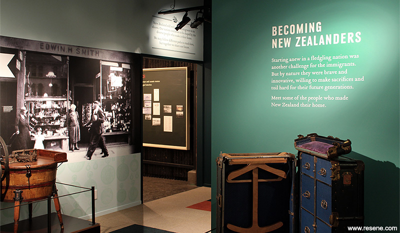
The final section, Becoming New Zealanders, required a change in pace and dynamic. The preceding spaces were mostly low stud with rich, warm paint finishes. In this last section, with its notably higher stud, the emphasis was to create a sense of openness and contrast. It is a space which shares personal stories of bravery, entrepreneurialism and innovation from people who made New Zealand home. A soothing palette inspired by sea, sky and forest created an appropriate canvas - Resene Reservoir (pastel aqua green) was the main colour selected, with Resene Green Room (oceanic green) and Resene City Limits (deep green) in support.
As a final experience, the visitor spins the coloured wheel of fortune to find out how the story ends for their character. The entire exhibition colour palette is brought together harmoniously in the wedges of the spinning wheel.
Resene City Limits was also used for the ceiling spaces in the first and last sections as an alternative to the standard choice of black. Both of these spaces have high studs in contrast to the cabins in the central exhibition space. The colour is dark enough to absorb light and disguise piping and other fittings/facilities (in the same way black would) but with a depth and character that adds to the overall feeling of the space.
All colours were used in Resene SpaceCote Flat, a durable and matt finish, important for both lighting walls dramatically without reflection and for the application of exhibition graphics and decals. All colours for The Immigrants were selected for their richness under exhibition grade lighting. Colours that look great in natural light often look washed out under exhibition grade lighting – a colour needs to have dynamic range and look strong in both spot lighting and shadows. When working on exhibition and display projects with tight budgets The Letter Q have found being bold with colour by choosing high chroma, richly pigmented Resene colours is the most cost effective method of achieving a lot with a little.
The other factor when working in exhibitions is that the colours selected often have to leap across different media as seamlessly as possible. The designer starts by selecting the colours for each space within the exhibition from the Resene ranges – this leads the colour palette for graphics within the different spaces. Then using the cmyk colour specs from the Resene website to set up swatches in their graphic files, printed colours can be matched to the paint finishes. The final step is working very closely with the printer during the proofing process to achieve accurate colour matches – paying particular attention to placements where large-scale wall graphics meet the paint finishes.
The journey of colour throughout this exhibition won it the Resene Total Colour Display + Product Award 2013. The judges found the “strong confident use of colour, brave and Innovative. The palette is carefully contemplated for an exceptional end result. Colours integrated in displays are well thought through. Colour leads the navigation through the display and is woven into the story. The colour palette has a nautical theme without being cliché and is cleverly bound together through the interactive colour wheel.”
Architectural Specifier: Pearson & Associates Architects
Building Contractor: Savory
Client: Voyager New Zealand National Maritime Museum
Exhibition Art Direction, Image Research, Graphic Design, Colour Selection: The Letter Q
Interior Designer: Pearson & Associates Architects
Object Mounts and Installation, Interactive Build: Object Support
Print Production: Big Colour
Winner: Resene Total Colour Display + Product Award 2013
Project: Resene Total Colour Awards 2013
From the Resene News – issue 4/2013
Resene case studies/awards project gallery
View case studies that have used Resene products including many from our Resene Total Colour Awards. We hope these projects provide inspiration for decorating projects of your own... view projects
Total Colour Award winners:
2023 |
2022 |
2021 |
2020 |
2019 |
2018 |
2017 |
2016 |
2015 |
2014 |
2013 |
2012 |
2011 |
2010 |
Entry info
Latest projects | Project archive | Resene news archive | Colour chart archive
![]()
![]() Get inspired ! Subscribe
Get inspired ! Subscribe ![]() Get saving ! Apply for a DIY card
Get saving ! Apply for a DIY card
![]()
Can't find what you're looking for? Ask us!
Company profile | Terms | Privacy policy | Quality and environmental policy | Health and safety policy
Colours shown on this website are a representation only. Please refer to the actual paint or product sample. Resene colour charts, testpots and samples are available for ordering online. See measurements/conversions for more details on how electronic colour values are achieved.
What's new | Specifiers | Painters | DIYers | Artists | Kids | Sitemap | Home | TOP ⇧


