Auckland
The colour scheme for the Middlemore Hospital Emergency Centre Fast Track and Triage project was designed to provide a bright, friendly and calming atmosphere when entering and experiencing the space while portraying a safe and professional image of the department.
The Middlemore Hospital Emergency Centre Fast Track and Triage project for Counties Manukau District Health Board involved the redevelopment and fit-out of the front entrance of the Middlemore Hospital Emergency Centre. This project involved the fit-out of approximately 550 square metres of the emergency centre to provide a new entrance, reception, waiting area, security office, ambulance triage and fast track treatment unit. The centre contains both clinical and public spaces with very specific briefs for all areas to cater for the complex nature of the tasks completed by the users of the space.
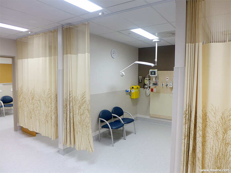
The intent of the project was to replace the entrance to the emergency centre built in 1998 as part of the Kidzfirst building with a more spacious and welcoming reception to the department and create a more suitable waiting area with a light and friendly environment being desired. The clinical areas were designed to allow ambulance patients to have their own space to be triaged in a clean and clinical environment. The fast track department has been designed to better utilise the space available to provide a contemporary healthcare environment with a focus on the swift but professional treatment of patients and their health requirements.
The colour scheme for the Middlemore Hospital Emergency Centre Fast Track and Triage project was designed to provide a bright, friendly and calming atmosphere when entering and experiencing the space while portraying a safe and professional image of the department.
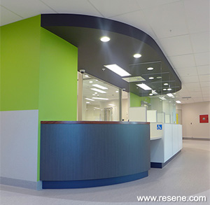
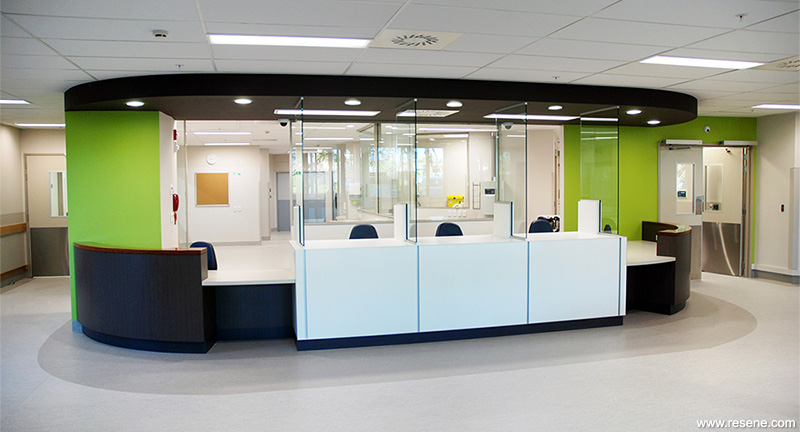
The main feature of the project is the large reception counter which also provided many of the project’s opportunities for the use of colour and materiality. With the neutrals specified by a campus precedence, a palette of contemporary yet earthy tones (Resene Eighth Napa, Resene Alabaster and Resene Quarter Lignite) was picked in both paint and joinery colours and materials.
A bright green (Resene Impromptu) was introduced behind and to the sides of the reception counter accentuating the bright white central section. A dark charcoal (Resene Ironsand) bulkhead paint colour was matched with the counter’s toekick allowing the central section to float in the space. The result is a bright welcoming and professional point of contact for the department that has been well received by staff.
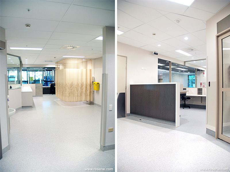
Throughout the clinical space the earth tones were matched with timber grains in the joinery and lighter tones in the curtains to create a clean, contemporary and calming feel in an environment that can be a high intensity and high stress environment.
Architectural specifier: Klein Architects
Building contractor: Canam
Client: CMDHB
Project: Resene Total Colour Awards 2013
Resene case studies/awards project gallery
View case studies that have used Resene products including many from our Resene Total Colour Awards. We hope these projects provide inspiration for decorating projects of your own... view projects
Total Colour Award winners:
2023 |
2022 |
2021 |
2020 |
2019 |
2018 |
2017 |
2016 |
2015 |
2014 |
2013 |
2012 |
2011 |
2010 |
Entry info
Latest projects | Project archive | Resene news archive | Colour chart archive
![]()
![]() Get inspired ! Subscribe
Get inspired ! Subscribe ![]() Get saving ! Apply for a DIY card
Get saving ! Apply for a DIY card
![]()
Can't find what you're looking for? Ask us!
Company profile | Terms | Privacy policy | Quality and environmental policy | Health and safety policy
Colours shown on this website are a representation only. Please refer to the actual paint or product sample. Resene colour charts, testpots and samples are available for ordering online. See measurements/conversions for more details on how electronic colour values are achieved.
What's new | Specifiers | Painters | DIYers | Artists | Kids | Sitemap | Home | TOP ⇧