Auckland
The owners wanted to add some energy to Fred’s through the use of colour.
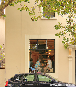
In the centre of Ponsonby, where Franklin Road meets Ponsonby Road, sits Fred’s: Espresso and Soda Bar. As the name suggests, this cafe is not your typical cafe. It has a quirky, playful feel. Cups are a mix and match selection and there are jars of lollies and cakes behind glass. Staff are friendly. It is the kind of place where you chat to friends or read the paper.
You enter from Franklin Road. Up a few steps and you are on to a paved courtyard with tables and chairs, with the main entrance to the cafe on your right. The cafe itself is one main light-filled space with the kitchen in an adjoining room. The ceiling is high and there is a large picture window which looks back onto Franklin Road with people passing by under the grand plane trees which line the street.
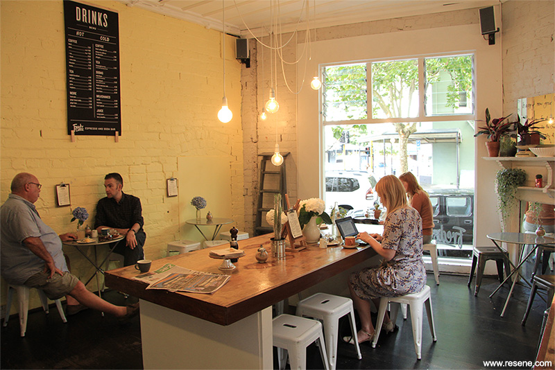
This location has been used as a cafe for about a decade, so when it changed to Fred’s it was important for the space to have a new look, which would give life and personality to the space, emphasising the new identity of the cafe. The new owners did not want to change any of the main structure. Their plan was to use and adapt some of the existing furniture and to add in some new pieces as well, thus changing the layout of the cafe but keeping the counter at the same side of the room. The main difference was to be the introduction of colour through the use of Resene paint.
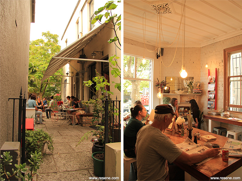
The owners wanted to add some energy to Fred’s through the use of colour. At our first meeting they talked about their ideals for the cafe: a cool, mid-century modern aesthetic. It was important for the colours to be inviting, but not of the palette which is usually associated with the earthy tones of a household interior. It would be a cafe that you would be excited to go and see for the first time, and would be keen to return to.
As a starting point, we looked at several different artists, so we could think about the effect different colours had upon each other: and agreed that Andy Warhol’s palettes (especially in his series of portraits of Marilyn Monroe) used some tones we wanted to bring to the interior. Then when looking at the Resene range, we selected Resene Moonbeam, Resene Teal Blue, Resene Floyd and Resene Havoc.
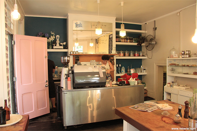
The paints were applied to the interior and to pieces of furniture throughout, but the main focus was the wall opposite the front door, as this is seen through the window to Franklin Road, and it greets you as you enter the cafe. Resene Moonbeam was used because of its sunny disposition. Behind the counter, where there is a series of shelves; we wanted to use a darker tone, which would play well with the wall of Resene Moonbeam, and give the room a little depth. We chose Resene Teal Blue for a glow of midnight-in-the-city.
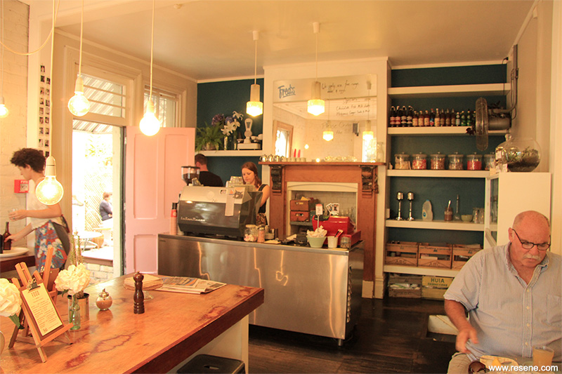
Then for some of the seating, a bright red Resene Havoc, just to keep you on your toes. This was also used on a ladder, which is leaned against the wall and holds magazines for people to read when drinking their coffee. And for the front door, Resene Floyd, as sweet as candy and perfect for a soda bar.
Architectural specifier: Rogan Nash Architects
Client: Fred’s: Espresso and Soda Bar
Project: Resene Total Colour Awards 2013
Resene case studies/awards project gallery
View case studies that have used Resene products including many from our Resene Total Colour Awards. We hope these projects provide inspiration for decorating projects of your own... view projects
Total Colour Award winners:
2023 |
2022 |
2021 |
2020 |
2019 |
2018 |
2017 |
2016 |
2015 |
2014 |
2013 |
2012 |
2011 |
2010 |
Entry info
Latest projects | Project archive | Resene news archive | Colour chart archive