This month's project is a sign made up of a disassembled pallet and a piece of salvage timber I had lying around. This is just the top portion of the Mexican themed sign for a bar / restaurant refit.
I started off by doing a quick chalk rough of where my lettering's going to be and I lettered in the wording in white. All the paints used here are water based Resene Lumbersider. The timber has not been sealed.
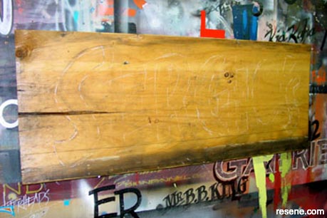
Photo 1
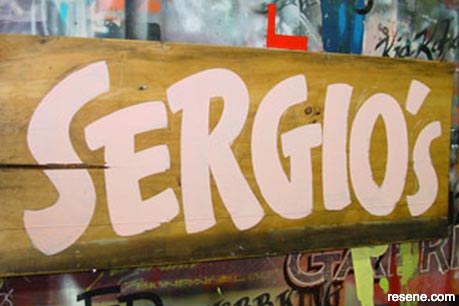
Photo 2
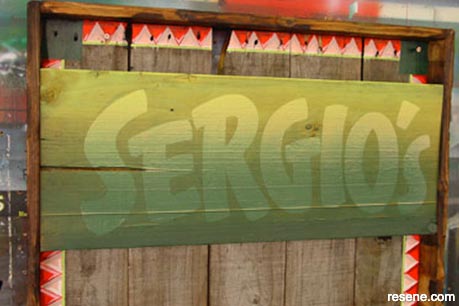
Photo 3
After the lettering was in it was sprayed in a blend from top to bottom using dark green and light green, making sure that the white lettering still showed through.
Photo 4 shows the wording re-lettered now, again in white and an outline has been left for reference later on. I've "ticked" in the lines where I want my black shadow. It's easier doing this now rather than last.
It's worth pointing out to beginners here that each time I add another coat of paint, I'm tidying up the letter shapes as I go. The letter "O" started off pretty ordinary but ended up looking spot on at the end. So, don't worry if you think your project isn't perfect from the beginning...tweak it as you go.
Photo 5 shows my shade all complete, time for the fun bit.
Photo 6 shows the first of my 3 colour blend. I've painted in the base yellow which was Resene Turbo yellow.
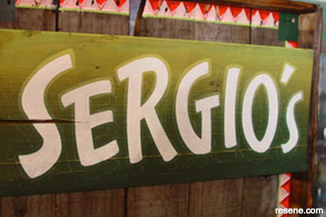
Photo 4
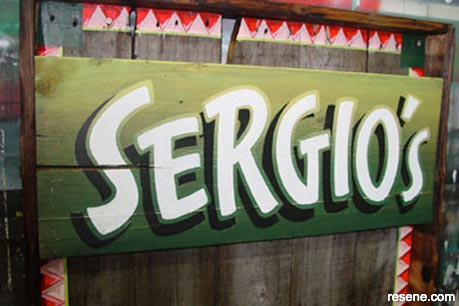
Photo 5
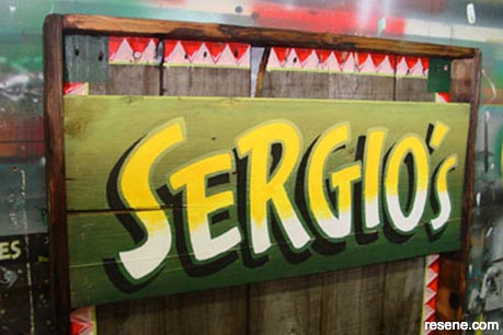
Photo 6
Photo 7 shows where I have blended more white up into the yellow giving the blend a better feathered look. You can see why I have left that outline around the letters now.
Photo 8 shows the addition of a darker yellow in the top portions and feathered out once more. This was the same yellow as before but with some Resene Guardsman Red added to give it an almost orange tone.
Photo 9 shows the outline lettered in now with a green tinted white acting as an undercoat for a bright lime green topcoat. Now those feathered blending brush marks are all covered up.
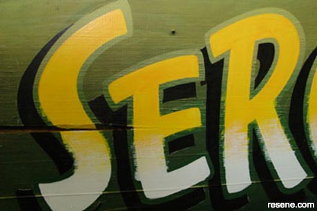
Photo 7
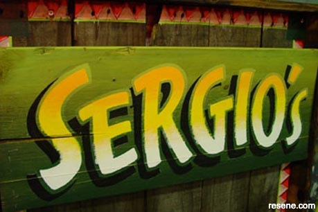
Photo 8
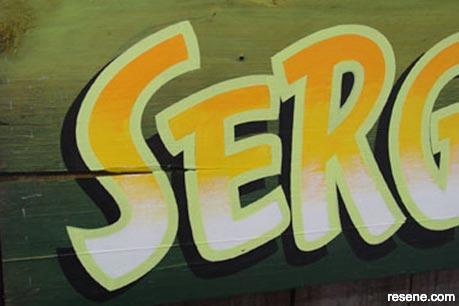
Photo 9
Photo 10 shows the sign as I intended to have it but that lime green colour really killed that nice yellow blend and the colours also clashed badly, so....what to do ?
Photo 11 shows my fix. I re-did the top portions in a dark green then added some dollops of the lime green back onto that darker green as a finisher. Now I'm happy.
Photo 12 shows a close-up of the finished lettering. The colours look great to the eye. I also added a saguaro cactus to the left for effect. Yeah, okay, I'll come clean, my lettering wasn't spaced too good and I had an obvious gap on the left end. Easy, let’s add in a cactus.
Photo 13 shows a pic of the pointing hand I painted at the bottom of the sign. Get these "add ons" right and they can really make a sign "ping".
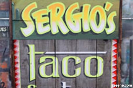
Photo 10
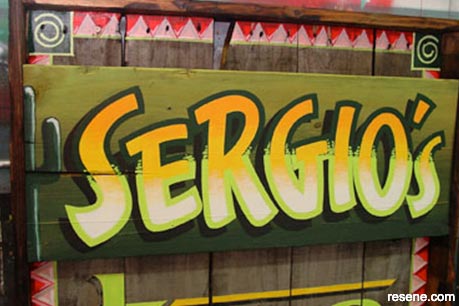
Photo 11
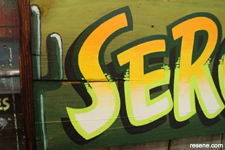
Photo 12
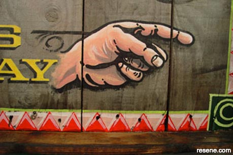
Photo 13
Signwriter: Jeff Harvey
![]() Get inspired ! Subscribe
Get inspired ! Subscribe ![]() Get saving ! Apply for a DIY card
Get saving ! Apply for a DIY card
![]()
Can't find what you're looking for? Ask us!
Company profile | Terms | Privacy policy | Quality and environmental policy | Health and safety policy
Colours shown on this website are a representation only. Please refer to the actual paint or product sample. Resene colour charts, testpots and samples are available for ordering online. See measurements/conversions for more details on how electronic colour values are achieved.
What's new | Specifiers | Painters | DIYers | Artists | Kids | Sitemap | Home | TOP ⇧


