 Neil
Henson, Fashionbytes, was in New Zealand recently to present his recent
research on worldwide trends that will drive the design of future homes.
Neil
Henson, Fashionbytes, was in New Zealand recently to present his recent
research on worldwide trends that will drive the design of future homes.
Neil Henson, Fashionbytes, visited New Zealand to build on his 2005 seminar series (view 2005 seminar notes) on the emerging global trends that will drive the design of homes in the future, which had a technical bias. This year he explored the use of colour and design to evoke the senses to make a home 'feel' right. Looking at new ways of connecting to our built environment and re-engaging people in the technical world we live in today. These seminars, held in Auckland, Hamilton, Wellington and Christchurch, were sponsored by Resene as part of their educational programme for architects and designers.
This is being applied in 5D marketing by leading companies, using the five senses to engage their customers. Some companies spend enormous budgets on research and development of their products. The sound of a door closing in a luxury vehicle, the crunch of a cornflake, the smell of a new cotton shirt, or the feel of linen or merino wool clothing... When these manufacturers get it right people will pay more for their product as they perceive more value in a product that satisfies their senses on multiple levels as well as the aesthetics.
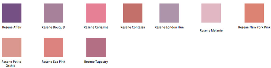
Scent triggers our memories and transports us to another time or place. The fragrance of a particular flower today here is the same as it was on the other side of the world last century. If you give a person perfume or cologne as a gift you are giving them liquid memory. In homes it is the fragrance of flowers and plants in the garden, furniture polish or wax, leather and timber, clean bed-linen and soap, fresh baking, herbs and spices that enhance the spaces we live in. Air pollution damages our sense of smell and can make us ill. Natural products for building and furnishing and lots of indoor plants improve the air we breathe and smell. There is now the technology available to infuse products with fragrance. The colours of the fragrant palette include soft and dusty shades of peach, yellow-cast pink, lilac - reminiscent of floral undertones and nostalgia. Textiles in this palette have lustre and silky finishes, with both traditional and modern interpretations of lace and cut-aways. This palette is perfect in a bathroom and more complimentary to skin tones than hard-edged white tiles.
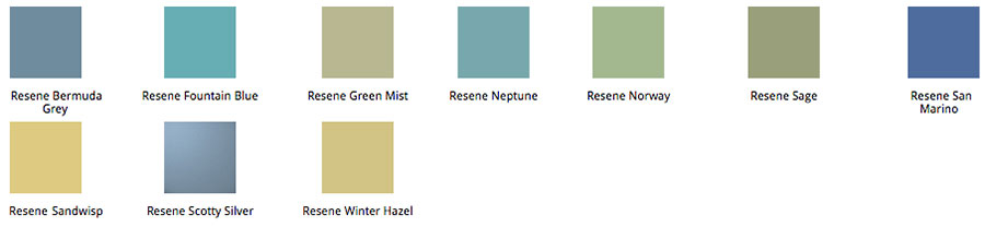
Touch is the first sense we develop when we are born. Whether warm or cool, smooth or rough, touch reinforces comfort, safety and trust. Research tells us that premature babies that are massaged and cuddled develop 50% faster than those not touched. Residents in aged care have better health when they hug other people and pets than those living in isolation. If you touch a person on the arm when speaking with them they are more likely to remember what you have said. Textural and tactile surfaces specified within the home are important in order to satisfy touch. Warm timber surfaces in the bathroom, such as those used in Japanese architecture, are more appropriate than cold glass or ceramic surfaces. The cool handle of linen, walking barefoot on stone or timber, the warmth and softness of cashmere, wool and mohair velvet - these natural products provide a pleasing touch in our environments. Squishy cushions and soft blankets thrown over old leather chairs give a feel of comfort. The spa colour palette has been developed to sit alongside touch - blues and greens which are cool and refreshing, and symptomatic of the ritual of bathing. Textiles are oversized florals and raised textures that work back with white or ivory, and tea-stained backgrounds.
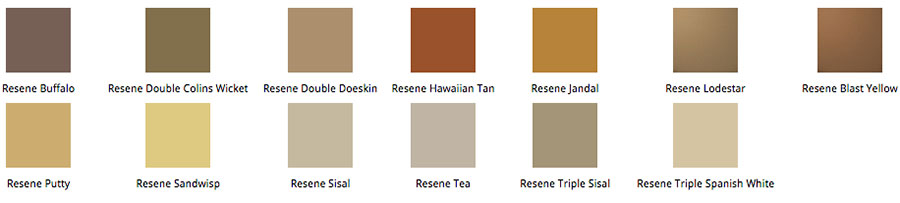
Taste is a word often used in our vocabulary to describe a room or object - fine taste or bad taste. Eating is a ritual in most cultures - birthday cake, wedding breakfast, funeral wake. When Carlos Petrini discovered McDonalds cafè by the Spanish Steps in Rome he promoted artisan food and the slow food movement, which is now worldwide. Are we too busy to prepare and cook food in our homes, have we lost the art of eating and chatting around the family dining table? It seems that fast food and eating on the run are the norm in many families today and as a consequence kitchens are getting smaller. In Scandinavian schools children grow their vegetables and herbs, help prepare nutritious salads and meals for their lunch, dine with the teaching staff - there are no obese children to be seen. They value health and wellbeing from the earliest years. The two colour palettes for this sense are tea house and gelati. Teahouse comes from the ritual of taking tea - naturals which can be used as a monochromatic or tonal scheme. Metallic and burnished shades plus white for zing, or terracotta and biscuit shades anchored with grey neutrals. Fibres are precious and rich, or noble and textural. The gelati palette in contrast is fresh and vital - a subtle clash of clean colours grounded by white. Suitable for a younger market, summer and outdoor living. When combined with transparent effects this palette looks more sophisticated.
Sound is represented by music across all customs, anthems, themes of movies, gospel singing, or a live aid concert that raised millions of dollars. In contrast we have noise pollution from traffic, machinery, office equipment and telephones. Recently Neil was engaged to look at the office space for a banking corporation. During his research with staff he found that 80% listened to ipods while working to block out the white noise of humming computers, telephones etc. in the open plan space. We need to challenge our design to minimise this intrusion into our sleeping and thinking spaces. When classical music was played in railway stations, youths who had been vandalising the area soon vanished as the sound was not to their taste. The pop art colour palette is a modern ethnic treatment of art and design from Islamic countries, featuring indigo tiles and mosaics, small block prints on fabric. The blue and red can be worked with black and white, and red and white is rising in popularity in homewares and fashion to symbolise the desire to heal the world. The clashing brights are fun colours seen in the 60s and would appeal to young consumers in bedrooms and living and dining spaces. Think of pop artists Andy Warhol and Jasper Johns, or Italian furniture designers Ettore Sottsass and Marco Zanuso who took on the playfulness of the 60's. A sensual home is one where we hear the sounds we want to hear and make us happy.
Sight is the sense that most designers probably overdose on as they are usually very visual people. How we perceive things visually may not be the same as others, which is important to remember when working with clients. The other common problem between designers and their clients is that designers can visualise a concept for a space where many clients cannot imagine how a space will look when refurbished. One of the drawbacks of internet shopping for clothing is that the buyer can see the photographed item but they cannot experience the sensation of the feel of the fabric that a garment is constructed from. The colour palette developed for sight is harmony, a deeper level of colour, an understated juxtaposition of colours. Sheen adds life to this palette but it can also work in textiles, such as linen and canvas.
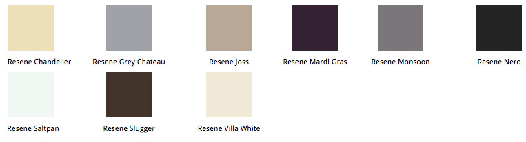
Intuition is the sixth sense, a more intellectual version of how we feel. It is by logic we prove and by intuition we discover. The ancient Greek proportions (golden mean) worked in balance with human scale. We shape our buildings, thereafter they shape us. Space, light and proportion are independent of style. Buy something that raises your spirits every time you see it - something you choose on instinct - you will always enjoy it. Make your home a pleasure zone. The last colour palette is called mystery and offers a new feeling for black and white in both comfort and classical applications. It has been inspired by the cubist movement in art, a modernist approach. Modern furniture in new core colours, lamps made from machine guns, new ways of making a statement on what is happening in our world.
There is more colour being used in all industries and a new freedom in design is emerging - people are ready to have more fun. Lilac and violet are uptrending, the spa blues and greens are still popular. The neutrals are seen as the grounding palette. Eye candy is seen in lots of prints and patterns, both small and large scale. Technology enables us to personalise products with photographs and the new luxury is honesty in the origin of product, fairness of trade and impact on the planet.
Fashionbytes designs and manages the colour ranges for several industry groups including apparel, textiles, homewares and furnishings. The latter half of the seminar focused on the presentation of the latest Fashionbytes Colour Palettes and these were supported with packs of colour samples from Resene, which the seminar attendees numbering over 500, took with them.
Review provided by Jill Carroll of Colourwaves.
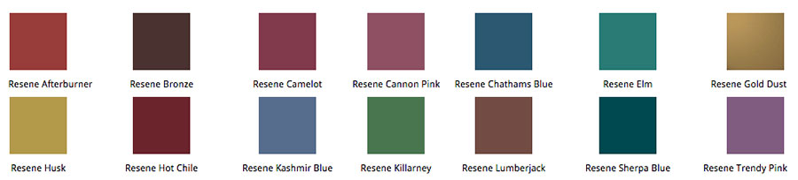
A selection of Fashionbytes Colour Palettes for Spring/Summer 2007 presented in Resene colours.
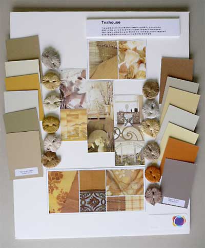
| Teahouse - ceremony - taste | |||||
| This palette is one of purification: serenity, simplicity, yin and yang. Warm whites are reminiscent of rice paper. Shades of sandalwood, fresh cedar and bamboo glow like sun, cool taupe, willow, beige and silver-tinged stone shimmer as if touched by moonlight. | |||||
|
|||||
|
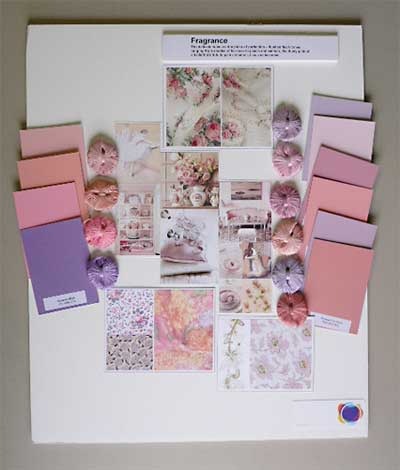
Fragrance - scent |
|||||
|
The delicate hues are the pinks of perfection
- flushed flesh tones ranging from shades of tea-rose to peach
and salmon, the dusty pink of a ballerina's tutu to pale carnation,
lilac and lavender. |
|||||
|
|||||
|
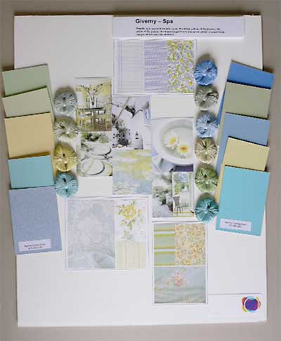
Giverny Spa - touch |
|||||
|
Fragile, sun washed aquatic hues, the straw yellow
of haystacks, the white of lily petals, the algae-tinged blues
and silver-green of shed trees merge nature with the abstract. |
|||||
  |
|||||
|
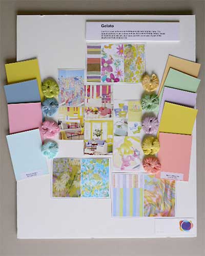
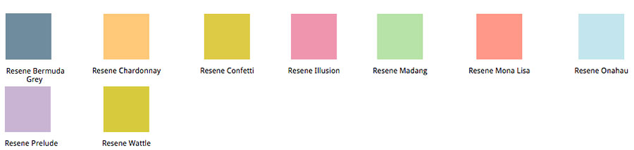
Gelati - taste |
|||||
|
Cool ice-cream colours and bubblegum pink are
brighter here. The opaque pastels are as rainbow-soft as air brushed
bubble letters. Sweet animations and web art, club flyers and
CD covers are all part of the playful and hallucinatory mix. |
|||||
  |
|||||
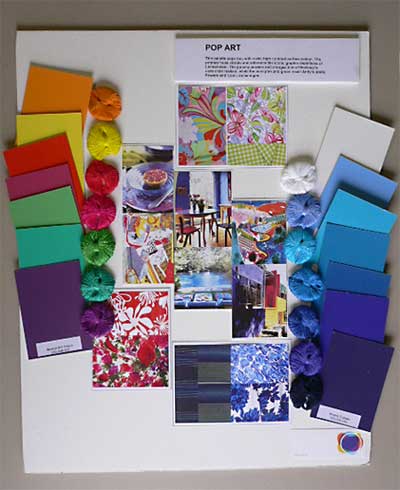
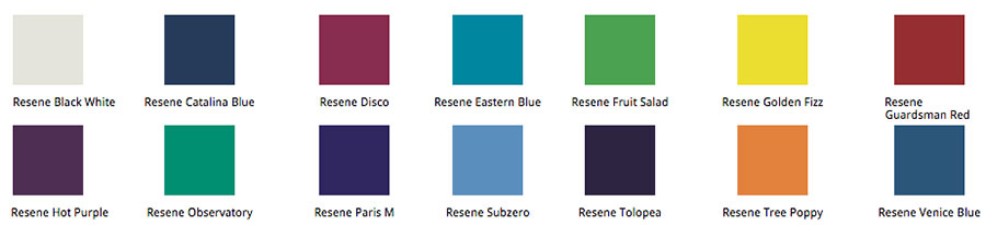
| Pop art - sound | |||||
|
This palette pops too, with vivid, high contrast
surface colour. The primary hues vibrate and reference the iconic
graphic depictions of Lichtenstein. The punchy purples and oranges
hint of Hockney's cartoonist realism, while the pure pink and
green recall Andy's pretty flowers and iconic dollar signs. |
|||||
  |
|||||
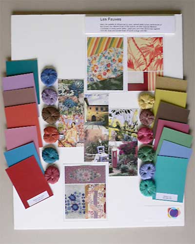
| Harmony - sight - Les Fauves | |||||
|
Here the palette is influenced by pure, spiced
earth tones reminiscent of the Orient, the vibrant blues of the
Islamic art that inspired Matisse. Contrasts of dusty grass green,
petal pink and rose harmonise against cool sky blue and sunset
hues of burnt orange and lilac. |
|||||
  |
|||||
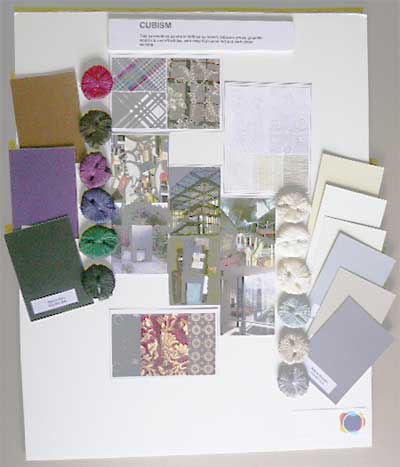
| Mystery - intuition - Cubism | |||||
|
This harmonious palette is defined by brown, tobacco,
greys, graphite, squid ink and off-whites with deep flat Indian
red and dark green accents. |
|||||
|
|
|||||
View 2009 seminar notes
View 2008 seminar notes
View 2007 seminar notes
View 2005 seminar notes
![]() Get inspired ! Subscribe
Get inspired ! Subscribe ![]() Get saving ! Apply for a DIY card
Get saving ! Apply for a DIY card
![]()
Can't find what you're looking for? Ask us!
Company profile | Terms | Privacy policy | Quality and environmental policy | Health and safety policy
Colours shown on this website are a representation only. Please refer to the actual paint or product sample. Resene colour charts, testpots and samples are available for ordering online. See measurements/conversions for more details on how electronic colour values are achieved.
What's new | Specifiers | Painters | DIYers | Artists | Kids | Sitemap | Home | TOP ⇧