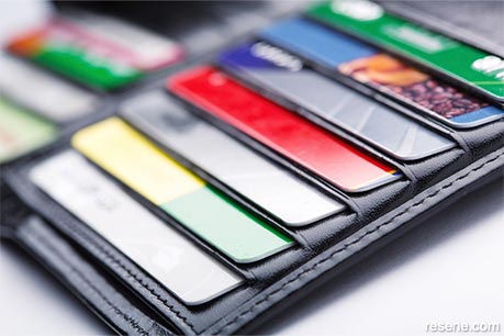
A business card is a staple of modern day marketing, and it's easily one of the smallest and simplest tools in your advertising arsenal as a tradie.

A good business card can help your company stand out in a busy wallet
They are relatively affordable and quick to create, so here are a few top tips for your business cards to help boost your business.
What, who, and how to contact you – in that order.
Those are the very basics of any business card. Firstly, it should include a basic explanation of what you do, then offer your name and contact information. One important tip is to include contact details that reach you directly. For example, instead of including a generic company phone number or email address, use your own personal ones. If you have met someone and they want to call you about a job at a later date, they will want to speak to you directly, not anybody else.
As for social media pages, go ahead and include them on your card, but only if you keep them up to date and are active on them. If your business card offers a Facebook address that leads to a dead page, it won't be beneficial to your business. If your Facebook page is regularly updated with interesting photos and information, it can be a great addition to your card.
One of the most common mistakes in business cards is using a font so small that it's hard to read. After all, not everyone has perfect vision and it's likely many of your customers will need to pull out their reading glasses to make sense of the information. If you have the space, make the font as big as you dare to make it that much easier for your clients to give you a call.
Another common error when making cards is to fill the space with all the information you can fit on there. While it's tempting to include every detail about your business, this can actually do more harm than good. If you find your card starting to look quite busy, look for ways to condense or cut down the information. For example, instead of writing out social media profile addresses, you could just include the social platform's logo to show that you do have a page there. If in doubt, cut out the contact details you rarely ever use to keep in touch.
Any small quirks you can add to the presentation to make it a little more memorable can be a great addition. For example, a painter may design the card as a paint chit, and a builder could include a small mm rule down one side on the back. These small details can help you stand out from the crowd.
While there are always exceptions to the rule, most cards can do without various items that will only clutter the space.
For example, QR codes that link people to your website are sometimes used on cards as a 'clever' way to invite prospects to your online space. However, remember that not only do they have to have a QR code reader on their phone, it also means they can only browse on their mobile. Many people would simply rather type in your web address.
You can also most likely leave off a physical address. If you have a brick and mortar store somewhere that's relevant to your business (i.e. as a showroom), you should certainly include it. However, many tradies won't need anything more than an indication of which city or area they work in at most.
January 18, 2017
The Resene Trade Blog
Information of interest for professional painters
Order online now:
Testpots |
Paints |
Primers and Sealers |
Stains |
Clears |
Accessories
![]() Get inspired ! Subscribe
Get inspired ! Subscribe ![]() Get saving ! Apply for a DIY card
Get saving ! Apply for a DIY card
Can't find what you're looking for? Ask us!
Company profile | Terms | Privacy policy | Quality and environmental policy | Health and safety policy
Colours shown on this website are a representation only. Please refer to the actual paint or product sample. Resene colour charts, testpots and samples are available for ordering online. See measurements/conversions for more details on how electronic colour values are achieved.
What's new | Specifiers | Painters | DIYers | Artists | Kids | Sitemap | Home | TOP ⇧
