From habitat magazine - issue 36, feature home
Earth’s coldest and hottest spots are the inspiration for an art and travel lover’s small but vibrant home.
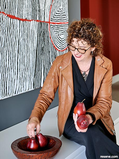
There are few moments in your life that can be described as pure, unbridled awe. For Meg, one moment was seeing the pure white and intense cerulean and deep blues on the icebergs in Pleneau Bay, Antarctica. The memory of icebergs floating in the ocean like ghostly sculptures was so visceral it felt like it had left an imprint on her DNA, and a photograph doesn’t quite do it justice. She hadn’t expected to be describing this feeling to Catherine Whitting and Kate St James while they discussed the ideas for her home renovation. Then, her Sydney apartment was an insipid clotted-cream colour, and she required the St James Whitting interior design duo to whip it into shape.
The vibe the oatmeal walls gave her home was the opposite of the Antarctic colours. It sucked the life out of her vibrant art collection, which includes Australian indigenous artists such as Yannima Tommy Watson and Elizabeth Nyumi.
“On the cream walls, the artworks had lost a lot of their drama and power. Colour felt like it leeched off into the walls. I needed colourful walls to bring them back to life,” says Meg.
Catherine and Kate are advocates of sustainable design and use waterborne Resene paints in their homes thanks to their low VOC (volatile organic compounds). The duo have their own Resene colour range in Australia, the SJW Elementals Collection coloured by Resene. Their design ethos is to create homes for their clients and their psychology or, as Catherine puts it, “we create wellness in an interior space and also wellness in their headspace”.
They decided to use the icy Antarctic blues Meg had described as part of their plan for the apartment. It posed one challenge: the cool colours Meg had described were a stark contrast to the scorched earth of the Australian Outback, the inspiration and homeland of many of the indigenous Australians whose artworks are part of Meg’s collection.
“You wouldn’t normally associate the Antarctic with Indigenous Australian art or the coldest part of the earth with the desert, so our challenge was to embrace these ideas in an elegant way to make Meg feel a connection to her home through colour,” says Catherine.
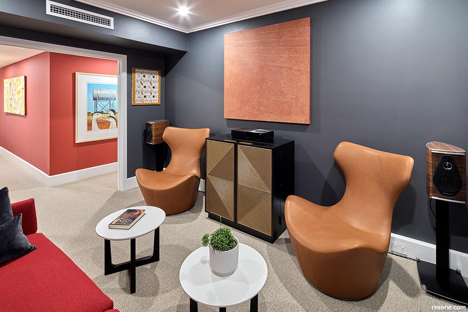
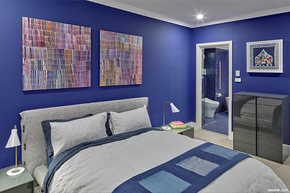
Catherine and Kate designed the home to be divided between private and public spaces by colour. The bedrooms and private areas are in vibrant Resene blues. Meg wakes up each morning in the master bedroom immersed in Resene Kudos with an ensuite that includes a bathtub resembling an iceberg and a vanity not unlike the body of a penguin. The guest bedroom is just as cool, with grey-blue Resene Atomic on the walls paired with a breath-taking blue hillside mural, Resene Wallpaper Collection P010-VD4. The mural reminds Meg of Tuscany, another one of her favourite destinations.
“The bedroom feels nourishing for me, and the ensuite has resonances of Antarctica. It’s a very peaceful, calm place to be. The spare bedroom is just as restful and guests wake up to the hills of Tuscany with beautiful blues and greens – relaxing and restful,” says Meg.
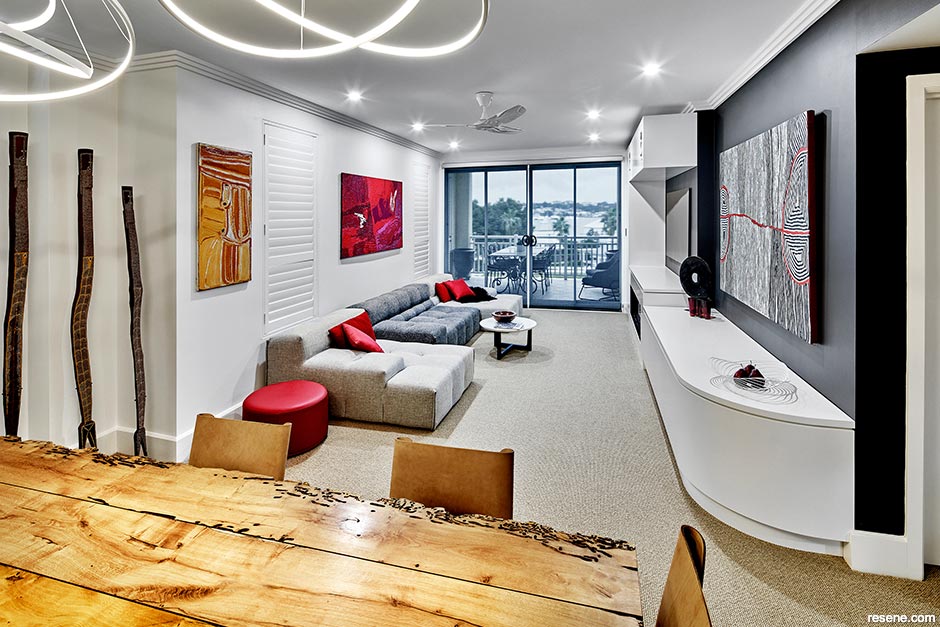
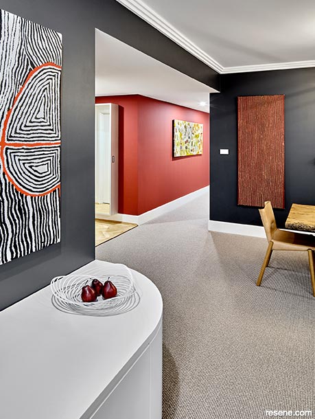
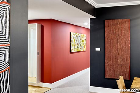
Catherine and Kate chose a warm red, charcoal grey and white colour scheme designed to function as an art gallery for the home’s entertaining areas. “With the original insipid wall colour, the art didn’t sing, and it never fitted the space,” says Catherine.
“We analysed every piece of artwork for its colour properties, and the wall colours were chosen to enhance the artworks,” adds Kate. Resene Lusty in the hallway was chosen to match the red line in Hairstring by First Nations Australian, Judy Napangardi Watson, creating a visual cue to help navigate through the rest of the home.
In the lounge, SJW Igneous from the St James Whitting Elemental Collection by Resene (try Resene Grey Friars as an alternative) is part of an analogous grey scheme with Resene Alabaster on the ceiling and joinery highlighting the punchy pink artwork My Country by Yannima Tommy Watson and the rusty orange work (untitled) by Eubena Nampitjin.
“Many big galleries worldwide use red or green walls to make the artwork come to life, and we wanted to create that gallery experience. We used Resene SpaceCote Flat on the walls as the matte paint doesn’t reflect the light, which is ideal for artwork.”
As well as loving art, Meg is a fan of classical music, soft jazz and wine and Kate and Catherine designed a seating area especially for enjoying both. It features SJW Igneous (try Resene Grey Friars as an alternative) on three walls, creating a cosy space perfect for a glass of Australian shiraz or New Zealand pinot noir with friends while listening to good music.
Even when she’s not entertaining, Meg says simply coming home to her colourful home is a treat, and she loves seeing her favourite pieces shine. “I love just walking around from room to room. It gives me such pleasure to see my artwork nourished by the walls. It feels like my art has a home too.”
Although this home features bold and darker colours than the previous cream scheme, Meg's space feels larger. Catherine explains the optical illusion:
"A lot of people are afraid of dark colours because they think it's going to make things smaller, but here it gave the illusion of height and depth, particularly in the hallway, which looked much wider.
"Dark colours recede, and I've experimented with it myself and it can add about 30 centimetres of additional perceived depth. This is because you don't have the light-reflection value of white, which makes everything jump forward. We made no structural changes to the apartment, but we made everything seem much bigger than it looked with the cream."
Choose the right Resene colours and paints for the job.
Gallery style: Resene SpaceCote Flat’s matte finish makes it ideal for displaying artworks because of its low light reflection qualities. The waterborne paint is highly durable and it can also be used in wet areas. Meg’s home features Resene SpaceCote Flat in Resene Lusty in the hallway.
True colour: Insist your cabinetry maker, joiner or kitchen designer specifies Resene AquaLAQ. This waterborne satin acrylic paint system is designed especially for cabinetry and is not only durable but gives you the authentic Resene colour.
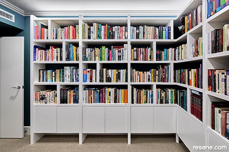
Shelf care: Give your shelving or wardrobe a refresh by repainting them with Resene Enamacryl gloss or Resene Lustacryl semi-gloss. Paint walls or the back of a wardrobe in a contrasting colour to make them pop. Meg’s library has walls painted in Resene SpaceCote Low Sheen tinted to Resene Timekeeper to make her book collection shine.
a sanctuary inspired by polar colours
Designer Di Henshall suggests an alternative scheme:

Di Henshall
It can be daunting decorating a living room that will appeal to you and your family in terms of aesthetic and function. Drawing inspiration from the owner’s travels to Antarctica we have selected a natural colour scheme with beautiful yet practical furnishings that complement the Resene colours. We have used deep green tones including Resene Seaweed on the right wall and deep blue Resene Coast on the left. Resene Alabaster is used for the ceiling and skirtings to help create further depth and life in the space. At our studio, we always specify Resene Alabaster for a bright white consistent finish. Resene Paddock is used on the cabinetry and by selecting the lighter toned cabinetry it helps soften the room. The flooring in Resene Colorwood Whitewash and the polyester blend rug are in harmonious shades of grey to finish the theme.
email di@dihenshall.com.au web www.dihenshall.com.au
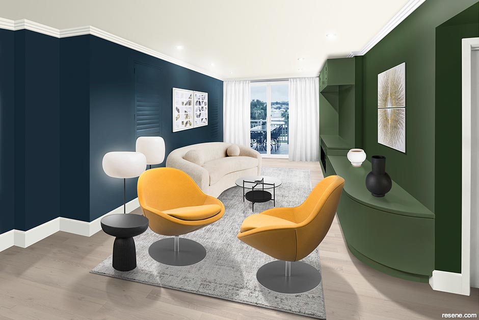
Darker colours Resene Seaweed and Resene Coast give this modern luxe living room design a cocooning quality and a sense of intimacy. Resene Paddock on the cabinetry lightens the green wall and further softness comes through with Resene Alabaster on the ceiling and trims, Resene Colorwood Whitewash protected with Resene Qristal ClearFloor on the flooring and the rug from Freedom. The yellow chairs from Bo Concept add a pop of colour while the floor lamps from Horgans, couch and artworks from Coco Republic and vases on the shelves from Freedom add curved shapes to this cosy yet chic design. Illustration: Malcolm White
Top tip Skirting boards can take a lot of wear and tear from feet and furniture legs. Protect skirtings and other trims by painting them with Resene Enamacryl gloss or Resene Lustacryl semi-gloss, both waterborne enamel paints which are not only easy-to-clean but extremely durable.
sustainable style with a mid-century twist
Designer Samantha Rei of Sustainable Spaces suggests an alternative scheme:

Samantha Rei
I’ve created a cosy living area using colour to make the most of this small space. I’ve used the warm neutral, Resene Swirl, two metres up the wall with the upper wall and ceiling in Resene Black White to heighten the ceiling and make it feel more spacious. Dark flooring in Resene Colorwood Pitch Black makes the room feel wider. Built-in shelving, painted in Resene Black White, Resene Swirl and Resene Cello, draws the eye up while acting as a wall divider from the hall and dining area. For longevity and to minimise future waste, I’ve chosen classic mid-century furniture pieces that are built to last such as the Eames Lounge Chair and AS4 modular storage system on the right wall, perfect for apartment living.
email samantha@sustainablespaces.co.nz web www.sustainablespaces.co.nz
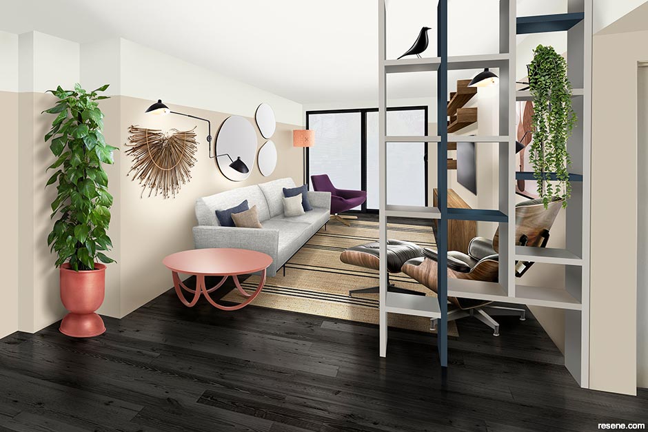
This shelving has been transformed into a room divider using upcycled timber painted in Resene Swirl, Resene Cello and Resene Black White. Colour makes the small space feel larger and more inviting with Resene Swirl painted two metres up the wall and the ceiling and top half of the wall in Resene Black White heightening the room. Flooring in Resene Colorwood Pitch Black widens the space. Mid-century pieces including the Eames Lounge Chair and Ottoman and the Metropolitan Chair from Matisse as well as an AS4 modular storage system from Mr Bigglesworthy are investment pieces built to last. Sofa from Forma, coffee table and cushions from Città, wall lights from Mr Ralph, second-hand planter painted in Resene Coral Tree, artwork on right wall from Nood, flatweave jute rug from Weave Home and mirrors from Slow Store. Illustration: Malcolm White
Top tip: Resene Colorwood is a waterborne wood stain ideal for rejuvenating or changing the colour of timber while showing the natural beauty of the wood grain. Protect the finish on flooring with Resene Qristal ClearFloor waterborne urethane to give a durable satin finish.
Design: Kate St James and Catherine Whitting
Words: Emma Rawson
Images: Marian Riabic
Search habitat magazine stories
Printed copies of habitat highlights are available from late March 2024 at Resene ColorShops and resellers, while stocks last. You can view back issues of habitat magazine online.
Specifiers:
If you have an idea, project or story that you think would suit habitat, we’d love to hear from you. Please drop us an email with your details and include photos if submitting a project.
Sign up for a DIY card and Save! Australia | New Zealand
![]() Get inspired ! Subscribe
Get inspired ! Subscribe ![]() Get saving ! Apply for a DIY card
Get saving ! Apply for a DIY card
![]()
Can't find what you're looking for? Ask us!
Company profile | Terms | Privacy policy | Quality and environmental policy | Health and safety policy
Colours shown on this website are a representation only. Please refer to the actual paint or product sample. Resene colour charts, testpots and samples are available for ordering online. See measurements/conversions for more details on how electronic colour values are achieved.
What's new | Specifiers | Painters | DIYers | Artists | Kids | Sitemap | Home | TOP ⇧