From Habitat magazine - issue 30
Wellington architect and Resene Total Colour Lifetime Achievement Award winner Gerald Parsonson sees colour as a crucial component of successful design.

I have always had a love of the natural world. Nature is full of colour, from subtle to strong. Just cutting a piece of fruit open can be a beautiful thing.
I like to explore local character in my work and colour is one of the tools to help accomplish this. The choice of colours can determine whether a building subtly fits into its setting or stands out, and the colours in a room have a huge effect on the success of its design.
Building spaces can cost hundreds of thousands – or even millions – of dollars. While the cost of painting is a relatively small component of that, colour has such a strong effect. As a designer, that means you get a lot of bang for your buck.
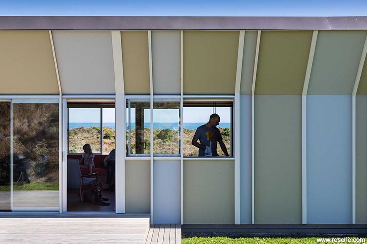
Gerald Parsonson designed this 87m2 beach house for Richard Stewart and Kerry Sexton in Te Horo, north of Wellington. Designed with economical materials, it makes use of a simple pitched roof angled to catch the nor’wester breeze and shelter it from southerlies. Gerald was rewarded with a Resene Total Colour Award for both its interior and exterior.
I consider myself a localist. I really like to explore the subtleties and stories of the areas I end up working in, and that has an impact on my personal style.
I enjoy a lot of different colours for different reasons, but I do like the soft blues/greys/greens, which are very calming and relaxed, and can work well with many other colours such as creams, rusty oranges and watermelon reds. In a seaside setting they can be used to offset weathered timber and metal, and pick up on the colours of sea, sky and hills.
I think there is a place for any colour to get worked into my designs, in larger or smaller amounts. For example, just like good music, a good colour scheme can be made great by using strong or bright colours in small areas.
Resene Thumbs Up. It’s a great colour to use to light up a space or add colour in small ways, such as the inside of a skylight, edge of a door, design details or a whole wall. It also coordinates well with softer colours like off-whites, greys or grey/blue/greens.
Resene Candy Floss. Another great accent colour if you are up for it, use it to paint a smaller space from top to bottom, like a toilet or a hallway.
Resene Untamed. It’s a lovely natural and full green. A good colour for a house set among trees or just to give a natural feel wherever. It would be interesting to paint a whole room in it.
See more of Gerald’s work at www.p-a.nz.
Search habitat magazine stories
Printed copies of habitat highlights are available from late March 2024 at Resene ColorShops and resellers, while stocks last. You can view back issues of habitat magazine online.
Specifiers:
If you have an idea, project or story that you think would suit habitat, we’d love to hear from you. Please drop us an email with your details and include photos if submitting a project.
Sign up for a DIY card and Save! Australia | New Zealand
![]() Get inspired ! Subscribe
Get inspired ! Subscribe ![]() Get saving ! Apply for a DIY card
Get saving ! Apply for a DIY card
![]()
Can't find what you're looking for? Ask us!
Company profile | Terms | Privacy policy | Quality and environmental policy | Health and safety policy
Colours shown on this website are a representation only. Please refer to the actual paint or product sample. Resene colour charts, testpots and samples are available for ordering online. See measurements/conversions for more details on how electronic colour values are achieved.
What's new | Specifiers | Painters | DIYers | Artists | Kids | Sitemap | Home | TOP ⇧


