From Habitat magazine - issue 19
A confident colour and lighting consultant and his adventurous client create a bounty of brave and unexpected delights.
With a profound disregard for predictability and trends, Terry Hogg of Australian-based Lick Light+Colour enjoys shattering design preconceptions and encouraging brave colour choices. A recent commission at accessories designer Peter Lang’s Victorian terrace in Sydney’s Elizabeth Bay was a creative partnership made in heaven. And it’s a partnership that has resulted in Terry winning a 2013 Resene Total Colour Award.
“It’s about the significance and utility of the space itself,” Terry explains. “If a colour works in that space it simply works. I’m not interested in being locked in to what’s ‘in’, or in playing safe.”
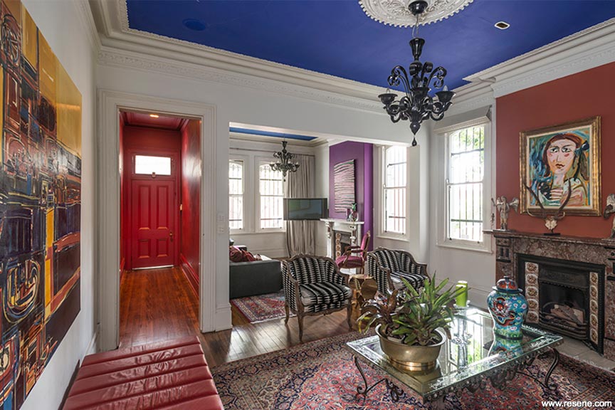
The result is a sublime palette choreographed to enhance and balance the moods of the rooms while showcasing Peter’s beautiful collectibles. Clever use of vibrant hues balanced with complex neutrals creates a sophisticated and indulgent colour scheme.
“I always begin with the space and the light,” explains Terry. “And then it’s about the client themselves. Everybody has a colour sense, even if they’re not aware of it.”
Immediately behind the terrace’s black, streetscape-safe front door a bold, spicy Resene Scarlett used on the walls and the ceiling is the very epitome of ‘wow factor’. “It’s about impact,” Terry explains. “Red can be such a strong, dominating colour but here it provides a warm shock that signals arrival.”
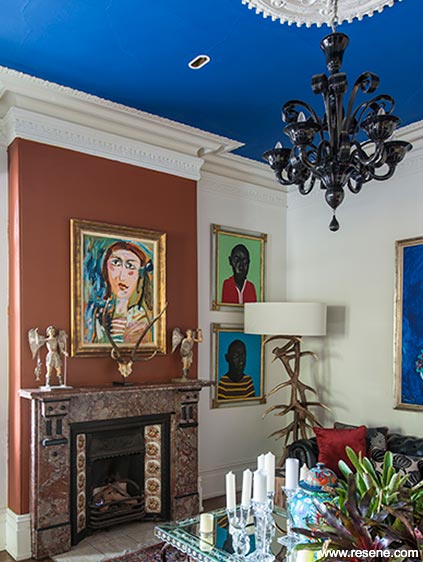
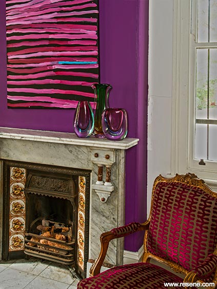
Throughout the interior a cool white paint colour custom-mixed by Resene and now nicknamed Resene Lick Minimalist provides the perfect backdrop for swathes of strong colour and Peter’s impressive art collection. Confident statements in purple Resene Troubadour and rust Resene Desperado surround the original marble mantelpieces and echo hues found in the paintings in the living room.
The pièce de résistance of the living room’s scheme is the cobalt blue ceiling, where the wondrous Resene Decadence frames Murano chandeliers. “I find that people often want to be taken further than they might dare to go themselves.” Terry says. “Peter was the kind of client who could quickly see what I was trying to create.”
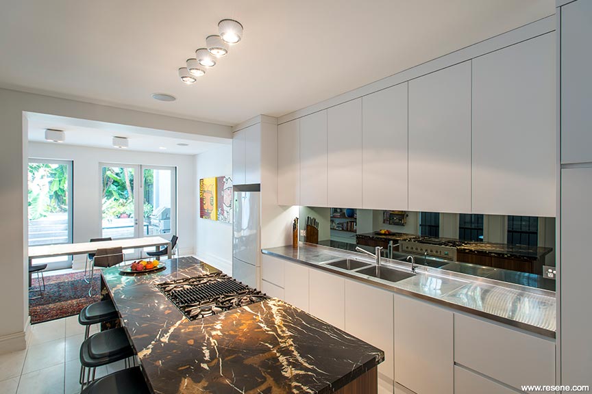
At the rear of the terrace, the calm, white kitchen-dining area provides the perfect counterpoint to the world of colour up front. Terry’s selection of finishes and lighting here includes a smoked-mirror splashback that reflects the solid, sensuous island bench of chocolate marble over walnut veneer.
Providing a serene and sumptuous transition to the upper level, one stairwell wall features the blackened navy of Resene Indian Ink. “People often think that dark colours make an area feel smaller but they can also represent vast space… a sense of infinity,” says Terry.
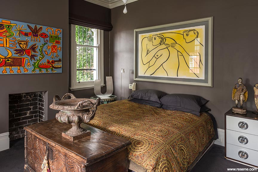
The colour’s depth offsets a quirky plate collection and rusted steel sculpture, and offers a striking contrast to Resene Kaitoke Green, which wraps from the landing into the hall.
Inspiring his clients to explore their boundaries with colour and lighting while gently managing their fears and misconceptions, Terry says: “My aim is to build a level of trust and entice my client with the possibilities. Initially, it’s about visualising and sharing with the client what they can’t see in a space… People have an emotional response to colour so it’s never about forcing my ideas. It’s about leading them beyond what they think is possible.”
“People have these strong colour associations… it’s like a fear. I might suggest a peach or an apricot and most people will immediately think of the 80s, when everything was salmon and grey. I like to take colours out of context and use them in a contemporary way. It’s fun to confound expectations.”
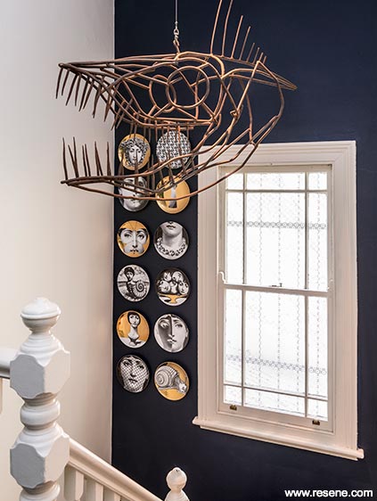
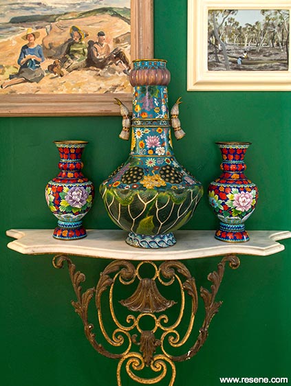
For the bedrooms, Terry suggested less vibrant yet still strong tones than those used elsewhere. “We wanted the bedrooms upstairs to feel moody and restful.”
In the master bedroom, the substantial grey-brown of Resene Oilskin was chosen for its complexity, and to create a rich masculine ambience. The guest bedroom is enveloped in the luxurious dark green-grey of Resene Cliffhanger.
Peter’s home shows what’s possible when colour boundaries are pushed, but Terry is quick to point out that such adventurous clients are rare. “When they see the result, people always say ‘I could never have done that!’ And that’s the point,” Terry says. “We are all good at different things… Colour is a passion for me, colour is what I do.”
Did you know... if you need help with your paint questions, decorating project or just want to be inspired and share your projects with like minded people, you can join the Resene facebook page by clicking ‘like’ on the Resene facebook page, www.facebook.com/resene?
Accessories: Chandeliers: Murano. Designer: Terry Hogg, Lick Light+Colour, Australia, www.lickcolour.com.au.
rugged good looks warm this room
Interior designer Robyn Mickleson of The Design Depot suggests this alternative scheme:
The quite masculine vintage good looks of the Halo range of furniture and accessories inspired this scheme. I wanted to give what is quite a formal space, with the two fireplaces, a welcoming casual feel but also retain an air of sophistication and glamour. The contrast between the dark Resene Foundry and the white Resene Alabaster adds drama to the space and helps define the two rooms; this is also heightened by giving the back area a different purpose, as a study. Using Resene St Kilda as a very modern accent colour on the front door, which is then echoed in the rug, keeps the scheme from becoming too neutral and predictable. It’s a very lived-in and cosy feel, created by leather, steel, timber and colour.
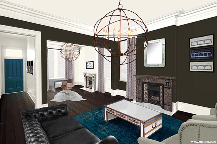
Walls in a warm deep shade of Resene Foundry, and trims in Resene Alabaster are the perfect backdrop for a scheme of vintage-style furniture from Halo, including artworks, a silver-framed mirror and linen armchairs. The front door in Resene St Kilda echoes the tones of the rug. The curtains are held with a black reeded rod and lotus finial from Vanda NZ.
phone 07 839 6757 web www.thedesigndepot.co.nz
Top tip: Enhance timber flooring with Resene Colorwood stain in your choice of timber colour then finish in Resene Qristal ClearFloor waterborne urethane to protect its good looks.
Accesories: Black reeded rod and lotus finial, from Vanda NZ. Newhaven linen drapes, from Textilia. Gyro chandelier, Kensington three-seater sofa in old saddle black leather, from Halo. Antique decolourised floor rug in blue green, from Nick Radford Rugs.
a local twist on a classic colonial style
Interior designer Greg Booth suggests this alternative scheme:
Having just visited Raffles in Singapore, I wanted to interpret that very English colonial look in a local way. The black and white flooring and the kentia palm echo the Raffles style, then I have added a monochromatic, almost skeletal framework with the Resene Black Haze walls in front, the Resene Eighth Pravda walls in the back and by highlighting the beautiful architectural details of the space – the windows and fireplace – in Resene Half Masala. Against that, I have added pops of colour in the bright tableware, carpet and that striking tiger artwork. I also wanted to define the two spaces with different purposes so have made the front area a dining space. It’s a look that takes the colonial look, adds a bit of Eastern surprise and then gives it a Kiwi twist. The rough planking of the table and stools also brings in a bit of ‘number eight wire’ feeling.
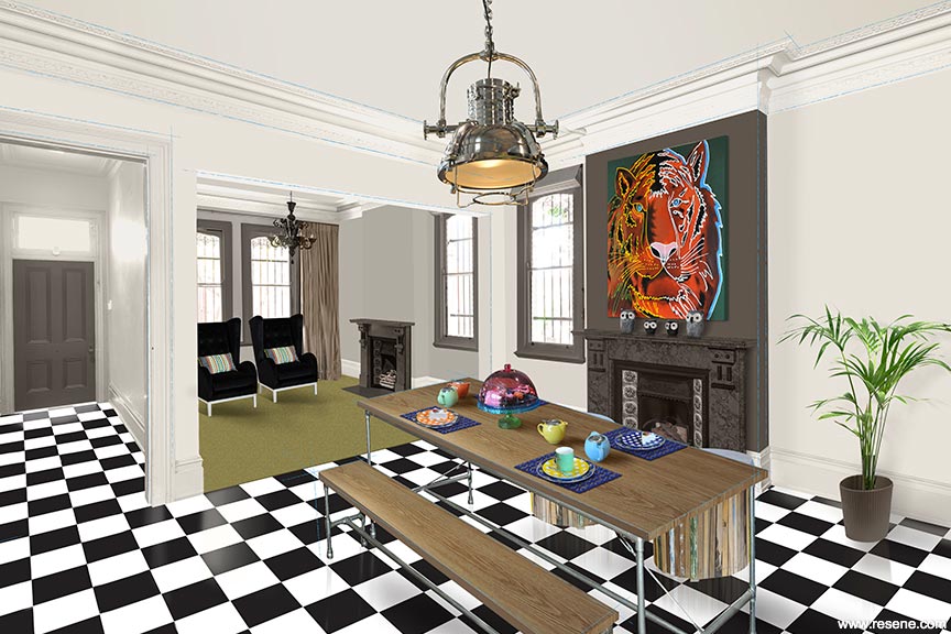
Turned into a dining space, this room uses Resene Black Haze walls with window trims and the chimney breast in Resene Half Masala, while the rear space is defined with Resene Eighth Pravda walls. The table and chairs are from the Tube Line range from Hunter Furniture.
mobile 027 221 2062 email gregb@carpetcourtdn.co.nz
Top tip: When painting inside, consider using Resene Zylone Sheen VOC Free – it’s free of volatile organic compounds, which is better for indoor air quality.
Accessories: D Blue Drum Chair with denim cushion, Initial Artwork, MS56 Warhols Lion, Ingmar Chair in Trento Lux 13 , from Hunter Furniture. Karastan Intriga Colours Range carpet, colour Cricket, from Carpet Court. Tableware, from Total Foods.
pictures: Ashley Mackevicius
words: Libby Kostromin, Making Meaning
illustration: Malcolm White
Search habitat magazine stories
Printed copies of habitat highlights are available from late March 2024 at Resene ColorShops and resellers, while stocks last. You can view back issues of habitat magazine online.
Specifiers:
If you have an idea, project or story that you think would suit habitat, we’d love to hear from you. Please drop us an email with your details and include photos if submitting a project.
Sign up for a DIY card and Save! Australia | New Zealand