|
Mixed and mingle neutrals
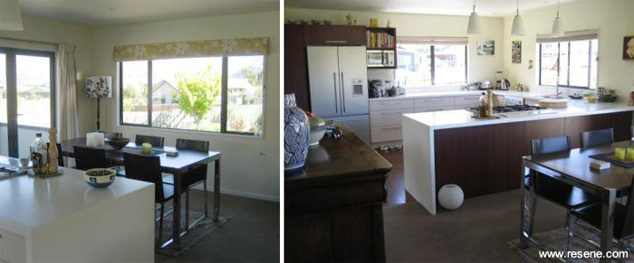
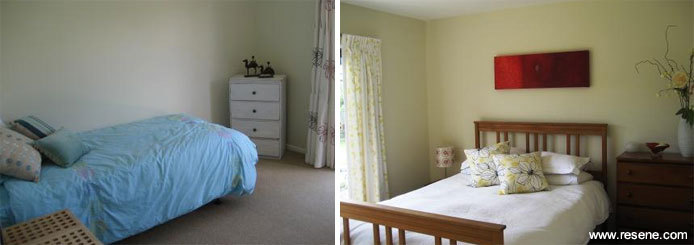
 When the Pearce family purchased their new house in Wanaka they absolutely loved its outlook and sunny position. The bones of the house were good but the interior finish really let it down. They decided to give the whole thing a spruce up with a new kitchen, new front entrance, and a completely new paint-job to replace the tired floor-to-ceiling mono-colour that was through every room of the house. When the Pearce family purchased their new house in Wanaka they absolutely loved its outlook and sunny position. The bones of the house were good but the interior finish really let it down. They decided to give the whole thing a spruce up with a new kitchen, new front entrance, and a completely new paint-job to replace the tired floor-to-ceiling mono-colour that was through every room of the house.
After much research (lots of browsing through magazine pages!) they chose a warm palette of neutral, earthy tones to complement the natural beauty of their Central Otago surroundings. The trick for them was to try and keep the palette warm enough so it wasn't too austere in the icy winters, but yet keep it fresh and modern. They also wanted to see some colour definition and variation of tone from room to room to reflect their love of colour and creativity while still retaining that sense of nature.
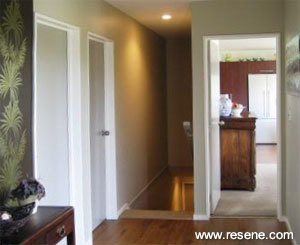
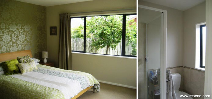
The result was a selection of colours taken from the Resene The Range Whites and Neutrals fandeck that all worked well together yet gave each room a sense of individuality. The new front entrance had been given a dramatic wallpaper feature-wall so the choice of hall colour needed to work well with that. Resene Sisal had enough hint of earthy-green to complement the nature-theme of the wallpaper and also give the long, central hallway the chance to set the tone of the house. All the ceilings, skirtings and door frames were given a crisp, clean finish with Resene Quarter Pearl Lusta, giving definition to the main wall colours. They then painted all the entrance doors to the rooms off the hallway with Resene Half Craigieburn, adding a touch more depth of green to the hallway area.
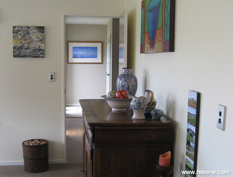
The three bedrooms were all given their own sense of style with subtle variations on the theme. The main bedroom was given a stunning visual backdrop with some gorgeous wallpaper then the walls were painted the lovely, calm and earthy tones of Resene Fossil. In the ensuite Resene Quarter-Fossil was a great match with the tiles and allowed the two rooms to flow into each other.
The single bedroom was painted the soft tones of Resene Travertine, which has just a hint of greeny-blue when you look closely.
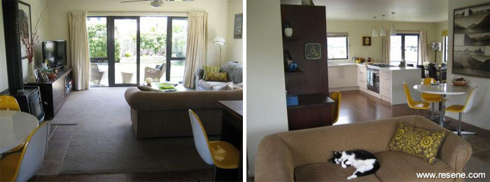
The double guest-bedroom has always appeared sunny and light and Resene Double Pearl Lusta matched beautifully with the crisp white and yellow curtains. The warm yellow tones bring the sunshine into the nature palette. This bedroom is also the closest to the dining-kitchen area where Resene Pearl Lusta sets the tone.
The open-plan kitchen-dining-lounge area needed to be kept fairly neutral to allow their various artworks to shine, however a hint of yellow was introduced into the dining-kitchen. The lounge, home-office, and lounge-to-kitchen wall were painted entirely in Resene Pearl Lusta, giving it a clean, neutral tone but still with that undertone of warm yellow.
Inspiration gallery 2010
Thanks to the Pearce family.
Decorating inspiration gallery
Click on the links below to view more great home decorating ideas and colour schemes for home interiors and exteriors.
|


