From the Resene colour inspiration – latest looks gallery
While the 80s and 90s may not have been the most enviable eras in the history of interior design, there is a lot of truth in the adage that everything does indeed come back around.
Elements of these time periods have been popping up on runways and in shop windows over the past few years, and it seems like the looks have some serious longevity.
This reading nook, while reminiscent of the late 80s and early 90s, still feels current today through its use of classic black and white furnishings and modern shapes. Pink and grey colour schemes, which were extremely popular at the time, are in vogue once again – as are art deco silhouettes and bold, contrasting patterns. These ideas may seem like a strange mix, but thanks to a careful balance, they have come together in an effective way.
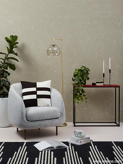
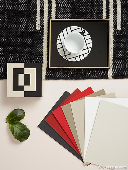


The key to finding that balance is to keep things simple. By limiting the number of different hues you use in the space but opting for different values or variations of the same colours, the result is a clean look with subtle layers of depth – in this case, reds and pinks, taupe and warm greys, plus black and white. This allows the contrasting patterns, which are one of the most important parts of the design, with enough visual space to keep them from overwhelming. It’s equally critical in a room like this not to overfill it. The elements need literal space from one another to build the natural harmony that’s evident here.
Scale, too, is important here in terms of the size of the patterns as well as the shape. While the pattern on the rug may be based on lines, the effect it creates follows a slight curvilinear shape that reflects the roundness of the chair and large plant pot.
The mottled textured wall effect in this room was created by hand. First, the walls were painted with two coats of Resene Napa. Then, using a crumpled absorbent cotton-knit rag – cut from an old t-shirt – Resene Eighth Stonewashed was sponged over top. To soften the effect, a second rag was used to dapple Resene Napa over areas with the most contrast.
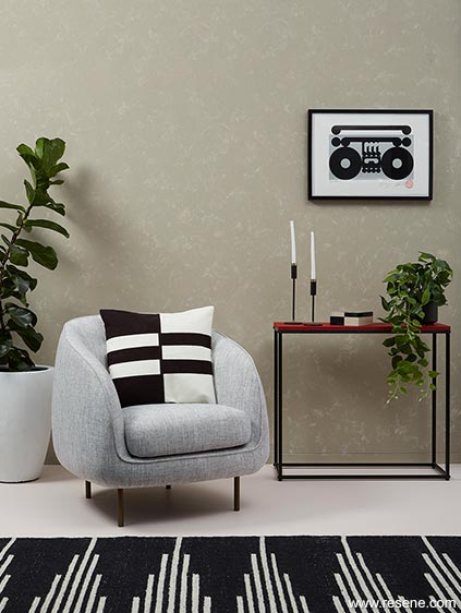
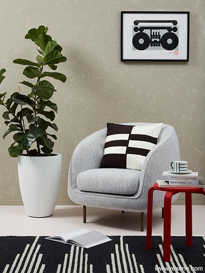
Classic black and white accessories, including the picture frame and small plant pot in Resene Noir and the large plant pot in Resene Alabaster, create a harmonious sense of repetition throughout the room. The floors, painted pale pink Resene Ethereal, and the red table top, painted Resene Dynamite, break things up and add visual interest. The fun boombox artwork (Pana Paka Screen Print by Weston Frizzell) ties the grey of the chair as well as the black, white and red accents together into a single focal point.
As a finishing touch, fresh plants have been brought in to liven things up. While you might not give it much direct thought, your brain still reads the contrast between the complementary reds and the green of the leaves, creating another subtle layer of depth within the space.
Styling by Laura Lynn Johnston. Photography by Bryce Carleton. 2019
Colour inspiration - latest looks gallery
Get inspired with colour and the latest decorating and colour trends! Select just the right look and mood for your space.
Filter: kids & teens | greens | blues | yellows | neutrals | oranges/browns | pinks/reds | greys/blacks | violets | pops-of-colour/multi-colour
Teen time
As your kids get older... more independance
Spring fresh
The most common wall colours used