From the Resene colour inspiration – latest looks gallery
Though it might seem crazy to think back about it now, were it only explored in its purest form, there wouldn’t have been tolerance for patterns or colour during the Modernist movement.
Luckily, there ended up being varying interpretations of what Modernism was and wasn’t. While all affirmed the overarching mantra that form should follow function, each expressed it in different ways.


Whether the ‘true’ modernists at the time liked it or not, the white paint and wood grains favoured by so many became the perfect backdrops for the plethora of bold colours, patterns, shapes and textures. Functionalism and Industrial Art – two significant extensions of Modernism – were headed up by plenty of designers that had an affinity for patterns and colour. American designers Charles and Ray Eames, for example, were known for creating simple prints and interesting patterns with basic geometric forms that followed their overarching philosophy that functional art should be accessible to all households. We owe a lot to design pioneers like this husband and wife duo who helped ensure modernism in the mid-20th century didn’t play out as the strictly minimalist and utilitarian affair that it might have. Instead, their approach offered up a remedy for our ails.
The primary reason why colour was used so boldly at the time was in direct response to the decades that preceded it. If there was one thing that our grey, war-torn world needed at the tail end of the 1950s, it was a celebration of peace, survival and the return to normalcy. While true black and white were certainly still present, it was colours like Resene Half Resolution Blue, Resene Retro, Resene Koru, Resene Turbo and Resene Kamikaze that brought a refreshing energy and brightness to the interiors of our homes. Other more subdued hues like Resene Quarter Heathered Grey, Resene Quarter Sorrell Brown, Resene Sandspit Brown, Resene Beryl Green and Resene Blanched Pink also fit well within this era to bridge the gap between stark neutrals and bold brights.
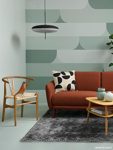
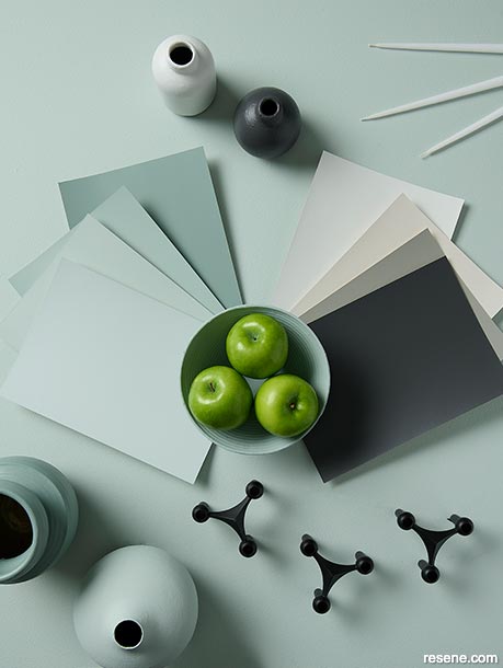
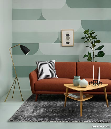
During the mid-mod era, patterns were generally limited to textiles and wallpapers and featured abstract, geometric and nature motifs. The patterns balanced that stability and dependability that modernism was all about with the celebration and energy that comes from liberal, jovial use of colour. While there are plenty of mid-century-inspired wallpaper options in the Resene Wallpaper Collection, another idea is to create a simple, clean-lined mural using paint. While the design may look deceptively complicated at first glance, it is surprisingly easy to recreate yourself and uses four gorgeous tonal blue greens from the Karen Walker Paints collection: Resene Smoky Green, Resene Robin Egg Blue, Resene Half Robin Egg Blue and Resene Quarter Robin Egg Blue.
One of the best parts about this particular mural design is that while it follows certain rules and structure, it also has a casual, freeform element. The horizontal widths of each band are equal – 30cm each – but the placement of the curves is randomised. We first used a pencil, ruler and level to mark our horizontal lines so that we would be sure any masking tape we applied would be straight and even. Then, we used a pencil to draw a curve on to a piece of A4 sized cardstock and cut it out with a pair of scissors to use it as a template on our wall. We traced all the curves in one direction before flipping our template over, positioned it up against the top corner of the already drawn curves and then traced it again in the opposite direction.
To plan out our colour placement, we used three colours per band – two for the curved stripes and a third for the space between them. We alternated our colour picks from one band to the next to ensure two shapes painted in the same colour wouldn’t bump up against one another and ruin the effect. If you’re worried about getting mixed up, use a permanent marker to label your paint tins 1-4 and then use a pencil to write on each area that you will be painting the corresponding number – not unlike a paint-by-number painting – to help you and anyone who may be assisting from losing track.
We also chose to paint our floor in Resene Half Robin Egg Blue and the adjacent wall (at left) in Resene Quarter Robin Egg Blue so that the tones would fully encompass the space, making the perfect base for building up the other elements of the design and layering in some stronger colours like black and burnt orange. As a finishing touch, we painted a simple few vases and accessories in the other colours from the mural, Resene Smoky Green and Resene Robin Egg Blue, to bring those colours off the walls and floor and into the living space itself.
Top tip: For a contemporary take on mid-century modern colours, look to the Karen Walker Paints colour collection – available from Resene ColorShops and selected resellers.
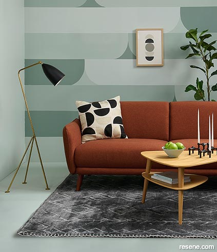
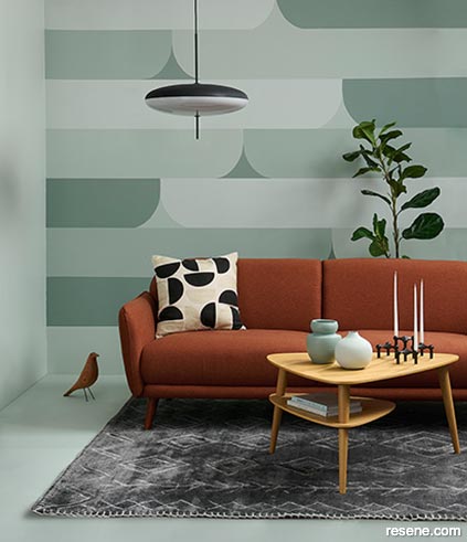
The Model S22 candle holder by German architect and designer Werner Stoff has become a coveted mid-century icon. First produced in 1967 by West German metalworking factory Nagel, it captures the essence of its time and creators and the striking design not only bears witness to a love of form and function, but also pays tribute to individual creativity with its modular nature. The S22 was an instant success, the bold design quickly became a must have accessory in aspiring households throughout the world. Not only was it an elegant and memorable object but also a statement of the owner’s personality. Because the design is modular and it can be endlessly stacked and reconfigured, vast sculptural structures could be created, showcasing anything from the rational and linear through to the wild and abstract.
Designed by Hans Wegner, the Wishbone chair first appeared at the Copenhagen Cabinetmakers’ Guild exhibition in 1947. With an ultra-simple hardwood silhouette that eliminated all nonessential material and a seat made from paper, spun to look like a rope (a Swedish invention during wartime, when sisal was scarce), it followed Wegner’s self-described “process of purification and of simplification.” At first, the Danes weren’t convinced by the style, as much of the furniture at the time was still heavy mahogany pieces; but the Wishbone found a warm welcome over in sunny California and soon gained favour in Germany. Within a few years, those in Denmark came around, embracing a chair that has become a hallmark of Danish modernism the world over.
The Eames House Bird is based on a treasured artefact collected by renowned designers Charles and Ray Eames. For more than fifty years, the wooden bird stood in the centre of the couple’s mid-century living room and featured in many interior photographs. The bird has been reproduced with permission from the Eames estate and is a welcome art piece in any interior.
Designed in 1950, what was then an innovative, experimental pendant lamp became another icon of mid-century design. At that time, the favoured material of the lighting industry was glass. But when Gino Sarfatti received the first samples of methacrylate in 1949–50 – a new polymer acrylic that was much stronger and lighter than glass – his experiments led him to a new suspension lamp, Model 2065. The simplicity of Gino Sarfatti’s elliptical design and the lightness of the materials make for a seemingly weightless luminaire. It has since been featured in several significant interior projects by notable Italian architects.
Styling by Laura Lynn Johnston. Photography by Bryce Carleton. 2021
Colour inspiration - latest looks gallery
Get inspired with colour and the latest decorating and colour trends! Select just the right look and mood for your space.
Filter: kids & teens | greens | blues | yellows | neutrals | oranges/browns | pinks/reds | greys/blacks | violets | pops-of-colour/multi-colour
Artfully yours
This room makes many nods to Frank Lloyd Wright
Check mate
Paint a coffee table and turn it into a chess board