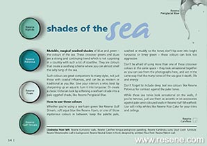
Mutable, magical washed shades of blue and green – the colours of the sea.
These crossover greens and blues are a strong and continuing trend which is not surprising in a country with such a lot of coastline. They are colours that create a soothing scheme where you can almost smell the salty tang of the sea.
Such colours are great companions to many styles, not just those with coastal influences, and can be as modern or traditional as you like. Give your interiors a retro twist by sharpening up an aqua to turn it into turquoise. Or create a classic Victorian look by softening a seafoam shade into a pale eggshell shade, like Resene Periglacial Blue.
Whether you’re using a sea-foam green like Resene Gulf Stream, soft aqua blue like Resene Foam, or one of those mysterious colours in between, keep the palette pale, washed or muddy so the tones don’t tip over into bright turquoise or limey green – these colours can look too aggressive.
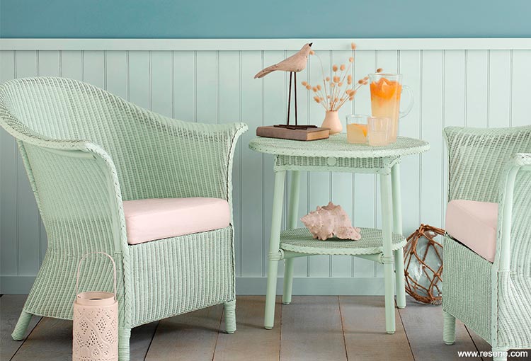
Resene Kumutoto walls, Resene Carefree tongue-and-groove panelling, Resene Kandinsky Lusty Lloyd Loom furniture.
Don’t be afraid of using more than one of these crossover colours in the same space – they look sensational together as you can see from the photographs here, and act in the same way that the many tones of the sea give it depth, life and energy.
Don’t forget to include deep teal sea colours like Resene Pelorous for contrast against the paler tones.
While these sea tones look sensational on the walls, if you’re nervous, just use them as accents or on accessories against pale sand-coloured walls in Resene Half Wheatfield. Use soft milky whites like Resene Rice Cake for your trims and ceilings.
Consider textural finishes for your sea schemes. Use Resene Colorwood Whitewash for floors or other timber to get a weathered look, or use something from the Resene Metallics and special effects range with a bit of sun-kissed glitter. Accessorise with baskets, coir mats, rattan furniture and rough-sawn timber. Juxtapose these against translucent elements (sheer fabrics and softly coloured glass) to represent the opaque beauty of the sea.
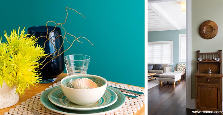
Left: Resene Patriot wall. Right: Resene Metamorphis wall in background, Resene Neutral Green in front; designed by architect Fleur Ford.
Search Habitat articles
If you have an idea, project or story that you think would suit Habitat plus, we’d love to hear from you. Please drop us an email with your details and include photos if submitting a project.
Habitat plus are not mailed directly. They are available free from Resene ColorShops and resellers while stocks last and available for viewing online.
![]() Get inspired ! Subscribe
Get inspired ! Subscribe ![]() Get saving ! Apply for a DIY card
Get saving ! Apply for a DIY card
![]()
Can't find what you're looking for? Ask us!
Company profile | Terms | Privacy policy | Quality and environmental policy | Health and safety policy
Colours shown on this website are a representation only. Please refer to the actual paint or product sample. Resene colour charts, testpots and samples are available for ordering online. See measurements/conversions for more details on how electronic colour values are achieved.
What's new | Specifiers | Painters | DIYers | Artists | Kids | Sitemap | Home | TOP ⇧