From BlackWhite magazine - issue 04, green thumb
Why standing out and blending in don’t have to be at odds with one another.
Whether the phenomenon stemmed from fear among clients, developers or councils, or it’s simply a case of tall poppy syndrome, if you were to paint a picture of many typical neighbourhoods, you wouldn’t need a broad palette to capture their essence. Even in areas where there are no restrictive covenants in place, a sea of white, beige and grey homes punctuated with the odd black-clad contemporary form is by far and wide the norm.
But if you look to the most photographed kerbs in the world, you’ll see a far more interesting palette: the Painted Ladies of San Francisco, Paseo del Prado in Havana, Nyhavn in Copenhagen. If you ask someone who hails from South America or Europe, they’ll tell you that these buildings capture the colours of nature. Despite our chromatically rich subtropical surroundings, antipodeans don’t seem to share the same associations. What constitutes a ‘natural’ colour here often doesn’t get more intense than a stonewashed grey. For some, even a misty blue feels like a risky choice.
Luckily, the way we colour our exteriors has been slowly evolving. It’s a change that’s only come about because of the designers, builders and painters who have wilfully campaigned to shift the perspective on how our streets could look. And sometimes it only takes a few making steps in the right direction before more thoughtful colour use catches on.
Architectural designer Barry Connor says his approach to colour has noticeably matured over the past five to ten years. “I think I used to be quite boring with colour, but I’ve really come around to realise the power of colour and I get really excited about it these days, using it to accentuate things and make a point in a really creative way. I’m not saying that we should make everything really shouty; it’s more about how important and transformational it can be with a building’s design.”
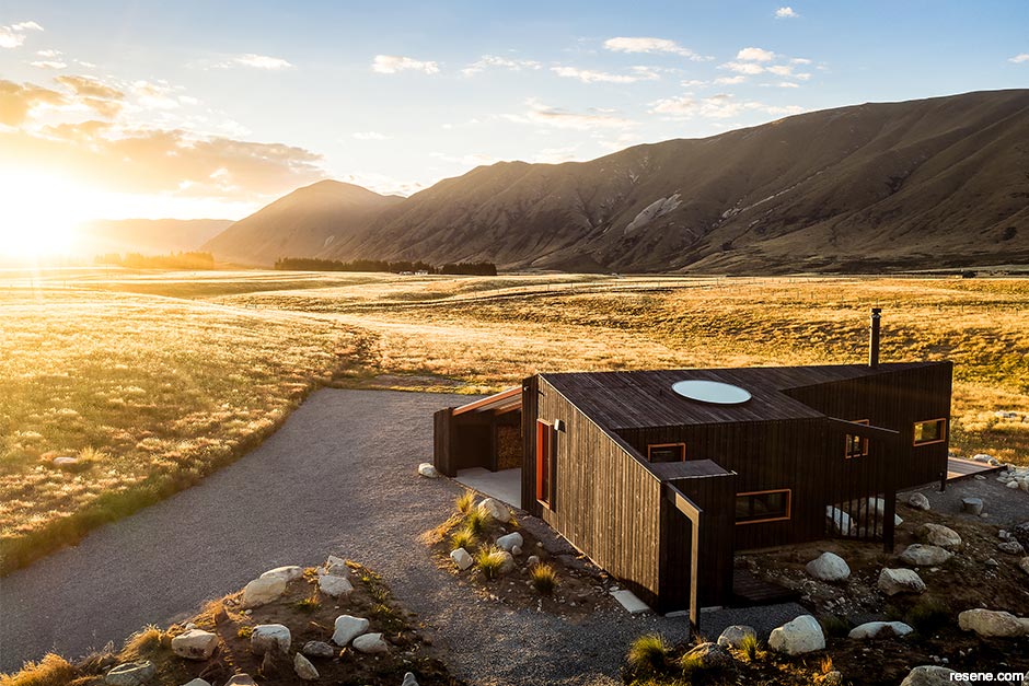
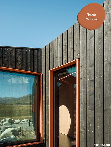
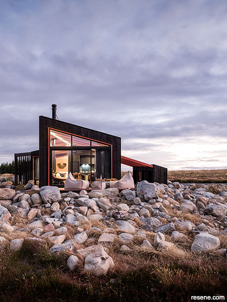
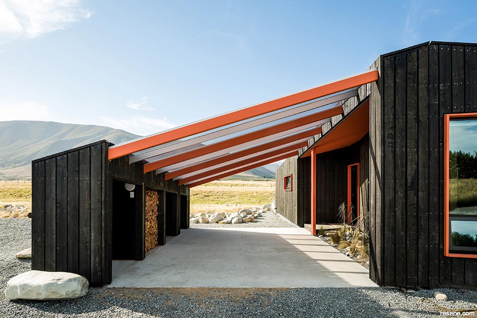
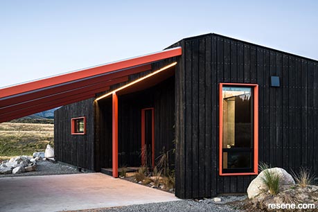
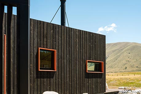
It took Barry by surprise when his Skylark Cabin design started turning the heads of writers, editors and award programme judges and he says his small Christchurch studio has never received so much media attention for a single project before. The project won three awards in 2021, including the Resene Total Colour Residential Exterior Colour Maestro Award – and it’s hard to ignore its brilliant use of burnt orange Resene Vesuvius in highlighting the building’s striking forms. In the case of this project, the choice was driven by the client.
“The client’s favourite colour is, unquestionably, orange. She drives an orange car and even her hair has an orange tone to it. The decision to use Resene Vesuvius was initially guided by that. However, another really awesome part about Twizel is that there is this bright reddish orange lichen that grows naturally on the rocks down there, so that particular hue really tied into that. That meant it gave the design personality for the client but it also tied in really well to the natural surroundings.”
The experience – and the resoundingly positive feedback about the project – was a eureka moment for Barry. “A lot of people gravitate towards typical natural colours, but I have started taking a different approach,” he says. “I’ve become intrigued with mosses and lichens. They grow pretty much everywhere, and you can find so many different varieties that are unique to specific geographic areas, but they’re such vibrant little tiny things that grow in all these neat different patterns.”
While the organism is more often condemned than celebrated, New Zealand is home to more than 2,000 species of lichen, and Australia is said to have nearly double that – and Barry has found he isn’t the only fan. “I was working on a renovation recently where this spot of lichen on the gate post caught my eye, so I uploaded a photo of it to the online Resene Colour Palette Generator to come up with colours for the project. The client recognised it right away as soon as he saw the photo, and he was just so excited to see that I had used that for colour inspiration. I had no idea the client loved that lichen because it’s a bit of an unusual thing for someone to like when so many view it as troublesome.”
Being more comfortable with and excited by colour now, Barry thinks both his confidence and suggestions have changed but it still can take effort to get clients to break out of the habit of doing what everyone else is doing. “A lot of clients tend to be afraid of colour and they are always quick to bring up the topic of resale,” he says. “Some don’t see anything wrong with having a vibrant letterbox or front door, but they always seem to worry about adding too much colour because they’re afraid it’ll personalise the building too much and then they won’t be able to sell the property later on down the road – which is silly, because if a new owner doesn’t like it, they can repaint it. And honestly, from what I’ve seen, adding a bit of personality and colour can actually add to the desirability and resale value.”
top tip: Turn your inspirational images into Resene colour palettes quickly and easily with the free online Resene Colour Palette Generator. Simply upload your image to get a customised Resene colour palette based on the most common colours that occur. Plus, the tool tells you what proportion each hue has in the palette to help give you an idea of how to balance your colour choices. Once finished, you can click on the colours for more information, download swatches or save or email your palette to clients or project team members. Try it out at www.resene.com/palettegenerator.
Barry believes that technology has been instrumental in convincing clients to make more courageous colour choices. “Computers now make it so much easier to give a reasonable idea of how a colour is going to look when you add it to a building. I’ve found it makes clients far more comfortable when they can visualise their colours first rather than them crossing their fingers and waiting to see how it turns out when it gets painted. It becomes about how that colour looks on their own home and helping them recognise the impact and versatility that it offers. At the end of the day, they’re paying me to tell them what is going to work best.
“We are working with some repeat clients that have been quite safe with neutral colours and timbers in the past, so they weren’t expecting me to show them an ochre green house! It’s quite a simple building with nice rooflines, but if you tried to do it with white weatherboards, it just wouldn’t work; it would feel too much like a 1970s villa. But I showed them what it would look like in Resene Grass Hopper to modernise it and they were over the moon with it. Plus, it ties in so nicely with the naturally-coloured timber stains.”
Colour matching technology has also helped open Barry’s eyes to the differences between the colours that are perceived to be in nature and the breadth of hues that are actually present in our surroundings. “I find the effect of light and shadow on colour so interesting, and in and around Skylark, that changes a lot between summer and winter. You get this completely amazing glow from the rising summer sun and the sunsets as well; colours like Resene Aloha, Resene Twisted Sister and Resene Bi Hoki. For me, driving through Lindis Pass when it’s not winter, those are the colours you’ll find there. People might not pick such bold colours to represent tussock covered hills, but those really are the hues in nature. By contrast, on a crisp, clear winter morning, you’ll see Resene Unwind, Resene Inside Back and Resene Dusted Blue.”
“Colour also triggers so many memories for people, and that can be a really nice tie in – to use it in ways that will transport them back to a special time or place. Every job we do, we set up a shared Pinterest board and we get our clients to put everything from designed spaces they like to door handles so we know that we’re on the same page, and that’s often where we find those connections to colour.
“Rather than trying to make their home specifically blend in or stand out, it’s really about enhancing it and using colour to balance it and personalise it – so in a way, it achieves both.”
› To see more of Barry’s work, visit www.barryconnordesign.co.nz.
This is a magazine created for the industry, by the industry and with the industry – and a publication like this is only possible because of New Zealand and Australia's remarkably talented and loyal Resene specifiers and users.
If you have a project finished in Resene paints, wood stains or coatings, whether it is strikingly colourful, beautifully tonal, a haven of natural stained and clear finishes, wonderfully unique or anything in between, we'd love to see it and have the opportunity to showcase it. Submit your projects online or email editor@blackwhitemag.com. You're welcome to share as many projects as you would like, whenever it suits. We look forward to seeing what you've been busy creating.
Earn CPD reading this magazine – If you're a specifier, earn ADNZ or NZRAB CPD points by reading BlackWhite magazine. Once you've read an issue request your CPD points via the CPD portal for ADNZ (for NZ architectural designers) or NZRAB (for NZ architects).
![]() Get inspired ! Subscribe
Get inspired ! Subscribe ![]() Get saving ! Apply for a DIY card
Get saving ! Apply for a DIY card
![]()
Can't find what you're looking for? Ask us!
Company profile | Terms | Privacy policy | Quality and environmental policy | Health and safety policy
Colours shown on this website are a representation only. Please refer to the actual paint or product sample. Resene colour charts, testpots and samples are available for ordering online. See measurements/conversions for more details on how electronic colour values are achieved.
What's new | Specifiers | Painters | DIYers | Artists | Kids | Sitemap | Home | TOP ⇧