From BlackWhite magazine - issue 03, green thumbs
Four professionals using colour to create community ownership in shared spaces.
Though we have great affinity and romanticism for our rural areas, New Zealand and Australia are actually both highly urban nations. According to The World Bank’s DataBank, in 2020, 86.7% of New Zealanders and 86.2% of Australians lived in urban areas. While there are obvious cultural and societal benefits to living in a city environment, it also has its drawbacks.
Urban dwellers often have to deal with health issues that come from the constant stress of being in a busy, rushed environment. Heavy traffic, noise and air pollution can all impair physical and mental states. Numerous studies have shown that there are different burdens of disease and disability in urban areas over rural ones, with some linking specific features of urban environments to particular health indicators such as an increase in anxiety disorders, social phobias and panic disorders. However, there are key ways in which design can help promote our urban population’s mental health – and these strategies are only going to become more important as time goes on and our cities grow.
Although we often talk about the influence colour has on our mental and physical states within indoor environments, more and more attention is being paid to the way the hues in our urban surroundings play. While increasing green and active spaces where people can get their necessary doses of nature and exercise without the need to venture far from home is important, colour is another major remedy for improving the wellbeing of city dwellers. We know that if humans spend their time confined to a concrete jungle it is not going to do their health any favours, but the colour urbanites need in their lives goes beyond blue skies and leafy greenery.
If you went to school for architectural design, interior design, landscape design, urban design or planning, you probably learned the way colour is used in built contexts can vaguely be structured into three categories. Firstly, there are practical uses that signal and separate the functions of a space. This can include things like painting an element of a design in a different colour to delineate its use, but also things like pictograms, signs and traffic signals. We know that a green light means go and a red one means stop and that green or pink paint on a roadway means a lane is reserved for bicycles or buses. Another common and popular method is the decorative use of colour, which can be simple things like what hue you choose for cladding, fascias, roofs, trims or awnings. But it’s the third approach to colour use in public spaces – increasing optical stimulation for the benefit of the user’s interaction and perception of the space – that may be the most important at a societal level.
Accentuating public space with colour can create awareness and bring attention to what’s there or promote specific activities, but it’s also a way of creating identity within a place. There are times when we want to make components of a design blend into their surroundings; this can make sense for residential home design in rural settings where you don’t want to disrupt the flow of nature. But in a shared public urban space, that shouldn’t be the default approach.
In the same way that traffic signs tell us where we can and can’t go, bright, bold and whimsical use of colour has its own symbolism which communicates that people belong in a space. Whether it’s accomplished through chromatically interesting murals, sculptures, footpaths, crossings, benches, playground equipment or other public facilities, colour has become an essential part of reclaiming public space and our mental wellbeing.
We talk to four professionals using paint to make a positive impact in the public realm.
Did you know?
Humans receive approximately 80 percent of their information from their visual surroundings, both natural and built. Colour as a form of sensory perception is so essential to our survival that academics have argued that colour should be awarded human need status.
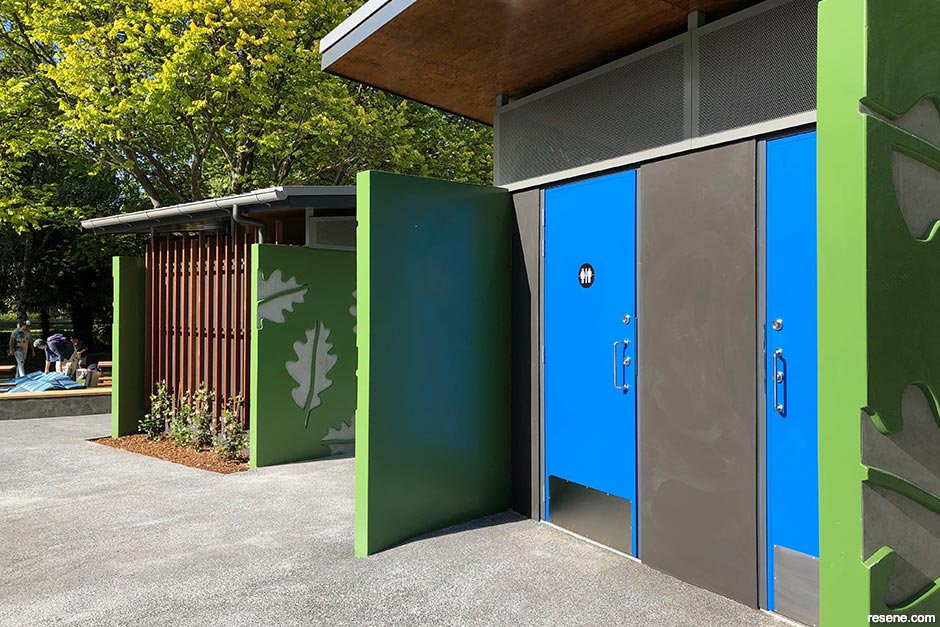
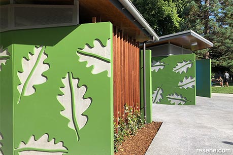
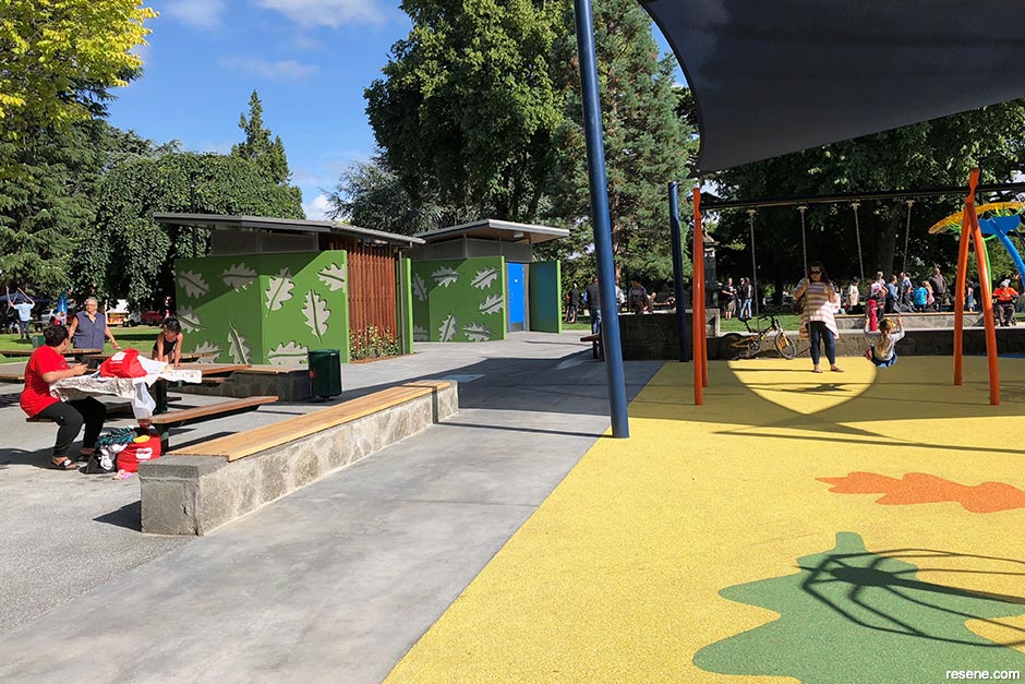
Public toilets are not something architect Brent Scott of Citrus Studio imagined he’d be designing much of, but after a number of successful projects with Hastings District Council, he has since leaned into toilets as a niche typology.
“They have become interesting projects for us,” he says. “They are all in public spaces, which are great environments to work in. I now find myself going to check out toilets when on holiday. We recently did a road trip from Napier down to Queenstown and made a point of stopping at the new toilets right on the coast outside of Kaikoura to check them out – but I can’t say the kids were keen that they were composting!”
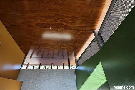
Brent points out that, as components of more complex urban and park developments, his colourful toilet projects don’t stand alone. “They’re elements of larger spaces which include playgrounds, recreation areas and landscaping, so once completed, it’s not just a building to see but a whole area. These projects have given me the opportunity to work alongside landscape architects and playground designers, which has been great. The other freedom is that they do not need to conform to typical building typologies, and given that most people think of public toilets as bland, concrete block cells housing dark and smelly spaces with a slightly unsafe feel to them, it has been liberating to break away from this. These toilets have all started with the aim to connect them to the environment to allow the light, air and sounds of the park to filter in rather than being a sealed box.”
“When I hear the phrase ‘blend in’ in a project briefing from a client, I always imagine they mean that the aim is to make a positive contribution to the context, which I think is a much better aspiration for a project. When you think about it, public toilets should stand out so you can find them; they shouldn’t be camouflaged to blend in,” Brent adds.
“Colour is a potent and obvious tool to use as it creates an instant emotional response and tends to draw you to a space or object. It is fun as well, can make you smile and even make you laugh. Colour both subtle and overt is prevalent everywhere in nature, and both sit happily side by side. It helps these toilets to be more than simply buildings. In a way, they become pieces of public sculpture, adding something beyond function to the context.”
“We have also discovered the combination of colour and pattern on the walls of these toilets has led to them being tagged much less than other similar buildings. Many think that colour is really only for busy and active urban spaces, but we have found that it works just as successfully in serene park environments.”
Brent encourages others to be more adventurous when it comes to using colour in public spaces. “It is easy to fall back to a neutral palette, which is often the unconscious path of choice. But if you think about what the design of a space is trying to achieve, you may find that adding colour will give a better result and create spaces that people are happier to be in,” he says.
Those who have worked on public projects with councils or developers know they can be challenging, as you’re often having to deal with a lot of stakeholders – and, at times, you may end up with a few too many cooks in the kitchen. But Brent has had great success through his smart approach and the relationships he’s built.
“The project team at Hastings District Council is small and very open and supportive – especially when it comes to using colour. For each project, colour is discussed when presenting a design and is part of the design expression, so it has a reason for being the colour it is.”
For Brent, this approach of getting the client to buy into the colour as part of the design has helped it become less of a personal preference. “I think it’s a good way to get clients on board rather than treating colour as simply a final choice of finish to be agreed to at the end, when it becomes much more subjective and difficult to reach a consensus on.”
When it comes to buildings in public spaces, function comes first so the paint specification you choose becomes important. “Resene has a great range of products that offer solutions. In the case of the precast concrete walls of the toilets, they are in Resene Uracryl which is really hardwearing and can be maintained. When it comes to colour, Resene has a great spectrum available in all ranges so the use of colour in the project is pretty unrestricted.”
› To see more of Brent’s work, visit www.citrusstudio.co.nz.
Illegal graffiti tagging can be a nightmare in public spaces. Not only can it detract from your design and cost money to fix, but the longer it’s left there, the more likely it is to attract more graffiti. When left unaddressed, tagging can also progress to more serious crimes, so it pays to have an anti-graffiti plan in place for your client to tackle graffiti promptly and keep the problem from escalating.
Traditionally, anti-graffiti protective coatings were full of solvents. However, Resene has developed a lower VOC option: Resene Uracryl GraffitiShield. This high performance waterborne two pack urethane is designed to provide a clear protective finish as a defence against graffiti. Once cured, if graffiti does occur, it can be removed using Resene Graffiti Cleaner without the need to repaint the area. It’s ideal for use on businesses, roadside walls and other structures that are prone to tagging. The best part is Resene Uracryl GraffitiShield is available in a range of gloss levels so you can get the right sheen for the look you’re after.
Resene Graffiti Cleaner is free of NMP and is formulated for easy removal of graffiti. It is very effective against common materials used for graffiti, such as spray paint, ink, crayon and lipstick.
While outdoor wall artworks are typically painted in Resene Lumbersider, foot traffic areas can require a non-slip finish. This can be easily achieved by adding Resene SRG Grit into Resene Walk-on or Resene Lumbersider or by choosing Resene Non-Skid Deck & Path, which is a product with a grit non-slip texture designed into it that can be tinted to a range of colours. See the Resene Decks, Paths, Driveways and Recreational Areas colour range for options. Altex Coatings, part of the Resene Group, also has a range of long-term high performance durable coatings suitable for asphalt road marking, footpaths, playgrounds and sports court surfaces.
“I have seen first-hand the positive impact colour has on our emotional state,” says artist Melinda Butt of Min Design.
“Colour and pattern are great for activation, engagement and wayfinding in public spaces but incorporating them also comes with therapeutic qualities and helps create a sense of public ownership – that the space belongs to the people, and that the people belong in the space.”
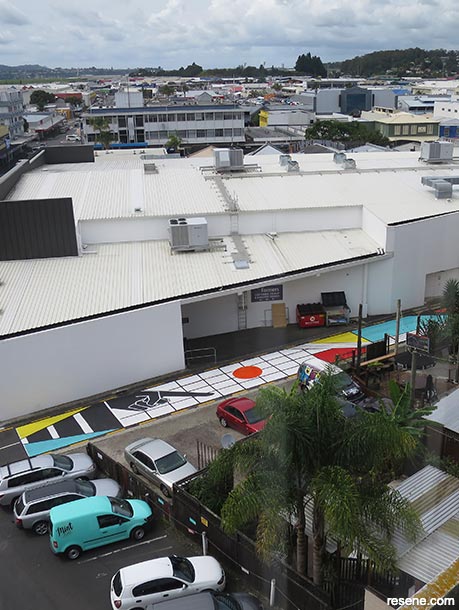
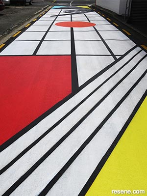
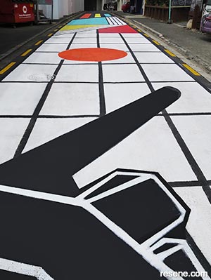
If you’ve ever walked around central Auckland, Hamilton or Whangarei, chances are you’ve already been wowed by Melinda’s work. A fusion of pop art and art deco inspired by everything from classical architecture and Bauhaus principles to Japanese poster art and Egyptian motifs, her bold iconographic style of murals is hard to miss. But until she was asked to create a special piece for Butter Factory Lane, her work had never been on a walkable or driveable surface. The 18 metre long and five metre wide mural she created featured an eye-catching combination of Resene White, Resene Black, Resene Roadster, Resene Gorse and Resene Riptide and was extremely popular with residents, adding to their sense of safety and belonging – especially when visiting the adjacent hospitality and entertainment venue of the same name.
Each of Melinda’s murals are carefully planned, and this project was no different. Before executing a large painting, she creates a smaller work using Resene testpots in her chosen colour scheme and views it under a range of lighting conditions to see how the hues change. “I have learnt the hard way that sometimes colour can shift dramatically depending on the light. In order to create a long lasting high-value work, the right prep work has to be done,” she says.
Melinda’s work has also been used to enliven public infrastructure from power boxes to public bathrooms and carpark entryways. “I use bright, bold colours in high activity zones to lift people’s mood and increase a sense of safety. If an area needs some vibrancy, it helps to add a few, bold primary colours. When paired with the simplicity of black and white, it adds an additional pop, both in the art movement sense and the visual field.”
› To see more of Melinda’s work, visit www.melindabutt.com.
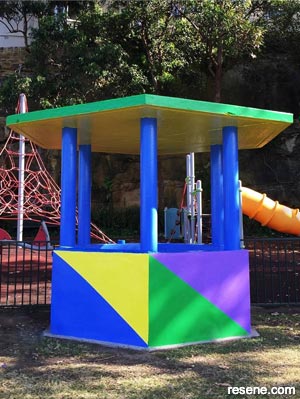
When you’re creating spaces for young children whose brains are still developing, the use of colour isn’t just about stimulation – it also becomes important for orientation and wayfinding, particularly among those who might not yet be old enough to read.
Streetscape’s talented team of designers creates and fabricates a range of street furniture solutions to enhance open space environments including decorative light poles, shelters and customised features and art sculptures. When they were brought on board to manufacture a set of benches for Sunnybrae Normal Primary School, the school asked for the children to be involved in the project. Streetscape had them help choose hues from the Resene KidzColour range.
“Having the students involved created pride of ownership with the children and gave the space a fresh, fun and interesting look and feel,” says Streetscape’s Paul Salmon. “However, once they were installed the teachers also discovered that the different colours of the benches created ‘spaces within the space’, with children meeting each other for lunch at the ‘red benches’ or making a playdate for handball outside the ‘yellow benches’, for example.”
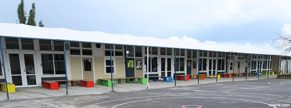
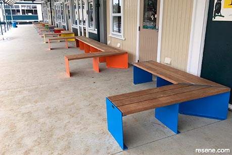
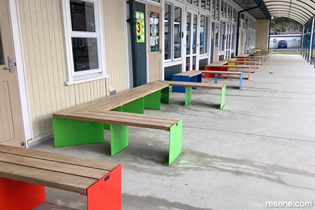
Paul says that opting for the L- and U-shaped formations from their Mack Mitre Series instead of standard straight benches also created more inclusive, communal areas for the children to meet and interact and for parents waiting to pick their children up at the end of the day.
“Our preferred paint system is Resene, and just like Resene paints, Streetscape products are also proudly made and designed in New Zealand to suit our country’s unique conditions and climate,” says Paul. “While a lot of the time the colours chosen for furniture designed in the public realm are picked purposely to be colours to blend into the space, having the occasional blast of a bold, bright colour can be the pièce de resistance of a project!”
“We have manufactured plenty of brightly coloured furniture for clients over the years with colours ranging from Resene Buddha Gold and Resene Poppy red to Resene Elvis blue and even Resene Outrageous orange for a client who wanted his bench seat to match his McLaren sports car! I’ve personally always been drawn to the tropical blue and green colours, Resene Riptide and Resene Spray; they remind me of long, warm summer days on the beach and in the surf – bring it on!”
› To see more of Streetscape’s work, visit www.streetscape.co.nz.
Sometimes it’s not just great colour use that helps activate a piece of public infrastructure – it’s refreshing and maintaining it. That was certainly the case in North Sydney’s Kesterton Park, where vivid, saturated colours were used to revitalise two picnic huts. In doing so, it invited greater engagement by members of the local community and provided a visual treat for ferry commuters.
“The picnic huts hadn’t been painted since the 1980s and were in need of an upgrade. They looked neglected and uninviting,” says Dr Zena O’Connor of Design Research Associates, who initiated the project. “The appearance of the huts discouraged community engagement and detracted from the park’s magnificent location on Sydney Harbour.
“Research indicates that colour encourages interaction and engagement, and the refresh highlighted the role that colour can play in transforming and revitalising the urban environment.”
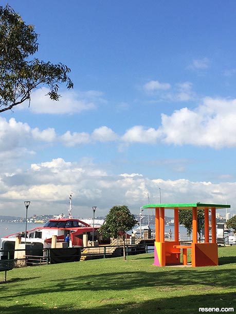
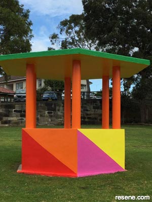
The design was based on the International Code of Signals (ICS) maritime flags used since the 1850s. “Each picnic hut panel was painted in the maritime signal for ‘O’ or ‘Oscar’ which reflects both the popularity of sailing on Sydney Harbour and acknowledges the activities of the working harbour,” says Zena.
Two colour schemes were designed, one for each picnic hut. Resene Adrenalin, Resene Havoc, Resene Smitten, Resene Happy, Resene Left Field, Resene Point Break and Resene Fuchsia were chosen, inspired by yacht spinnakers, Jacaranda blossoms and the surrounding natural landscape.
“A Resene gloss finish was the ideal choice for this project as it provided the right level of saturation and visual impact as well as maximum durability in all exposed conditions – a prerequisite for the harbourside location of this project.”
› To learn more about Dr Zena O’Connor’s work, visit www.zenaoconnor.com.au.
› Have you used Resene products to colour a public space? Share your project with us: editor@blackwhitemag.com.
This is a magazine created for the industry, by the industry and with the industry – and a publication like this is only possible because of New Zealand and Australia's remarkably talented and loyal Resene specifiers and users.
If you have a project finished in Resene paints, wood stains or coatings, whether it is strikingly colourful, beautifully tonal, a haven of natural stained and clear finishes, wonderfully unique or anything in between, we'd love to see it and have the opportunity to showcase it. Submit your projects online or email editor@blackwhitemag.com. You're welcome to share as many projects as you would like, whenever it suits. We look forward to seeing what you've been busy creating.
Earn CPD reading this magazine – If you're a specifier, earn ADNZ or NZRAB CPD points by reading BlackWhite magazine. Once you've read an issue request your CPD points via the CPD portal for ADNZ (for NZ architectural designers) or NZRAB (for NZ architects).
![]() Get inspired ! Subscribe
Get inspired ! Subscribe ![]() Get saving ! Apply for a DIY card
Get saving ! Apply for a DIY card
![]()
Can't find what you're looking for? Ask us!
Company profile | Terms | Privacy policy | Quality and environmental policy | Health and safety policy
Colours shown on this website are a representation only. Please refer to the actual paint or product sample. Resene colour charts, testpots and samples are available for ordering online. See measurements/conversions for more details on how electronic colour values are achieved.
What's new | Specifiers | Painters | DIYers | Artists | Kids | Sitemap | Home | TOP ⇧