From BlackWhite magazine - issue 03, blue sky
Belinda Burke infuses her Master of Architecture thesis with chromatic inspiration from both near and afar.

When you have gained first-hand experience of the benefits that come from living in an environment brimming with vivid colours, returning home to find streets lined with subdued homes decorated in soulless neutrals can be pretty disenchanting. But instead of letting it hamper her, architectural graduate Belinda Burke was ignited to advocate for confident use of colour in our built environment, fight the prejudice of chromophobia and help move our culture to embrace emotion, wonder, delight, sensitivity and sensuality.
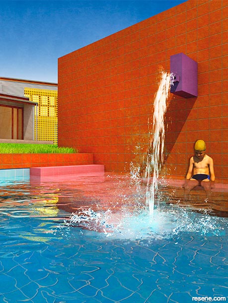
Her design-led research thesis titled Colour, Hell of a Good Thing! was fuelled by a passion for colour which was piqued during travels to Morocco, Spain and, particularly, Mexico, where she resided for six months. She was especially taken with Mexican Architect Luis Barragán’s way of choreographing magical atmospheres through the use of light and colour, which led her to focus on how his same strategies could influence contemporary architecture back home.
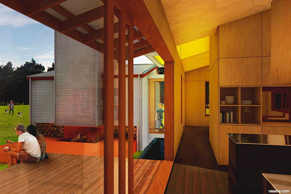
“I remember flicking through books on Barragán in my second or third year of study. I love his bold use of colour, and that’s what lured me in. I’ve now come to realise the wealth in Barragán’s architecture that extends far beyond a glossy page of pretty colours,” says Belinda. “When I was in Mexico, I walked through two of his houses – Barragán’s own home and studio and Casa Gilardi – and it was these rich experiences that made me eager to learn more about the ways in which he designed with colour, space and light. There’s an emotional and spiritual dimension to his manipulation of light and colour that makes it so captivating.”
“Barragán was heavily influenced by his exchange of ideas with people from other disciplines, and it was his crossover between art and architecture that interested me the most. He considered colour not just as a mere decorative element, but as a powerful tool for altering the perception of space. It was also his sensitivity to the potential of colour and its inseparable relationship with light, coupled with Mexico and New Zealand’s similar light qualities, that made him a desirable subject to draw from.”
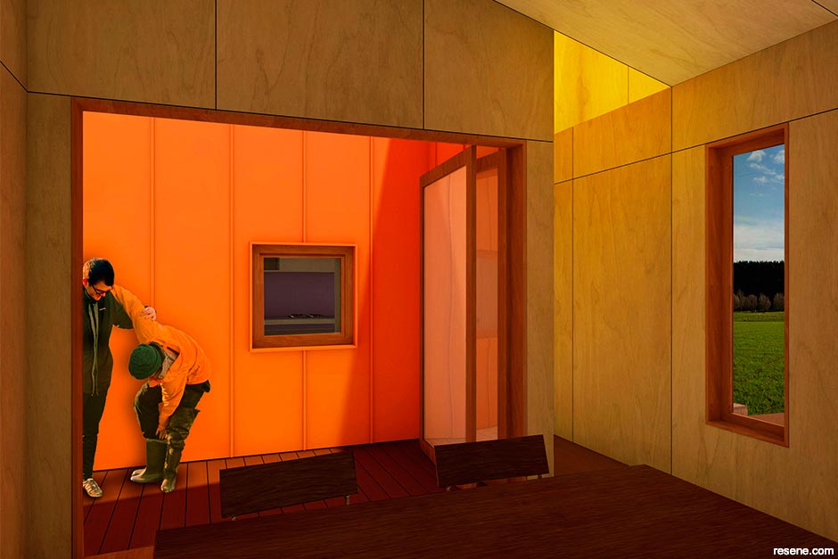
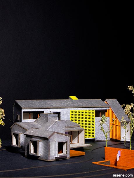
While the site could have theoretically been anywhere, Belinda chose the Wairarapa region as she thought it provoked a challenging and juxtaposing angle of investigation to the urban contexts of Barragán’s projects. “It’s a greenfield site that’s wide with long shadows stretching across the field, which seemed fitting as it embodied mysteries like that of de Chirico’s paintings, which influenced Barragán’s work. The rural setting provided an interesting venture into the tension between Barragán’s quest in Mexico; to design homes for privacy and refuge from chaotic surroundings versus the desire in New Zealand to have open living and transparency that allows for strong connections with the land. This led to a design where areas of shadow and intimacy give impact to surprising coloured moments with accents of colour that mediate between inside and outside light.”
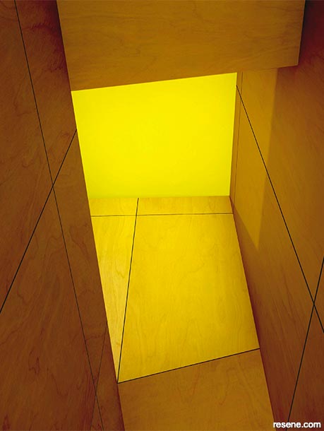
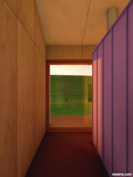
Belinda says her major challenge was determining whether to choose hues that appear to disappear into the landscape or ones that would yield an arresting contrast with the surroundings. “It also needed to be a colour scheme that would be compatible with the dramatic seasonal colour changes in the Wairarapa that shift from vibrant fresh greens in winter to warm dry ochres in summer,” she says.
She ultimately settled on a neutral exterior cladding that would fit well with nearby farm buildings. “The subdued tone allows the colours of the surroundings to stand out over the building, and as the material weathers, it will continue to recede into the landscape. The orange accents in Resene Outrageous, on the other hand, contrast with the landscape but still feel harmonious. They, along with the Resene Happy and Resene Marionette accents, appear from a distance as hints of bright colours amongst the land the way flowers do amongst trees and shrubbery.”
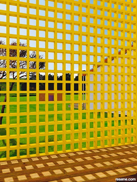
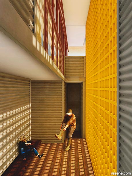
Since April, Belinda has been primarily working on residential alteration projects with James Fenton Architect in Te Whanganui-a-Tara, but with her thesis finished, she is looking forward to focusing more energy on her art. “My research advocates for cross-disciplining with a specific focus on the importance of fusing art and architecture. So my art practice is both a creative outlet and a means to test colour combinations that will hopefully influence my work in architecture,” she says.
When asked about what she’d like to specialise in during her architectural career, Belinda says she’s still figuring it out. “In a dream world, I’d be splitting my week between architecture and my art practice. Then again, I’ve often fantasised about dropping architecture all together in pursuit of other crafts – but haven’t we all?”
As fellow chromophiles, we can’t wait to see where her journey takes her.

Acacia baileyana
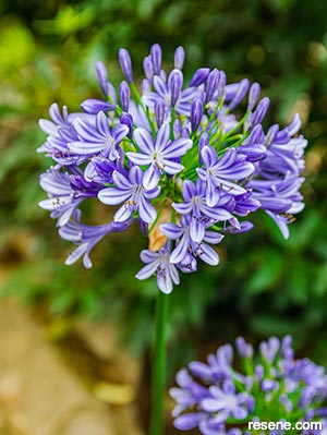
Agapanthus
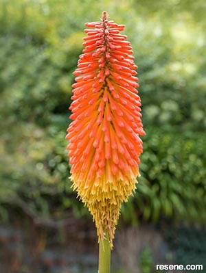
Kniphofia nobilis
“I get pretty overwhelmed when it comes to selecting colours. It can be terribly exciting, yet equally daunting. But some of the juicy colours I’ve come across are Resene Guggenheim, Resene Hypnotic and Resene Can Can. There are so many factors at play that aid in the selection of colours, including where they’ll be used and how they tend to respond to a particular context, so I try to keep open-minded when it comes to colours. There will come a time and place where some colours will work and others won’t, and all prior convictions I have about those colours will change.”
› To see more of Belinda’s architectural and artistic work, check out her Instagram feed @belinda__burke.
This is a magazine created for the industry, by the industry and with the industry – and a publication like this is only possible because of New Zealand and Australia's remarkably talented and loyal Resene specifiers and users.
If you have a project finished in Resene paints, wood stains or coatings, whether it is strikingly colourful, beautifully tonal, a haven of natural stained and clear finishes, wonderfully unique or anything in between, we'd love to see it and have the opportunity to showcase it. Submit your projects online or email editor@blackwhitemag.com. You're welcome to share as many projects as you would like, whenever it suits. We look forward to seeing what you've been busy creating.
Earn CPD reading this magazine – If you're a specifier, earn ADNZ or NZRAB CPD points by reading BlackWhite magazine. Once you've read an issue request your CPD points via the CPD portal for ADNZ (for NZ architectural designers) or NZRAB (for NZ architects).