From BlackWhite magazine - issue 01, Resene Total Colour Awards
Socially distanced accolades for this year’s Resene Total Colour Award winners.
In October, a panel of independent expert judges went through the exciting yet challenging process of selecting winners for this year’s Resene Total Colour Awards. It was the 11th year that the awards have taken place, and with a huge range of gorgeous entries, the decision wasn’t an easy one. While we may not have been able to recognise these astounding achievements in person this year, this latest crop of stunning award-winning projects coloured with Resene paints and stains are well worth celebrating.
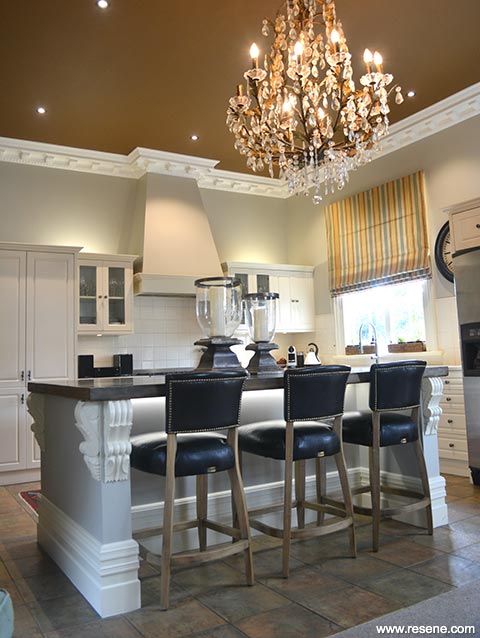
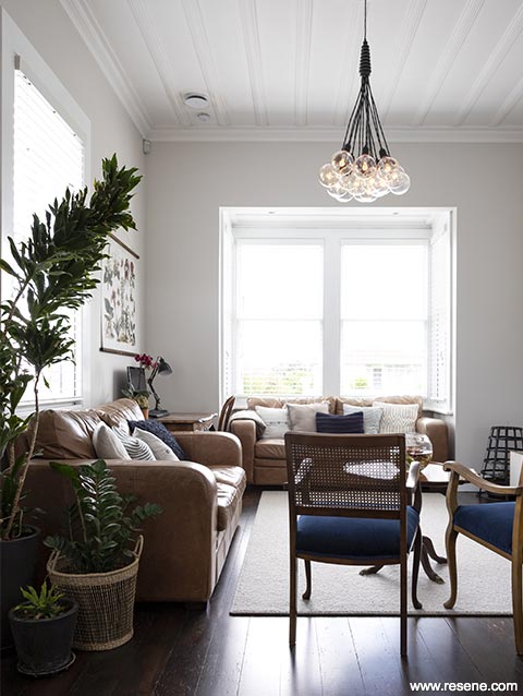
The owners of the historically relevant Nancy Martin House were this year's major winners, taking home the highest honour of the Resene Total Colour Master Nightingale Award as well as the Resene Total Colour Heritage Residential Award.
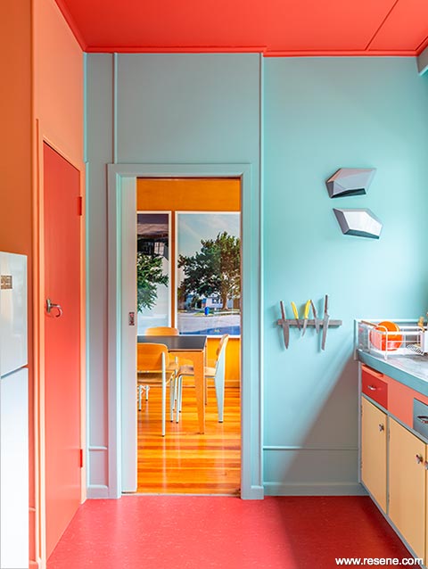
1 Heritage Residential Award + Nightingale Colour Master Award.
Ann Shelton and Duncan Munro
Nancy Martin House (by Frederick Ost)
After purchasing the home in 2013, owners Ann Shelton and Duncan Munro were resolved to return its rooms to their original colours. In early 2020, they contracted AAA Painters to complete the work. While the couple was originally motivated by a desire to retain and restore the original qualities of the incredible home, which is one of a handful of domestic homes designed by Jewish emigré architect Frederick Ost, they now have the added benefit and joy of living amongst an unexpectedly playful and energising Resene colour scheme in Resene Mexican Red, Resene Sea Mist, Resene Burning Sand, Resene Shadow Green, Resene Primrose, Resene Pearl Lusta, Resene Neptune, Resene Mist Grey and Resene Rose.
The judges called the project, "a labour of absolute love."
“This project is lavished with era appropriate hues, selected with incredible care and attention to detail and placement. The palette honours the value of design, wrapping it with a charming sense of mellowness and restfulness. The rimu doors cleverly read as a neutral thread. This project reminds us all that history has so much to offer as inspiration for colour selections of today if we make the time to look back and learn. It reminds us all to make the most of what is already there – sometimes all that is needed are fresh coats of paint colour to make old new again.
“So much passion and painstaking research and attention to detail has been poured into choosing just the right colours and placing them ever so carefully in the right places. This home is loved by colour.”
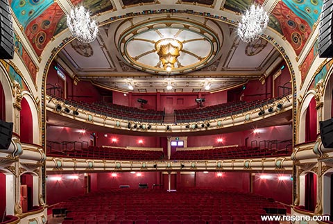
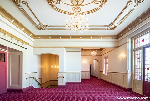
2 Heritage Commercial Award + Master Nightingale Colour Maestro Award
Dave Pearson, DPA Architects Ltd
Hawkes Bay Opera House Upgrade
The runner up and recipient of the Resene Total Colour Master Nightingale Colour Maestro Award and the winner of the Resene Total Colour Heritage Commercial Award was DPA Architects Ltd for their incredible work during the upgrade of the Hawkes Bay Opera House, which was recently renamed Toitoi – Hawkes Bay Arts & Events Centre. The refreshed colour scheme creates its own sense of drama and opulence while lending a contemporary feel that remains sympathetic to the building’s historic overtones, restoring Toitoi to a masterpiece in its own right.
“Opening back up in grand style, this project is steeped in colour, so richly and dramatically dressed. Features are carefully picked out in appropriate hues encouraging the eyes on a colour journey. A definite crowd pleaser, the hues warm up the audience and create a sense of anticipation for the performance that lies ahead. Luscious and rich, the palette enhances, and commands, centre stage.
“The hues honour the developing history of the project, painstakingly highlighting existing architectural elements. All elements have been ever so carefully considered from tip to toe, creating a wonderful sense of welcome and setting the scene for all to be entertained. Simply wonderful,” said the judges, “and well deserving of a standing ovation.”
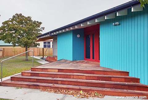
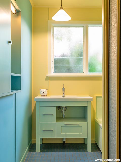
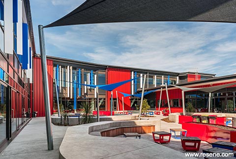
3 Education Award
Te Hohepa Kohanga Reo
by Bull O’Sullivan Architecture Ltd
Te Hohepa Kohanga Reo
Judges: “A little colour goes a long way with this project, bringing excitement and a warm welcome to young and old alike. Paint colours have been used as a versatile medium to co-ordinate with other materials. With the Kohanga Reo star leading the way, the hues have dual use as wayfinding devices, much as one might navigate by the stars at night. A considered use of the whole material palette with paint colours as the connection. An exciting new look for Kohanga Reo.”
4 Education Colour Maestro Award
ASC Architects
Shirley Boys’ and Avonside Girls’ High Schools
Judges: “Cultural narratives are carefully woven into a new interpretation of colour. With two school cultures to honour, the sophisticated colour palette brings together the needs of both, while personalising each and providing identity and wayfinding elements. Like fraternal twins, each school maintains its own sense of self but equally reads well as a duo. An astute use of colour that nurtures identity both individually and in combination with each other.”
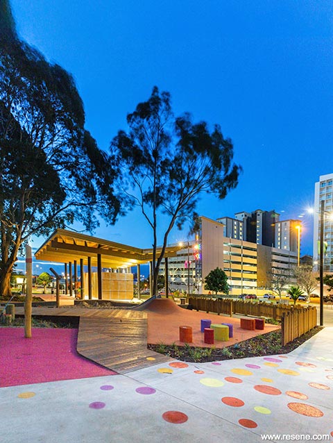
5 Landscape Award
Wraights Athfield Landscape Architecture (WALA)
Hayman Park
Judges: “Colour is thoroughly integrated into the bigger picture, with colour used as a device for wayfinding and to signify areas of the park that fulfil different functions. Structures are defined by their chosen colours and together glow in welcome to park visitors, working equally well during the day and as the sun sets. The bold colour palette opens up the park extending the boundaries and ties all the elements together with a sense of excitement and anticipation.” See more of this project here.
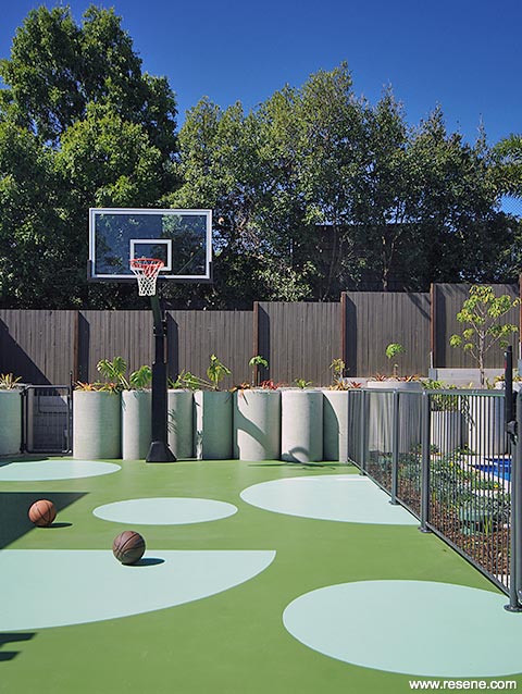
6 Landscape Colour Maestro Award
Jason Haigh, Cloud Dwellers
Breezebrick Courtyard House
Judges: “This project is the perfect example of how with a little creativity and paint colour you can easily create something out of nothing. What could have been a nondescript concrete pad has become a clever colourful feature deftly encouraging outdoor play while adding aesthetic appeal. The scale and rhythm of the circles is ever so carefully planned to elevate the space without overwhelming, perfectly complementing the distinct zones. An innovative and inspiring play on colour.” See more of this project here.
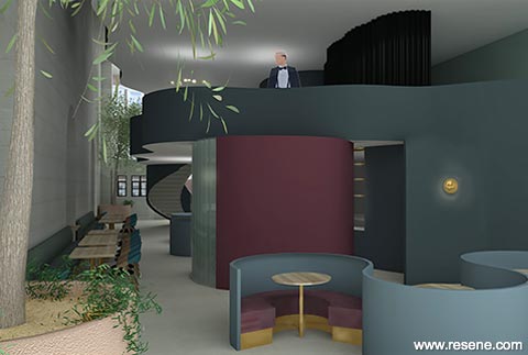
7 Rising Star Award
Anna McMillan
Fuel Restaurant Concept
Judges: “The concept of fuel is cleverly wrapped into this memorable design at all stages, embracing a deep colour palette with a sense of fluidity that is entirely appropriate. With a nod to the history of the building, the welcoming décor is carefully designed to suit a night-time focused space. Dark and cocooning, guests are encouraging to relax and linger longer.”
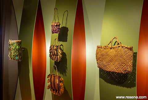
8 Installation – Experiential – Product Award
MTG Hawke’s Bay
Turuturu: Fingers, Feathers & Fibre
Judges: “The colours are so carefully woven into this project it is almost difficult to see where one colour ends and the next one begins. This careful related selection means not only are the hues sympathetic to the curated collection, but they relate equally well to each other. Inspired by nature’s unerring mastery of colour, this palette layers the best of nature’s inspiration with a flaxen twist. A natural winner.”
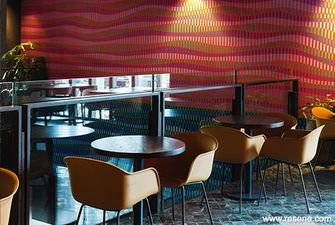
9 Installation – Experiential –
Product Colour Maestro Award
Love bErto Street Artist
Harbour Eats, Commercial Bay
Judges: “Meticulously detailed the colours ripple out across the wall. With an underlying vibe of a radio frequency, the colour subtly plays on the senses. Each colour is cleverly and painstakingly separated from one another so that each colour and the space that lies between set the rhythm in harmony. A unique application of colour that wraps and elevates this space.”
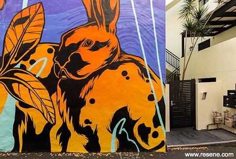
10 Visual Art Award
George Rose
Various works
Judges: “An incredible body of work, bold interpretations and colour palettes bring streetscapes and public spaces to life in a true celebration of colour and artistry. The works are over-scaled to suit each 12 environment. With an underlying style, the art is reinvented with each brief so that each work truly shines on its own. Harnessing an enviable eye for colour, the colour palettes and proportions are beautifully and brilliantly intertwined.” See more of these projects here.
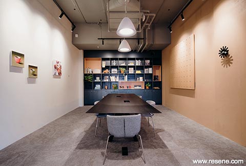
11 Commercial Office Award
Chris Wheeler, Hierarchy Group
Spaces Karangahape Rd
Judges: “Colour defines this workspace with a thoughtful and restrained use of colour. With a myriad of people to appeal to, the palette is universally appealing and instantly welcoming to all. The softened hues are light on the senses for easy concentration to support those busy at work with just the right amount of energy and liveliness to encourage convivial collaboration.”
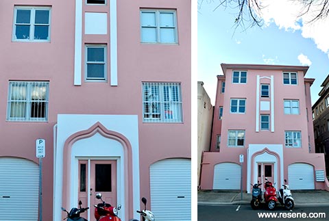
12 Residential Exterior Award
Kat Everett
Beau Rivage, Bondi
Judges: “This beachside location celebrates a local love of colour. With a neighbour dressed in colour, this project needed to have a colourful wardrobe of its own befitting its part in the colourful vintage duo. The colours carefully accentuate the architecture without overwhelming it. Happy, beachy and so full of sunshine.”
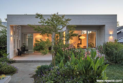
13 Residential Exterior Colour Maestro Award
Pat de Pont, Strachan Group Architects
Lean on Me exterior
Judges: “Snuggling into its site from the streetscape into the landscape, the clever pairing of hues handles the transition from street to private space and from traditional to modern seamlessly. The light filled private space is an unexpected delight which blends beautifully with the garden for a quick escape from city to social.”
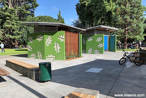
14 Commercial Exterior Award
Brent Scott, Citrus Studio Architecture
Cornwall Park Public Toilets
Judges: “This project raises the bar for public space amenities with its combination of colour and design. The hero hue and leaf motif are a careful balance of being bold enough to be a wayfinding device at distance while still being at one with the wider park surrounds. So well designed, well-coloured and simply gorgeous.”
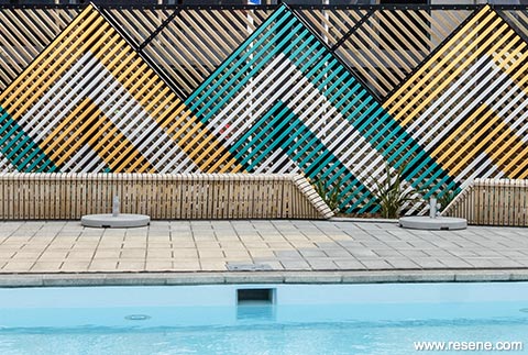
15 Commercial Exterior Colour Maestro Award
AW Architects
He Puna Taimoana, the Hot Pools at New Brightonp
Judges: “Judicious splashes of colour set the scene. Easy on the eye, hues of teal and yellow roll over from surf and sun to bring energy into this social space. Slatted materials add an extra textural dimension and create an illusion in the colour layers to read as a multi-toned woven vista. A masterful pairing of colour tone and treatment.”
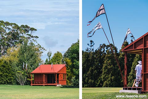
16 Bright Spot Award
Pac Studio
Point Wells Cricket Club
Judges: “A whimsical folly, this project just makes you smile. Drawing from the heritage of the sport reinvented in a quintessential Kiwi vernacular, every element is touched with a sheer love of the game with local flourishes for good measure. Camaraderie, cricket and colour come together for a perfect match.” See more of this project here.
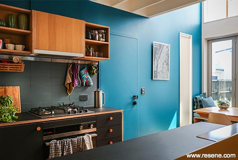
17 Residential Interior Award
Paul Anselmi of Bull O’Sullivan Architcture Ltd and Maria Chen
Chen Anselmi Units
Judges: “The delightful use of bold colour lifts the spirits. The timber is a foil to the hues and brings a taste of the trees outside indoors connecting this home back to the landscape. Exciting, optimistic and inspirational, with a clearly defined colour palette you simply can’t wait to come home to. Colour makes this home.”
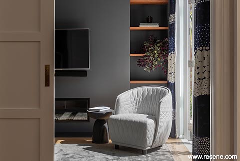
18 Residential Interior Colour Maestro Award
Natasha Markham, MAUD LTD
Twin Peaks
Judges: “A breath of tranquility washes over this home, with a restrained yet undeniably beautiful colour palette. Darker colours are cocooning in more intimate areas leading to lighter hues in shared social spaces. An elegant palette interpreted with modern living in mind. A masterful lesson in how to weave tranquil colour into a home.”
19 Residential Interior Colour Maestro Award
Amber Hamilton Interior Design
Glamorous Heritage Villa
Judges: “Flamboyantly dressed, eyes are immediately drawn to the magnificent ceilings of colour, which reach down from the ceiling into the room. Warm, deep and glamorous, using the ceiling for the main colour features allows the colour to make a grand entrance in each room with an uncluttered space to really let the colour sing. Beautiful.”
20 Commercial Interior + Public Space Award
Justine McAllister
Bacchanalia Bar
Judges: “Blank walling is totally transformed with an impressive sense of movement, playfulness and colour. The careful combination of lighting with colour, brings the work to life, enhancing it and using it as a beacon to draw in the fun-loving crowds. An energetic celebration dancing of colour for all to enjoy.”
21 Commercial Interior + Public Space Colour Maestro Award
Element17
Saigon Kingdom
Judges: “Historical and antiqued notes thread through this thematic space. Colours are at one with the surface giving the appearance they have been there forever as if engrained with a painterly look. The colour use and theming cleverly define the space and bring a distinctive taste of international inspiration home to enjoy Kiwi style. It is a feast for the eyes.”
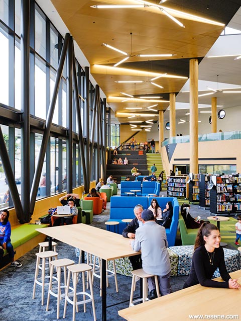
22 Commercial Interior + Public Space Colour Maestro Award
John Hardwick-Smith, Chris Winwood, Nick Strachan, Jaime Lawrence, Robin Aitken, Ari Stephens, Katherine Dean, Karly Houston, Stephen Brennan, Oliver Wright, Athfield Architects Limited
Waitohi Johnsonville Library and Community Hub
Judges: “As the backdrop to a busy space, the palette is sensitively chosen and placed. Appropriate, welcoming and calm it is serene with just the right amount of colour to liven the senses while focusing attention on the collection within. A fitting backdrop to a public space where young and old can sit and enjoy the space at their own pace.”
23 Neutrals Award
Abbey Lang Home
Roseberry Villa
Judges: “Quiet and unassuming this home is a haven on the senses harnessing the power of an achromatic palette. Dark neutrals are used carefully, with lighter hues for added loveliness. This colour palette combination will undoubtedly inspire other homeowners to eschew the all-white look and uplift their own home with stronger hues.”
This is a magazine created for the industry, by the industry and with the industry – and a publication like this is only possible because of New Zealand and Australia's remarkably talented and loyal Resene specifiers and users.
If you have a project finished in Resene paints, wood stains or coatings, whether it is strikingly colourful, beautifully tonal, a haven of natural stained and clear finishes, wonderfully unique or anything in between, we'd love to see it and have the opportunity to showcase it. Submit your projects online or email editor@blackwhitemag.com. You're welcome to share as many projects as you would like, whenever it suits. We look forward to seeing what you've been busy creating.
Earn CPD reading this magazine – If you're a specifier, earn ADNZ or NZRAB CPD points by reading BlackWhite magazine. Once you've read an issue request your CPD points via the CPD portal for ADNZ (for NZ architectural designers) or NZRAB (for NZ architects).
![]() Get inspired ! Subscribe
Get inspired ! Subscribe ![]() Get saving ! Apply for a DIY card
Get saving ! Apply for a DIY card
![]()
Can't find what you're looking for? Ask us!
Company profile | Terms | Privacy policy | Quality and environmental policy | Health and safety policy
Colours shown on this website are a representation only. Please refer to the actual paint or product sample. Resene colour charts, testpots and samples are available for ordering online. See measurements/conversions for more details on how electronic colour values are achieved.
What's new | Specifiers | Painters | DIYers | Artists | Kids | Sitemap | Home | TOP ⇧


