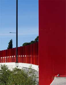
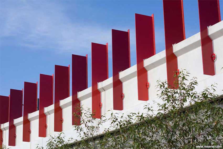
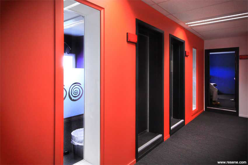
The clever red palette on the Clark Street Overbridge in Auckland by Architectus has been awarded top honours in the Resene Total Colour Awards for its unique use of colour on a very public space.
Resene has a long history of colour with colours like Resene Spanish White and Resene Pearl Lusta created over three decades ago still continuing to be top choices for decorators today. With thousands of colours available, the key is not just choosing the right one but putting it together with complementary colours and accents to bring the colour palette to life. The Resene Total Colour Awards were launched to encourage and celebrate excellent and creative use of colour.
Awards have been given for the best colour use in: Residential Exterior, Residential Interior, Education, Commercial Exterior, Commercial Interior – Public + Retail Space, Commercial Interior - Office, Display + Product, Landscape, Rising Star (student), Lifetime Achievement, with the Colour Master - Nightingale Award for the best overall colour use.
Colour Award winners
Colour Maestro award winners
The Resene Total Colour Master Nightingale Award, named after the Nightingale family who founded and still run Resene today, recognises excellence in colour and paint use, and was awarded to Architectus for the Clark Street Overbridge. They also won the Resene Total Colour Commercial Exterior Award.
Rhythmical in reds, the continuity in this project is delightful. It is almost like an art installation. It’s a brave decision to choose three reds that are so close together rather than keep them all the same or opt for more contrast. The similarity of the reds provides subtle movement. The light and shadow, it moves you on. It’s energizing and it is very appropriate. Brilliantly strong, the strength is in the rhythm and subtle changes of colour.
The judges were excited about the colour use because it was surprising and unexpected to turn a utilitarian commercial road bridge into such a fantastic urban sculpture. It’s a bold palette of similar hues, yet the decision to choose this palette required utter confidence. The whole community can embrace it, it’s something that reaches out and is shared by many with far reaching appeal and identification.
Find out more about this project
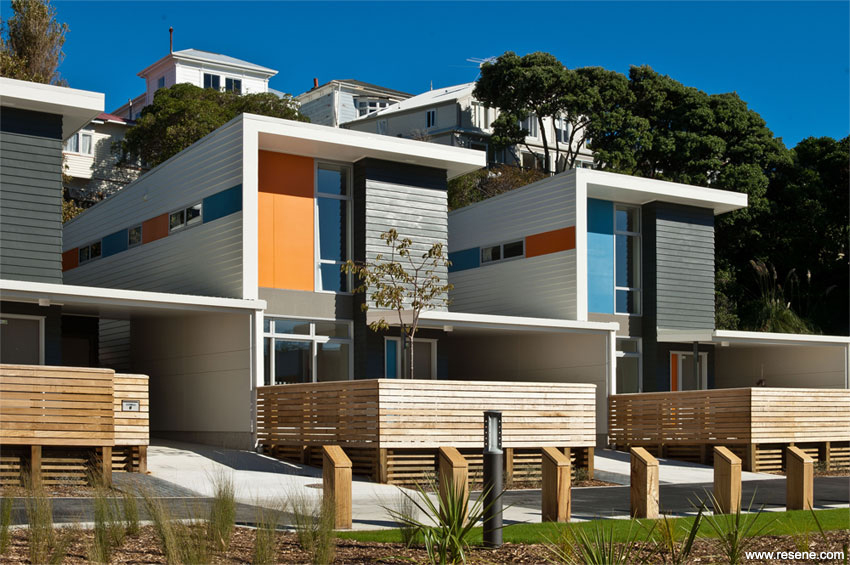
The clever colour selection and placement on the WCC Regent Park Development by Designgroup Stapleton Elliott won the Resene Total Colour Residential Exterior Award. This project also won the Resene Total Colour Maestro Nightingale Award.
The judges wholeheartedly agreed that this project positively contributes to the local community and greater built environment. It stands out without being garish, using colour well with a degree of sophistication not seen in other projects.
The WCC Regent Park Development demonstrates such a great use of colour to individualise what could just be seen as a collection of similar houses providing individuality without being overpowering. The colour gives each home a greater sense of ownership and helps strengthen the elevations with the colour adding to the architectural experience.
The setting and colours differentiate the buildings, allowing them to take on the moods of the day, in shadow and sun, generating a sense of movement with colour. The putting together of a palette like this creates intense movement, individuality and it is quite simply clever.
Find out more about this project
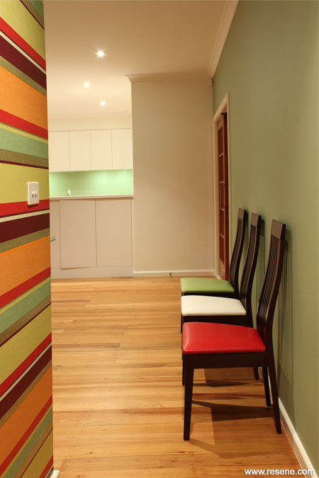
The fresh green colour palette of the Seel Residence by Parkhurst Design won the Resene Total Colour Residential Interior Award.
The Seel Residence exemplifies balance and tone. The green tones are very on trend and are so easy to live with and yet often we don’t bring them into the interior palette.
This palette is restful yet it has a sassy feeling of being a little bit bold. Green is an ideal foil to timber, providing a great complementary background just as it does in nature. The palette is an immediate reflection of what nature does providing the opportunity to be creative with touches of colour.
All the furniture has been carefully chosen and ties in with the overall colour scheme creating a sense of atmosphere that is very sympathetic to this 1938 brick and tile home.
Find out more about this project
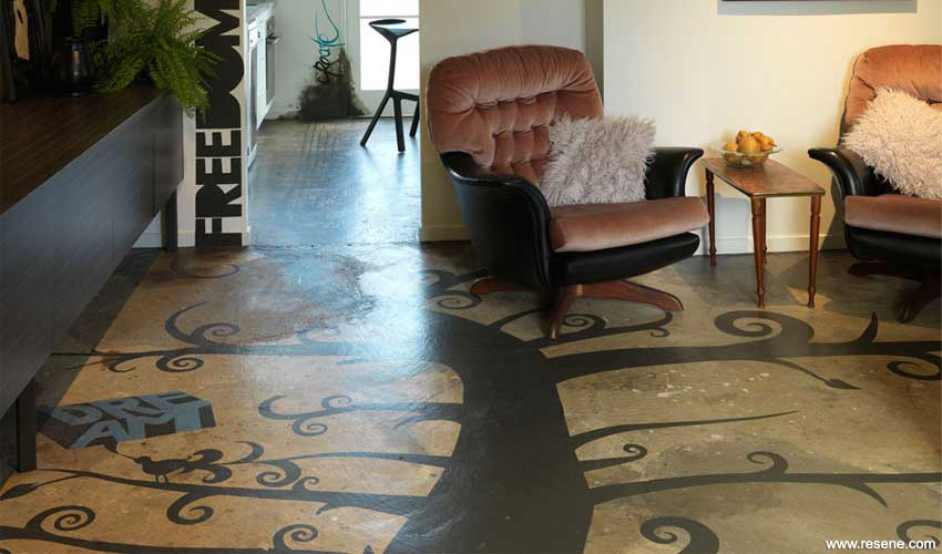
The striking floor finish of the Kingsland Art Project by Eucalyptus Design & Interiors was awarded a Resene Total Colour Residential Interior Colour Maestro Award.
The Kingsland Art Project demonstrates an innovative and unique approach to painting interiors. So often the floor is left to blend into the background. But this floor is a magnificent playground. It commands attention and doesn’t need any furniture; it just lives as a work of art.
The subtle enduring choice of colours feels moody and sensual. It is deep and grounded and works well with the concrete backdrop and blackboard wall adding a nice playful element so it doesn’t feel too somber.
Find out more about this project
A Resene Total Colour Residential Interior Colour Maestro Award was also awarded to Sarah Quinlan Design Ltd for the Nelson Project.
The intensity of colour is appropriate for the excitement of this kitchen. It creates a wonderfully strong place in the hub of the home. The colour palette is not only brave but very well balanced with the reds creating a nice sense of proportion using colour choices that are strong, deep and complex.
The slightly metallic floor provides a subtle sense of movement and light and the texture provides added dimension and contrast to the bold finishes.
Find out more about this project
The Resene Total Colour Commercial Exterior Award was won by Architectus for Clark Street Overbridge who also took out top overall honours with the Resene Total Colour Master Nightingale Award.
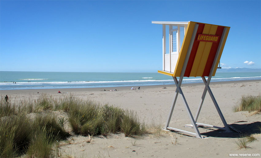
The delightfully coloured ‘The Chair’ by Wilson and Hill Architects Ltd was awarded a Resene Total Colour Commercial Exterior Colour Maestro Award.
We all want to be a lifeguard and spend our days sitting on the beach, even more so if we had a tower like this. It’s so classy yet so cute. Lifeguard colours are used in such a beautiful way so they are clean and crisp without being garish.
It’s an ensemble of beauty, colour, safety and intrigue. It’s like a classic kiwi bach sitting up on a chair.
Find out more about this project
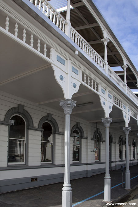
The heritage hues of the White Hart Hotel by Atelierworkshop was also awarded a Resene Total Colour Commercial Exterior Colour Maestro Award.
The White Hart Hotel captures tradition so well and is a delightful renovation of an iconic building. The colour palette could so easily have been stuck with traditional white but instead the palette includes clever colour selections that you might not expect drawing attention to some of the most important heritage features.
Resene Bali Hai used at the bottom of the building anchors the building and slowly moves your eye up to the features so that you fully appreciate the architectural detailing.
Find out more about this project
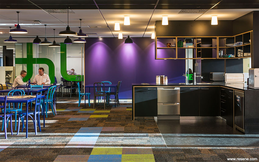
Multiple stories of colour stacked one upon the other in the Beca Fitout by Studio Pacific Architecture was awarded the Resene Total Colour Commercial Interior – Office Award.
There is a lot of line and form in the overall composition of each area of this Beca fitout and the blocks of colour steady it and ground it.
In a predominantly commercial environment the night can be as important as the day. Looking to the building at night time these spaces glow with a perfect juxtaposition of colour.
The colour palette is strong and well balanced with sophisticated, split complementary, complementary and related colour schemes all combining to work well together with a touch of monochromatic. This use of a variety of schemes that we are so familiar with has been beautifully put together in an enlightening way.
Find out more about this project
With bursts of colour to reflect its tenant, Element 17 was awarded a Resene Total Colour Commercial Interior – Office Colour Maestro Award for the Radio Network Christchurch.
Strong bold, dramatic bursts of colour, just what you would expect from a busy radio environment. Colour is used to overcome a completely internally focused space that has just one window.
It is a great example of colour having a purpose over just being a great set of colours. The colours delineate teams and spaces in such a delightfully appealing way. It brings together enough excitement and energy to be motivating and stimulating without being overpowering.
Find out more about this project
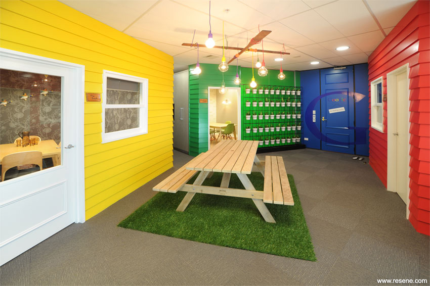
A Resene Total Colour Commercial Interior – Office Colour Maestro Award was also awarded to the delightfully kiwiana flavoured colour scheme by Spaceworks Design Group for the Google Office Fitout.
This office space reflects a truly on brand message with quirky and fun colour. Unforgivingly powerful, the use of the brand colours to tie in with the story has been expertly done. The local cultural influence helps it to identify with its environment.
The scheme comes together well with strong corporate colours transferred into the environment. Subtle colours have also been used in working spaces where more time is spent. This 50s bach like feel is just irresistibly clever and makes you want to get up and go to work.
Find out more about this project
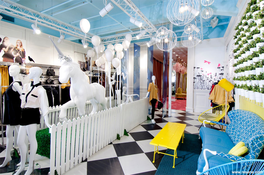
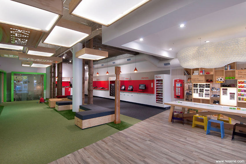
Winners of this award last year, Studio Gascoigne Ltd were again awarded the Resene Total Colour Commercial Interior – Public + Retail Award for their Glassons Queen Street fitout.
Glassons Queen Street has a refreshingly unusual colour palette that works dramatically well. It’s an acidic palette that is fresh and modern even though it takes cues from yesteryear. The palette extends to all surfaces including the ceiling with a unique colour selection that makes such a difference to the feel of the space and is picked up in furniture pieces.
It’s a fantastic example of how tradition and traditional colours work well when used in line and form of furniture. Incredibly smart and the judges congratulate their innovative use of colour.
Find out more about this project
Clever use of Kiwibank corporate colours by Designworks in the Kiwibank and New Zealand Post Retail Transformation project won them a Resene Total Colour Commercial Interior – Public + Retail Colour Maestro Award.
Bringing together the brand with a fresh colour palette has been done superbly well in this Kiwibank and New Zealand Post Retail Transformation project. They have taken difficult corporate colours and used them in such a precise and sympathetic way.
The colours are small elements but strong within the overall space. The neutrals make the space feel very welcoming and friendly and offer a sympathetic backdrop against which the stronger accent colours can shine.
Find out more about this project
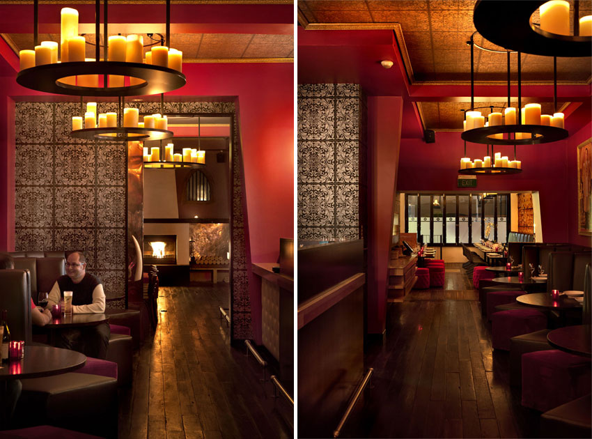
A Resene Total Colour Commercial Interior – Public + Retail Colour Maestro Award was also awarded to Xsite Architects for the regal colourways of Monarchy Restaurant.
You can sink into the sumptuousness of Monarchy Restaurant. The colour quite simply envelopes you and draws you in.
The palette suggests a moodiness, comforting and welcoming. Very regal, it feels luxurious, and works so well with the existing materials of bricks and timber, while adding another layer of richness and dimension.
It’s a beautifully balanced scheme that wholeheartedly adds to the ambience of the space.
Find out more about this project
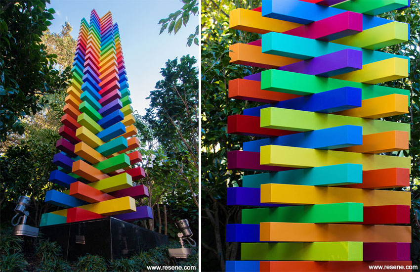
The rainbow tones of the Sang Siren entered by Sang Architects & Company Ltd and created by artist Michael Smither was awarded the Resene Total Colour Display + Product Award.
This Siren is just mouthwatering. Its form and colour is delicious, it’s exciting and pure. With the perfect proportions it could still be amazing without colour, but the colour adds so much intrigue.
The colour gives it a sense of spiral and movement that adds a new form to it, over and beyond the structure. Incredibly beautiful the judges were in awe of it.
Find out more about this project
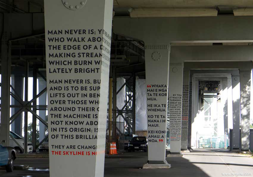
Boffa Miskell was awarded the Resene Total Colour Display + Product Colour Maestro Award for their combination of poetry with carefully considered composition and colour.
Nestled under the Auckland Harbour Bridge, this Trestle Leg Series is a delightful discovery. It captures the words of New Zealand in an iconic monument of our time.
It adds to the space and makes you linger in an area you would normally pass through. The colours chosen fit well, the small accent of the flame red just stops you in your tracks and demands attention. The strength of the lettering relates to the choice of the colour and adds clarity to the whole work. In a space that you would normally not give a second glance, it encourages you to stop and engage.
Find out more about this project
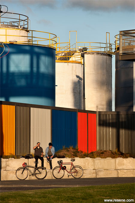
Impactful colour used to enhance and decorate the timber of the Waipa Woodprocessing Workshop by Darryl Church Architecture was awarded the Resene Total Colour Award.
Such a clever use of colour to highlight the main attraction, the Waipa Woodprocessing Workshop highlights sustainability with the broad use of natural materials while intricately using colour in highlighting.
It has used a fantastic combination of the natural screen over the stained timber to amplify both materials. This dark stain behind exterior screen makes the screen more powerful and gives an amazing play of light on the colour behind. It gives nuance of colour, creating dimension and a liveliness. The strength of green matched with the timber is reminiscent of fresh foliage and the greater environment.
The coloured stains draw attention to the key timber elements so appropriate for this educational facility. Wood is the star of the show and yet the colour has underscored this and excites it and draws your eye to the star.
Find out more about this project
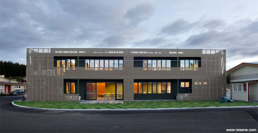
A Resene Total Colour Education Colour Maestro Award was awarded to McKenzie Higham Architecture for Amesbury School, a colourful project from tip to toe.
Immersed in colour, Amesbury School features colour in everything. Fun and engaging, the colour palette is lively and uplifting and so appropriate given its use.
The colours are linked to a central project story, different languages and cultures reflecting the internal school story and the objectives of the project so powerfully. Colours are used to designate areas, coming together as a powerful play of colour. The colours slide with ease into each other with a related palette that takes you from orange to pink to burgundy in such a delightful way.
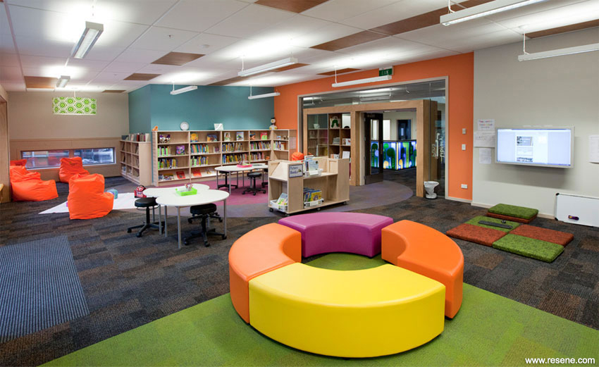
Find out more about this project
The striped finish of Avonhead School Learning Centre by Opus Architecture was also awarded a Resene Total Colour Education Colour Maestro Award.
This old building has been reinvented with delightful colourful stripes. The selection of stripes was inspired by the architecture encouraging the use of a clean and fresh colour palette. The stripes incorporate both subtle and bold colours working gloriously well together.
The look is consistent throughout the entire project with the lineal pattern being repeated, which helps to link the complete project together. The reflection of a book spine appearance is incredibly interesting and entirely appropriate for this school.
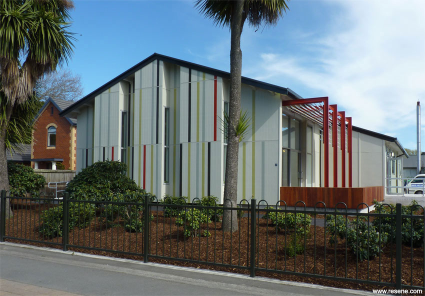
Find out more about this project
Now a busy and popular part of the Auckland landscape, a collaboration between Australian based Taylor Cullity Lethlean and New Zealand based Wraight + Associates won the Resene Total Colour Landscape Award for Jellicoe Street, North Wharf and Silo Park.
The colour scheme throws itself out to the general public arena and draws attention and interest to key elements within a broad landscape.
A beautifully rich colour palette, it is selectively used to create areas of interest to complement the silo backdrop. Colour ensures that you see the highlights as you move around the space and there is a wonderful sense of discovery as you spot something new.
The palette comes together into a nice nautical feel without resorting to a cliché.
Find out more about this project
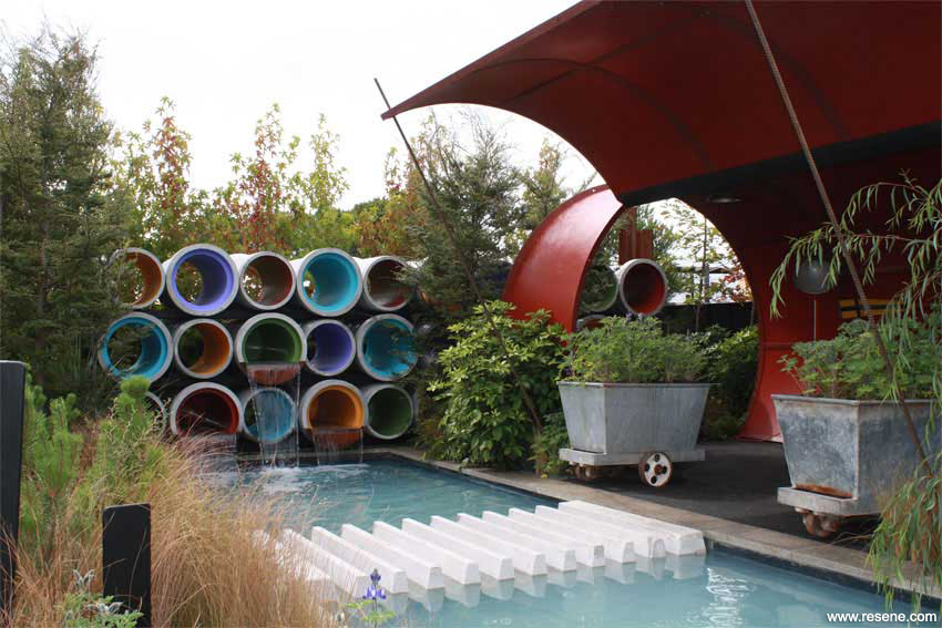
Max's Pipe Dream, a display garden by BECA, was awarded a Resene Total Colour Landscape Colour Maestro Award.
It’s exciting to see the colour used in the rounded form internal surfaces. It is unexpected and provides a wonderful sense of play and mystery as you look into the form.
The palette is fascinating – it feels very sophisticated even though the colours are almost sorbet like. It has been put together with an implicit understanding of colour as it is very hard to get these colour tonings right. The coloured pipes have a lovely integration with the water and general landscape surrounding it.
Find out more about this project
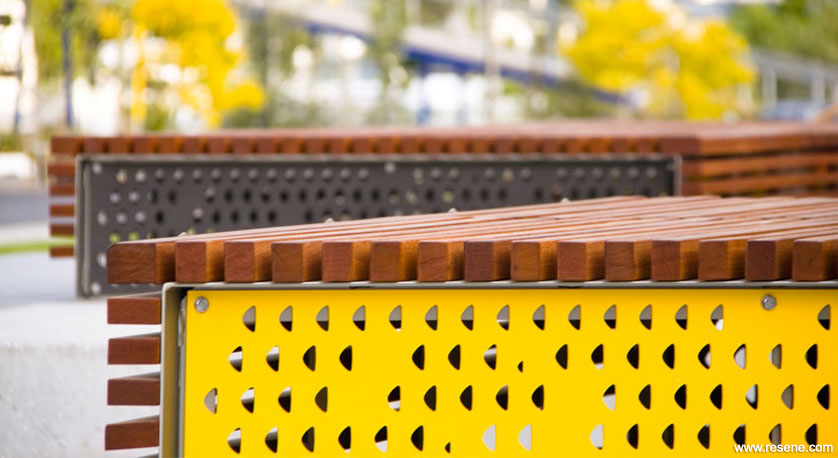
The striking yellows and metallics of London Quay by Boffa Miskell were also awarded a Resene Total Colour Landscape Colour Maestro Award.
A flash of yellow like a lightning bolt invigorates the waterfront in this project. The colour selection adds fire to the solidarity of the greys and steel and is subtle yet lively.
The judges loved that the metal was perforated and you feel as though you are looking through into the hidden depths of the colour. The perforations are unique and highlighted by the colour. It’s a glorious unified scheme.
Find out more about this project
The fusion of architecture and colour in the Arts & Crafts Cultural Mall by Grace Salisbury Mills won the Resene Total Colour Rising Star Award.
This Arts & Crafts Cultural Mall architecture has provided a great framework for colour to be used. The use of colour has been done boldly and passionately but it doesn’t dominate the architecture.
There is an element of surprise and discovery of colour, which is cleverly used to theme different areas of the space. Rather than opting for en masse end to end colour, this project takes a bold palette and carefully places it to maximum effect to contrast against the architectural backdrop. You appreciate the colour coming out to greet you.
The Resene Total Colour Lifetime Achievement Award recognising a person in the architecture and design industry who has shown dedication to innovative and excellent colour use in their work, was awarded to Di Lucas of Canterbury.
Ever since Di graduated from Lincoln with a Landscape degree she has been advocating the sensitive use of colour. Perhaps being born and bred on Bendigo Station in Otago among the muted colours of tussock and rock, she was imbued with a sense of colour as something that complemented the landscape.
In 1970s when she was working as a landscape architect with Ministry of Works she was able to change the application of paint to public structures. She had the highways maintenance teams stop putting white paint on all structures, and blue and white on bridges. She encouraged and demonstrated the use of paint colour to respect the local landscape, such as the changing of the AJ Hackett bungy bridge from primer pink to possum brown. White was only to be used for where needed for safety.
As well as doing lots of private projects, Di ran workshops and produced New Zealand’s first rural landscapes guide in 1980.
In 1982 Di was contracted by NZ Steel to design the first colour range for Colorsteel manufacture. It was a challenge to select a small range that would look good anywhere in New Zealand. For the standard range of colours she chose and named colours – Ironsand, Lignite, Scoria, Karaka, Lichen and Tussock. It’s a tribute to the enduring quality of those colours that after 30 years, five out of the six colours remain in production and are some of the most popular colours available.
It’s not only in rural areas that Di has shone, but in the use of colour for heritage buildings in towns and cities. In her warm and friendly manner, Di has had a profound influence spanning more than four decades on the way colour is used.
![]() Get inspired ! Subscribe
Get inspired ! Subscribe ![]() Get saving ! Apply for a DIY card
Get saving ! Apply for a DIY card
![]()
Can't find what you're looking for? Ask us!
Company profile | Terms | Privacy policy | Quality and environmental policy | Health and safety policy
Colours shown on this website are a representation only. Please refer to the actual paint or product sample. Resene colour charts, testpots and samples are available for ordering online. See measurements/conversions for more details on how electronic colour values are achieved.
What's new | Specifiers | Painters | DIYers | Artists | Kids | Sitemap | Home | TOP ⇧