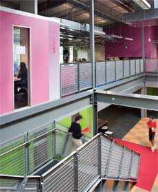
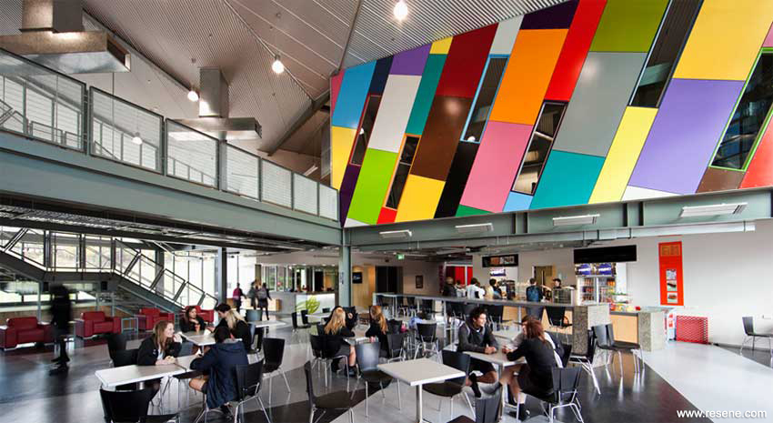
The striking colours of Albany Senior High School in Auckland by Jasmax has been awarded top honours in the Resene Total Colour Awards. The school chose between a neutral palette and a bright and bold option - bright and bold won hands down.
Resene has a long history of colour in New Zealand with colours like Resene Spanish White and Resene Pearl Lusta created over three decades ago still continuing to be top choices for decorators today. In keeping with Resene’s focus on sustainable innovations, Resene has developed its own range of non VOC (volatile organic compound) tinters to enable all Resene decorative paints to be tinted without unwanted VOCs. With thousands of Resene colours available, there’s no point having all these colours if they aren’t being used well, which led to the creation of the Resene Total Colour Awards, to celebrate and encourage creative use of colour.
Over 100 entries were received. Awards were given in ten categories: Residential Exterior, Residential Interior, Display + Product, Education, Sustainable System, Rising Star, Commercial Exterior, Commercial Interior – Public + Retail Space, Commercial Interior - Office, Lifetime Achievement, with the Colour Master - Nightingale Award for the best overall colour use.
Colour Award winners
The Resene Total Colour Master - Nightingale Award, named after the Nightingale family who founded and still run Resene today, recognises excellence in colour and paint use, and was awarded to Jasmax for Albany Senior High School. They also won the Resene Total Colour Education Award.
Colour is central to all aspects of Albany Senior High School, best summed up as a neutral tonal canvas with splashes of colour providing meaning to the vision of the school. 10 separate strong colours are introduced, one for each of the 10 learning communities and playing them off against bright carpet stripes and muted pinboard stripes.
All the school’s colours are then brought together in the heart of the school, the entry foyer, where they are all represented in a larger than life pixelated wall that encloses the library. Here the colours represent the diverse aspects of the school coming together as one, new exciting and thought provoking school.
The highway of colour draws you in; you are attracted by one and then your eye catches another. They have successfully used a huge colour palette, cohesively and in such a strong confident way.
It doesn’t necessarily look like a school, it could be any building. It’s exciting.
The entry form for the Resene Total Colour Awards 2012 will be available from this website from late summer 2012.
Find out more about this project
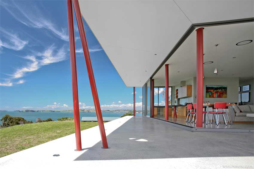
John Mills Architects of Wellington was announced the Resene Total Colour Residential Exterior winner for 60s Residence.
The exterior colour scheme is part of the interior and vice versa. The clients were open to strong, saturated colours that revitalised this gem of the aspirational 60s suburban culture.
The grey mid-blue engages with the surrounding hills, which are clad in native bush, while also delivering a crisp and confident response to the beiges and greys of the surrounding generic houses. The lively juxtaposition of colour really captures a great sense of home, a nice warm family home without being garish. The colours appropriately reinforce the 60s architecture of the house and seems reminiscent of tints that people would use to paint old baches, capturing the joys of the 60s and the days of flower power of peace and hippies.
The colour scheme has been designed to integrate the interior, to create a natural flow. It has instant appeal and a delightful sense of celebration.
Find out more about this project
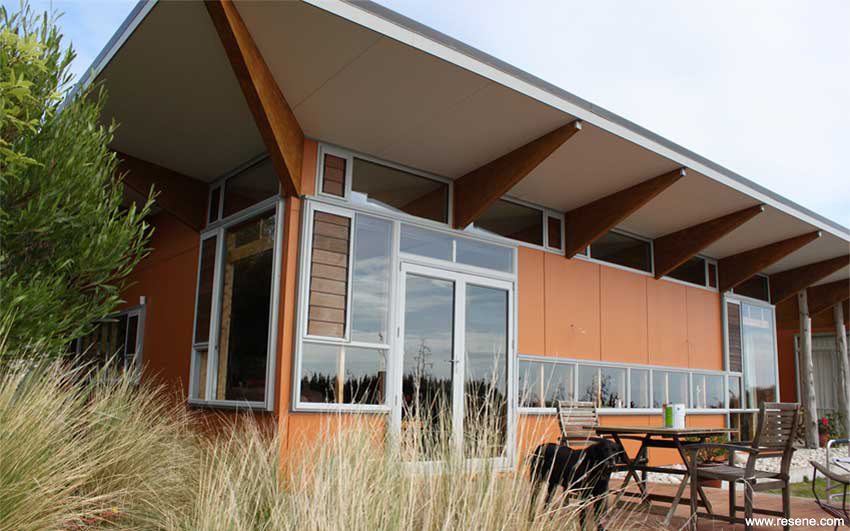
A Resene Total Colour Residential Exterior Maestro Award recognising excellence of colour use was awarded to Gordon Dalkie Architects of Christchurch for Janssen House.
Conceptually the home is a piece of driftwood caught on a rock at the water’s edge; its movement represented by mass flax planting to the bank. Colours are carefully chosen to reinforce this concept and to strongly reflect the local environment while simultaneously being bold enough to stand alone.
The anchoring form, or ‘rock’ articulated as a climbing wall accessed from the roof terrace is painted a warm light grey reminiscent of the base grey tone of local granite gravels. To contrast with this, the main body of the house was envisioned as a rich warm burnt orange brown, a colour glimpsed in wet timber and the local iron pan layer beneath the site.
This project reflects the natural environment. It rises from the ‘iron pan’ soil of the site and connects earth to house. The orange is a bold choice but it shows a lot of creativity and the inspiration from the ‘iron pan’ ensures that it is harmonious.
Find out more about this project
A Resene Total Colour Residential Exterior Maestro Award recognising excellence of colour use was also awarded to Pacific Environments Architects NZ Ltd of Auckland for Bourke House.
The original family summer cottage relocated to next door made way for a new ‘campsite’ of conceptual ‘tents’, formed as connected pavilions. Neutral colour inside provides an inviting backdrop to the exterior, with native timbers salvaged from the seashore, eclectic collections personalising and connecting to the heart. Splashes of red – from the pohutukawa tree – represents the Christmas flower of joy and celebration – a client favourite. The Resene Burgundy highlights the structural innovation of the house. Without this unexpected use of colour the house would appear bland.
The judges admired the uniqueness of the totem effect. The use of colour brings this design feature to life and helps integrate exterior to interior.
Find out more about this project
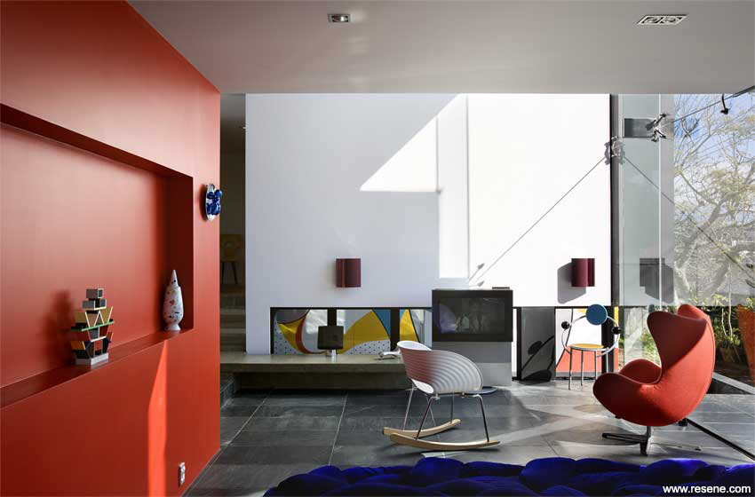
Daniel Marshall, Daniel Marshall Architects, won the Resene Total Colour Residential Interior Award for the Corinth Residence in Auckland.
Working with an existing 1960s home designed by the celebrated modernist architect Vladimir Cacala, the design intention was to provide modern living necessities while disturbing the existing house as little as possible.
The judges felt its exciting to see an architectural project enjoy the bold use of colour shown here. The colour integrated with the use of the recess and the play of shadow gives extra complexity and breaks the continuity of the colour.
It is hard to use primary colours well; it’s difficult to make a primary colour scheme work. The specific hue of red used is restless and aggressive, it advances and moves. Red rises to the ceiling but everything else is more grounded to earth, providing a natural sense of domination. Unexpectedly, because of that domination it draws you into other elements in the room.
Find out more about this project
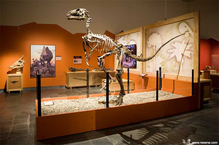
Stepping back in time with the Waikato Museum Hatching the Past exhibition, the dinosaur life inspired colour scheme won the Resene Total Colour Display + Product Award.
The colour selection for this natural history exhibition was dramatic, yet friendly and inviting for a family audience. The exhibition features a selection of eleven Resene colours, from a ‘dirty’ neutral, through spicy warm tones and swampy greens, to a mellow Resene Minx. The hearty colours, link to nature: fiery orange of rock, lush green of foliage, and deep red of blood. Colour was used to clearly define the exhibition sections for visitors. A jagged line alluding to a cracked eggshell travels the perimeter of the gallery. Resene Nero silhouettes of dinosaurs are painted on the walls to give visitors a sense of awesome scale of the creatures.
Thoughtful colours, lighting and layout work together to create a space with a sense of wonder and amazement, where a discovery takes place around every corner. The judges found the use of colour understated but powerful and sophisticated, depicting the lives of dinosaurs. Using a unique nicely bright palette of colours, the palette complements the content without overwhelming it. All elements work together with the colour helping to tell the story of the exhibition.
Find out more about this project
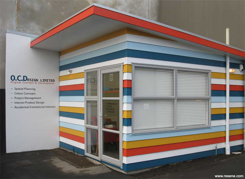
A fun and cheeky colour scheme by O.C. Design of Christchurch was awarded the Resene Total Colour Commercial Exterior Award for striking colour use on their office exterior.
The palette challenges the common use of neutral tones. In deliberate contrast from the neutral colour combinations of the other existing eight units, this dynamic colour scheme showcases the company’s creative individualism by interpreting current colour trends in a unique innovative way.
The existing cladding provided a natural inspiration for horizontal stripes along both sides of the studio. The Resene colours selected have also been incorporated in the company’s graphics creating visual balance.
The exterior is like a pair of candy striped socks. The colours are beautifully matched to each other. The colour scheme is innovative as most would have opted for just one or two colours but they have successfully used multiple colours in a small space. The use of the orange on the cantilever roof is immensely clever, it says ‘right this is the top of the building, this is where we stop’.
The exterior is cheeky. Painted neutral you wouldn’t have looked at it twice before, but now suddenly the colour has completely transformed how you interact with this space. The colour palette resonates with everyone in a different way.
Find out more about this project
Bold gargoyles with a sense of humour on Tattoo in Wellington won Archaus Architects a Resene Total Colour Commercial Exterior Maestro Award.
Tattoo is in a very eclectic area of the city. The new complex fits into its surroundings, yet stands out from the crowd. It is intense but at the same time fun and inviting.
The result is ‘city art’ for everyone and anyone to stand, gaze and deliberate. Whether you love it or hate it; it prompts conversation between those nearby, a permanent canvas for future change.
Welcoming creatures instructively beckoning you into the south main entrance and on the north these creatures are leaving, in a hurry, for the enjoyment of purely comedic visual aesthetic.
The colours were a response to combining simplicity and visual impact. The use of simple variants of primary colours allowed the exploration of a large space with elementary restrictions, while working with the infinite possibilities, with mixing each. This mural is a good example of continuity despite scale, as well as maximum impact, despite restrictions in the colour palette.
This is bold and exciting. It’s a façade of the city and has an inner city restlessness about it. We celebrate the fact that someone has gone out on a limb and injected art into the cityscape.
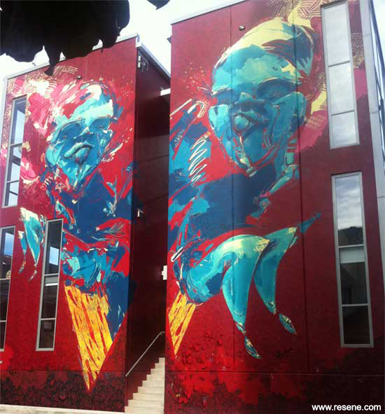
Find out more about this project
Interact Architects were awarded a Resene Total Colour Commercial Exterior Maestro Award for the traditional tonings of the refurbished century old St Anne’s Church in Wellington.
Over 100 years after it was first built, the hall has been redeveloped to meet the needs of a modern congregation and community. The project has taken seven years to come to fruition and is a result of community, Council and Historic Places Trust consultation, and a credit to the fundraising efforts of the Anglican Parish who now owns the buildings.
The new exterior colours were selected to complement the red brick of the church. The distinctly different architecture of the hall had to have an appropriate stand-alone exterior scheme, while still reading as one complex.
The exterior colour scheme is carried seamlessly into the new foyer space where the exterior fabric of both historic buildings has been retained then to the interior proper. The eclectic architecture and finishes required careful consideration of colour for a consistent feel.
This colour palette is subtle and pleasing, reflecting and respecting its era highlighting the traditional features. It’s entirely appropriate for its location and easy on the eye, making the building nestle comfortably into its surrounding.
Find out more about this project
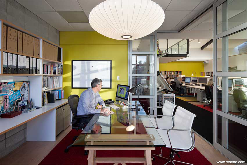
Gascoigne Associates were awarded the Resene Total Colour Commercial Interior – Office Award for their funky office fit-out.
This is a flexible and fun work environment by combining architectural simple lines and white surfaces with some quirky but easily changeable elements and plenty of colour that reflects the firm’s interior design speciality.
To create a sense of individuality for each workstation and to allow the sharing of inspirational images, Resene blackboard walls and pinboards are dotted around, which staff regularly update as they discover and share new ideas.
Hits of colour on walls, accessories and furniture add interest. Black also features strongly as a foil for all the white, which is accentuated by the huge amount of natural light that floods the space. Every surface, piece of furniture and light fitting was chosen to be practical as well as beautiful.
The colours have been used to great success emphasising the role of the business. The entire scheme works well with the bold carpet underfoot. This office shows a hugely fun, creatively vibrant use of colours.
Find out more about this project
Koru House in Wellington with its nature palette won a Resene Total Colour Commercial Interior - Office Maestro Award for Vorstermans Architects.
With multi agencies to house the fit-out was designed to provide a unified workspace to facilitate communication between agencies and support for families.
It was important that the look and feel of this facility didn’t identify with any of the individual stakeholders, needed to be vibrant and engaging for children, but also work well in an office environment. A tricky combination of requirements to meet in a single colour palette.
To capture the imaginations of the children, and aid in way-finding to multiple suites, each suite was given a theme and an identifying colour scheme, such as the toi toi suite with a beach theme, blue feature wall, sand coloured feature carpet, and beach themed art.
This is an entirely culturally sensitive use of a colour. It’s calming and reflective. The colour palette appears to fit the brief very well and works at both a practical and aesthetic level for both the clients and staff.
Find out more about this project
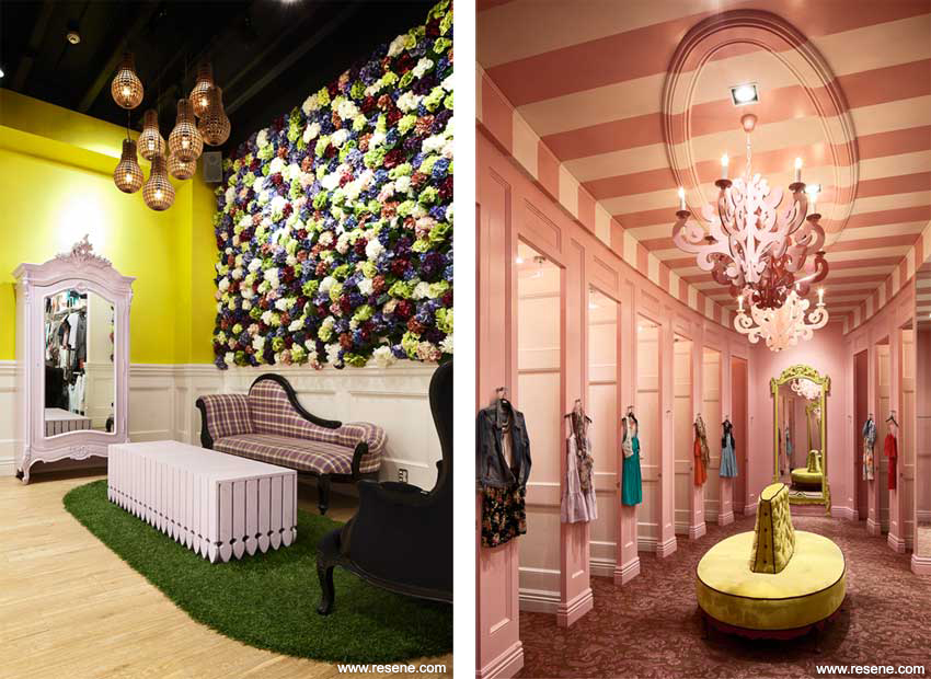
Gascoigne Associates also won the Resene Total Colour Commercial Interior – Public + Retail Award for the dressed up colour scheme at the Glassons Flagship store in Newmarket. This project also won a Resene Total Colour Nightingale Maestro Award.
Fun, whimsical and unashamedly girly – the Glassons Flagship store in Newmarket unveils each space like a story in a picture book.
The ‘Rooms of the Mansion’ theme transforms the shopper to a magical place where the fitting rooms are candy stripe pink, button hole ottomans are bright green and the door knobs are cut crystal. The overall effect is sophisticated and provides a canvas for the fast changing merchandise to take centre stage. The colour palette is predominantly a warm white allowing clothing and visual merchandising elements to take centre stage without succumbing to blandness. The plush furniture and floral wall are unexpected touches within a volume retail environment.
It shouldn’t work but it does. It is so innovative and exciting. It has a sense of humour and is entirely playful and appropriate.
The store is Inviting, the colour is very appropriate for the environment. The pink fleshy hue creates a fantasy, it is unexpected. The palette has a creative energy that encourages you to be creative and to try on clothing and combinations that you wouldn’t normally. It’s encouraging and works for the client perfectly. Fantastical, it’s like being Alice in Wonderland.
Find out more about this project
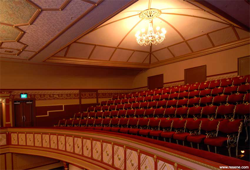
The beautifully refurbished Theatre Royal in Nelson, won Palmer and Palmer Architects a Resene Total Colour Commercial Interior – Public + Retail Space Maestro Award.
The careful conservation work within the auditorium revealed a wealth of information about previous colours used and these informed the final colour selection assembled to create a rich lustrous interior befitting the auditorium’s heritage.
An element of opulence is lent from the use of the metallic gold painted details and deep velvet fabric curtains and upholstery. The broad areas of soft warm colours embrace the audience as the auditorium lights dim. Subtle use of contrasting Resene sheens recreate an original wall panel border stencil pattern found beneath layers of paper. Darker colours of the dado and flooring solidly ground the scheme with integrity. The foyer colours mediate between the exterior and the auditorium with luxurious details on a fresh crisp background.
This project embodies a beautiful use of a large colour scheme used to pick out the heritage details. It’s completely harmonious. Different areas such as the foyer and auditorium show such harmony even though different colour palettes are used. The atmosphere reads as a strong sense of light at the entrance then moves you though to the Theatre full of ambience. It’s a very warm welcome, welcoming you through to a perfect environment for sitting and waiting in anticipation for the magic ahead.
Find out more about this project
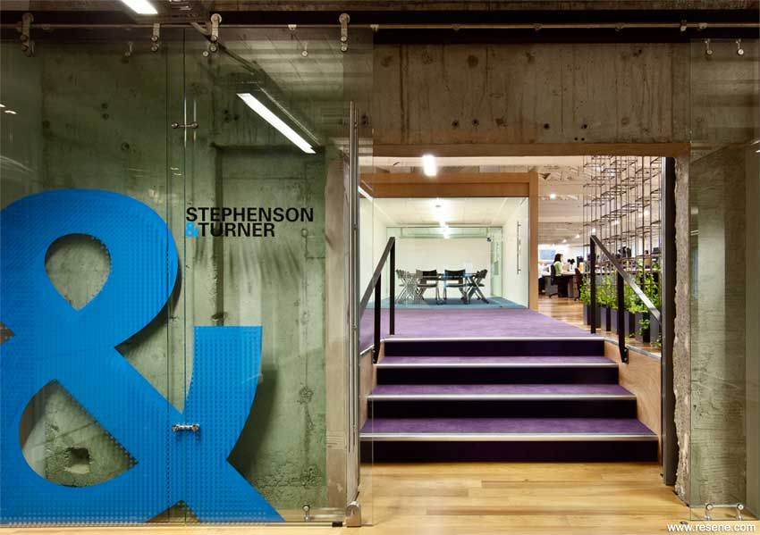
With a focus on sustainable systems, including Environmental Choice approved paints, Stephenson & Turner again took out the Resene Total Colour Sustainable System Award, this time for their Wellington Design Studio.
The fit-out has been awarded a 6 Star Green Star Interiors rating by the New Zealand Green Building Council, the first historic building in New Zealand to be awarded a 6 Green Star Office Interiors rating, the highest level attainable under Green Star, representing world leadership.
The concrete, brick and timber set a wonderful canvas for a working environment. The studio fit-out features sustainably-harvested and reused timber, daylight addressable lighting, natural ventilation, eight operable skylights, heat-pump and radiant heating as well as a green wall and strict use of low VOC Resene paints and adhesives. The result is a fresh, comfortable, open working environment all designed with the intention of promoting health and well being to employees. Clients now enter directly into the creative environment of our studio and can be actively involved in the design process. It’s a great place to work.
This project meets the criteria in every aspect; the very neutral palette and clear Resene finishes on many concrete and timber areas underscores the traditional structure of a heritage space and the need to protect surfaces.
The judges were impressed with the developed concept in this historical building. Every appropriate surface is covered and protected.
The combination of neutrals works well with other elements, and has captured the embedded energy of the building and architectural history.
Find out more about this project
The Resene Total Colour Education Award was won by Jasmax for Albany Senior High School who also took out top overall honours with the Resene Total Colour Master – Nightingale Award.
Find out more about this project
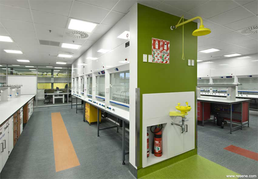
Lab-works Architecture Limited were awarded a Resene Total Colour Education Maestro Award for the Alan MacDiarmid Building, Victoria University.
The design philosophy for the laboratory spaces was to be visible from other areas and to be open to each other for the sharing of information and learning.
Working from a cohesive palette of colours, continuity between spaces is created, while still indicating separate zones. With a background of neutral tones providing the common base between areas, a vibrant and crisp family of highlight colours accentuates the design. These were paired with corresponding vinyl and joinery colours to achieve the co-ordinated aesthetic.
The colour palette reflects the serious aspects of a laboratory and intellectual space, encompassing all those elements but is sparked with the strength of the colour used. The form of the colour highlights the architecture of the space. The yellow looks like ribbon in moonlight.
The result brings an excitement and a vibrancy that contradicts the bland environment that is more stereotypical of laboratory spaces in the past.
Find out more about this project
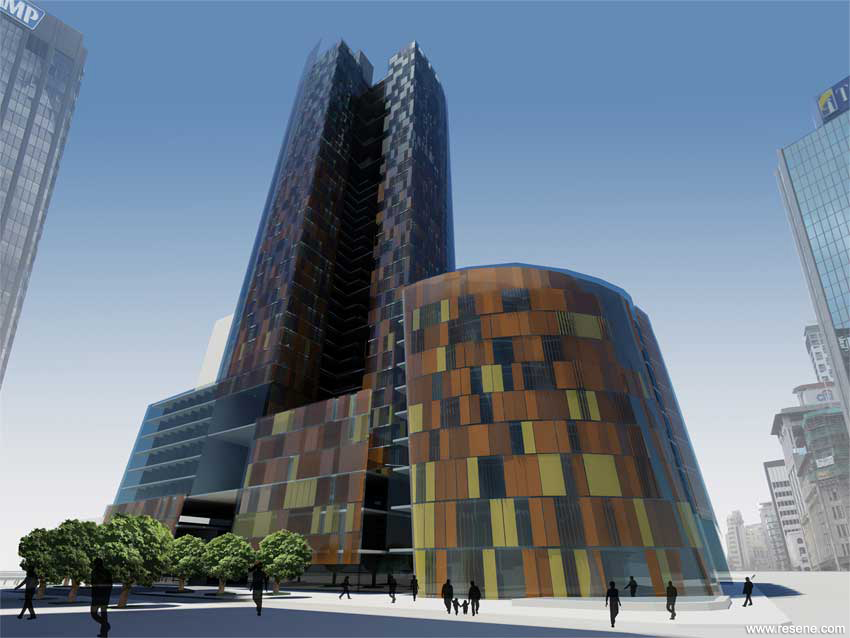
Kate Andrew, an Auckland University student, won the Resene Total Colour Rising Star Award with the Skyscraper and Connectivity project. This project also won a Resene Total Colour Nightingale Maestro Award.
Humanising an oversized building, the facade is comprised of a series of coloured vertical louvers, which can be controlled by the people occupying the accompanying space. Each set of three opaque glass louvres is coloured with Resene colours so that when pieced together the entire façade creates a constantly changing vibrant display for the downtown area. Inspired by nature, earthy colours reside near the ground and gradually fade to blues higher up the tower, almost dematerialising the building as it rises.
The concept is sophisticated and the colour palette shows a hugely mature understanding of the colour palette with the use of a wide variety of colours that work both together and in contrast.
The use of a Resene colour palette developed with glass adds luminosity and excitement; the colours have a character of their own. It is alive and exciting. The colours reflect and further develop the palette, it is dematerialising the skyscraper as it rises, and as it goes from earth to sky the colours reinforce the lines and forms of the architectural structure.
The colour is the building.
Find out more about this project
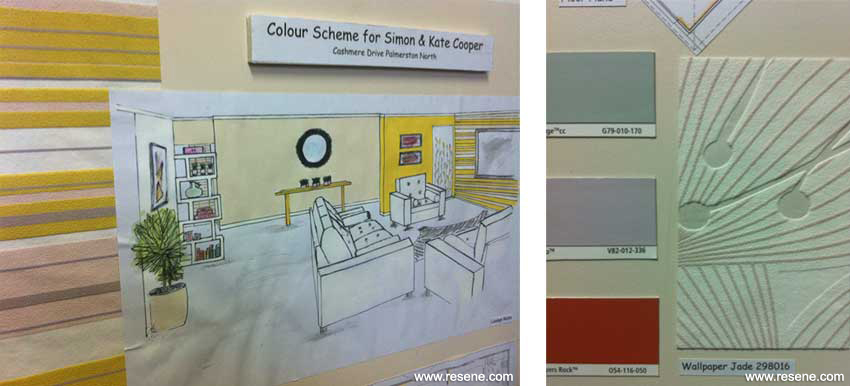
Simone Duckett and Sharon Dorman, who both attended UCOL in Palmerston North, each received a Resene Total Colour Rising Star Maestro Award for their residential colour schemes.
In Sharon Dorman’s colour selection designed for the Cooper family, the use of Resene Ipanema is delightful and unexpected. The palette has a sophisticated marrying of neutrals with the strong yellow giving a healthily fresh feeling with the use of the citrus, and wallpaper adding a lovely fresh elegance.
Inspired by the hues of the wallpaper, the colour palette has been developed well. The whole palette is quietly vibrant and the secondary palette, which on first impression wouldn’t be complementary, works together wonderfully. Complementary colours and the use of proportions shows a high level of colour understanding.
Simone Duckett’s residential colour scheme is well thought through, entirely appropriate for the brief and thought has been given to whether it is achievable and appropriate.
The living area of the family home has a bright fresh colour scheme which is both modern and timeless. The area is used for socialising, relaxing and dining by a family who appreciate both bright colour, and minimalist design. This inspired a simple grey and white scheme with a fresh accent colour to lift the otherwise monochromatic scheme.

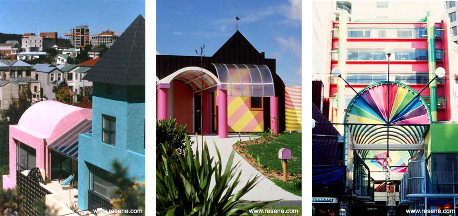
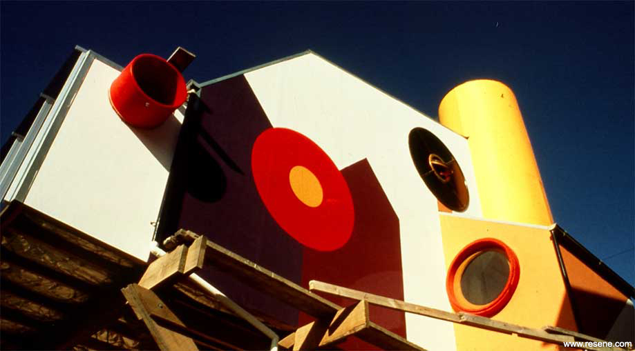
The Resene Total Colour Lifetime Achievement Award recognising a person in the architecture and design industry who has shown dedication to innovative and excellent colour use in their work, was awarded to Roger Walker of Wellington.
Roger has been producing architecture for around four decades, first graduating with honours from Auckland University in 1967. He commenced his own business in 1971 and became a member of the NZIA in 1973 and a Fellow in 1987. In 2000 he received an ONZM for ‘Services to Architecture’.
In his career he has designed an airport, service station, a primary school, a kiwi display centre, two motels, two hotels, two churches, three tourist attractions, three medical centres, four shopping centres, five childcare centres, 150 houses, 250 townhouses and 300 apartments… and counting. His work has won 17 branch, national and colour awards from the NZIA.
Roger has worked innovatively with coloured paints and enthusiastically explored any new technical developments in paint technology. He was part of the team that worked with Tony Nightingale on the original development of the Resene Total Colour system. Roger has always been a passionate advocate of colour, often wears red or yellow shoes and has never owned a beige coloured car.
![]() Get inspired ! Subscribe
Get inspired ! Subscribe ![]() Get saving ! Apply for a DIY card
Get saving ! Apply for a DIY card
![]()
Can't find what you're looking for? Ask us!
Company profile | Terms | Privacy policy | Quality and environmental policy | Health and safety policy
Colours shown on this website are a representation only. Please refer to the actual paint or product sample. Resene colour charts, testpots and samples are available for ordering online. See measurements/conversions for more details on how electronic colour values are achieved.
What's new | Specifiers | Painters | DIYers | Artists | Kids | Sitemap | Home | TOP ⇧