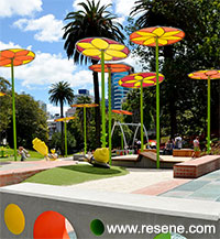
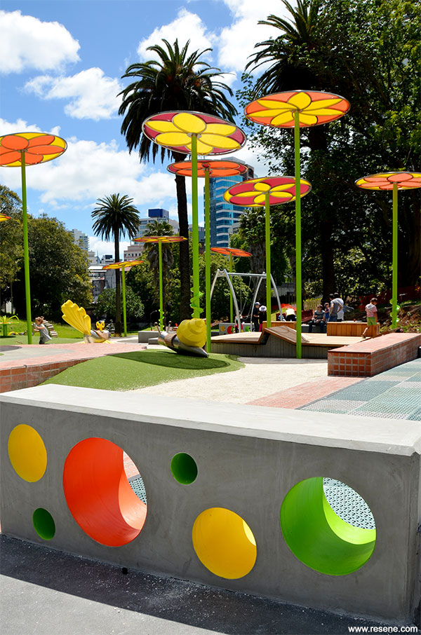
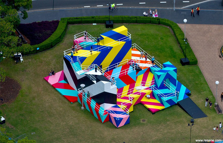
The fun colour combination on the Myers Park Playspace has been awarded top honours in the Resene Total Colour Awards for its bold colour choices that have transformed this inner-city reserve.
Resene has a long history of colour and today’s colour range of thousands of hues is a far cry from the handful that was available when Resene started 69 years ago. The Resene Total Colour Awards were launched to encourage and celebrate excellent and creative use of colour; to showcase striking colour palettes and combinations and provide fresh inspiration.
Awards have been given for the best colour use in: Residential Exterior, Residential Interior, Commercial Exterior, Commercial Interior Office, Commercial Interior Public + Retail Space, Display + Product, Education Junior, Education Senior, Neutrals, Heritage, Rising Star and Lifetime Achievement, with the Colour Master Nightingale Award for the best overall colour use.
Colour Award winners
The Resene Total Colour Master Nightingale Award, named after the Nightingale family who founded and still run Resene today, recognises excellence in colour and paint use, and was awarded to Myers Park Playspace by Helen Kerr and Haylea Muir, Isthmus. It also won the Resene Total Colour Landscape Award.
The judges described the project as fun fun fun! It’s Alice in Wonderland meets Dr Seuss, a collection of colourful park play pieces that are brought to life with bold energising colour. Even on the dullest day, the oversized characters flitting in the park in bright paint colours bring a sense of joy and playfulness, irresistible to children and their parents.
The colour cleverly contains the area and attracts children to play in one space. In a park that could easily have opted for primary colours, choosing a combination of orange, green and yellow ensures this play space doesn’t just fit with nature, it enhances it. Like a bunch of freshly picked flowers, this play space’s colour scheme has a real sense of ‘pick me up’ optimism that can be enjoyed by all ages.
Find out more about this project
Nambour Christian College Trade Skills Centre by Kirsty Newell and Cameron Conwell, Conwell Architects
The use of graduated colour cleverly guides you in and distracts you from the neighbouring building. It’s a smooth transition using a related scheme. The design team used a combination of dynamic structure and bold graduating colour to lead the eye deep into the site and to the front door of the restaurant. The colours selected reference the existing trees of the leafy campus.
It’s a practical yet colourful application with the colour bringing together a mix of building styles into connecting them into one. Blocks of colour tumbling down the wall catches the eye and helps direct guests down the new entry promenade.
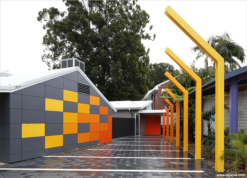
Find out more about this project
Haumoana Public Toilets by Brent Scott, Citrus Studio Architecture
As if dug into the sand like a sandcastle, this red explosion of colour on a beachfront is unique; there simply wouldn’t be another colour like it around.
The colour is used to be seen as big, to be in sharp contrast to the dull greens of the trees and the expansive blue sky. The intense red acts as a route sign, inviting a stop for a comfort break, a drink and a chance to lift your head and admire the view. Colour is used to make the blue sky appear even more intense and to highlight the natural environment surrounding.
When so many public facilities are dressed in camouflage, it is wonderful to see this one stand bold and proud.
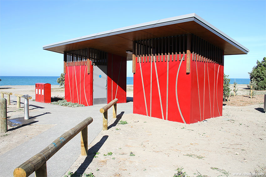
Find out more about this project
Media Merchants Office Fit-Out by Dianne de Barbera and Daniel Bullock, Bullock de Barbera Architects
Colour has been placed ever so carefully on this project, creating backdrops, intersections with materials and different visual effects as the viewer moves throughout the office space.
Colour is uplifting anchoring what is going on at the ground floor. It’s such a clever manipulation of colour highlighted by clever lighting. The palette is used to reflect the energetic and creative workplace perfectly.
With limited wall space available, the design team has cleverly used the ceiling as the main feature for maximum impact when you are moving around the space, but minimal disruption when seated and concentration is required.
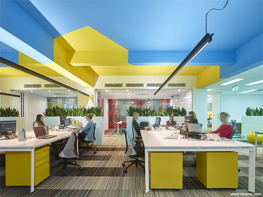
Find out more about this project
Corianders by Steve Rosling and Nancy Train, Element 17 Ltd
A courageous use of colour, this project meets the brief so well. It’s filled with jewelled sari colours that define different areas and create a vivacious interior that showcases the magnetism of Indian culture. Colour is powerfully used but is not over the top. It’s classic British Empire India meets Bollywood. Vibrant Indian spice colours are perfectly complemented by the furnishings.
It’s a chance to enjoy the taste of India through the use of colour. A feast for the eyes.
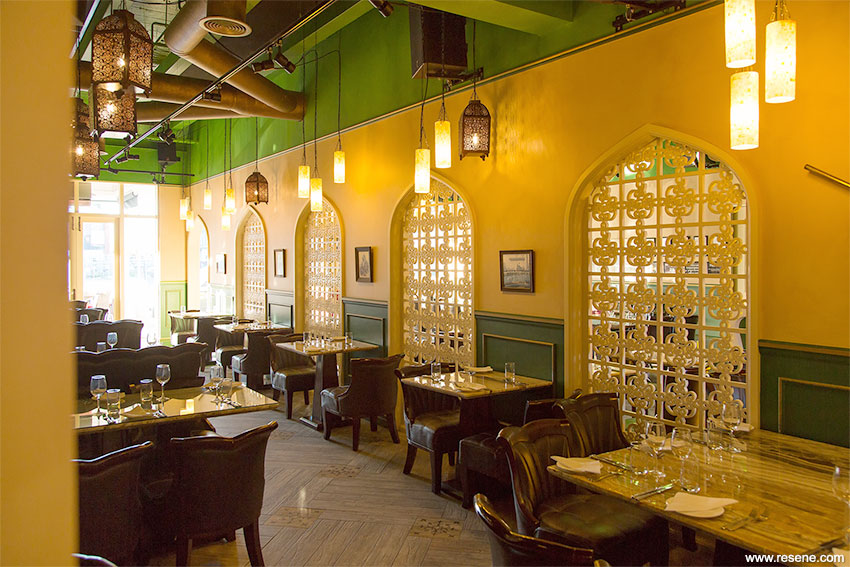
Find out more about this project
Insight Eyecare by Nicole Hamer-Nel, Ignite Architects – Interiors.
Strong colour works well with the strength of the timber; for a clinical yet comfortable and relaxing feel. The confidence of the colour and materials palette brings with it a sense of reassurance and trust with the dark and light combination providing a balance of light and depth. The timber provides a raw sense of honesty. Solid colour blocks are used with restraint drawing your eyes into the product showcases.
The palette gives an impression of a softened industrial colour palette, rich, velvety and welcoming.
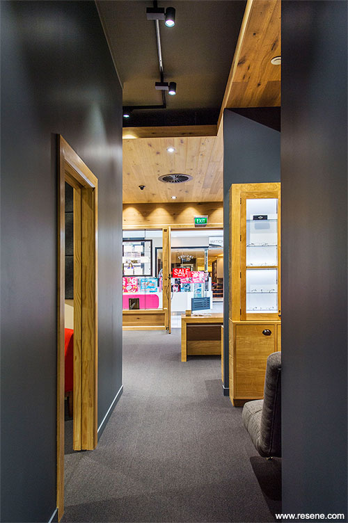
Find out more about this project
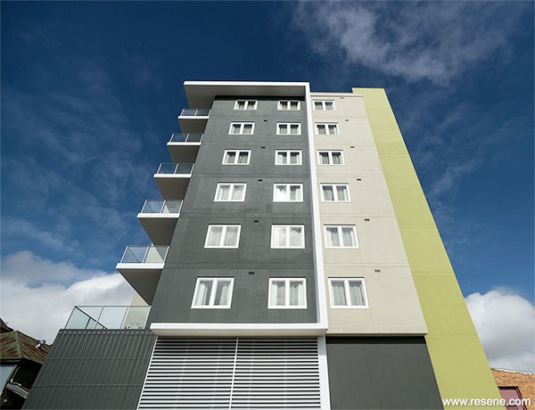
Quest Apartments Toowoomba by FKG Group
A bold combination of colours, this project combines neutral with fresh green to emphasise vertical elements.
What could easily have been all neutral, has been transformed into a sophisticated colour palette. The colour strengthens the architecture giving it added depth. It’s a completely artful delivery of colour.
The scheme provides a colour point-of-difference, easily identifiable from afar while still complementing and blending with the natural landscape of the park and gardens Toowoomba is renowned for.
Paparoa House by Lisa Day and Scott Donnell, Donnell & Day Architecture
Bringing the outside in, this colour scheme is sensitive to the exterior environment bringing elements indoors without overpowering the home. The palette shows understanding of the changing of light, and the effect of natural light and reflection on colour. The interior effortlessly links the house to the natural world, and provides a calm haven for family life. Inspired by sand, sea, sky and stone these colours seamlessly flow together as you journey through the house.
A colour scheme that remains a calm backdrop to busy life.
Find out more about this project
MDS Albany Showhome by Mark Wilson, Masonry Design Solutions
This colour scheme brings together a family of colour that you just wouldn’t expect to see in a show home where most tend to variations of whites. It’s a very sophisticated tonal colour scheme that is used and detailed well; indicating an intimate knowledge of the customer group it is intended to appeal to.
The colour palette works sympathetically with its surroundings while allowing the greenery of the golf course and landscaped gardens to stand out. It has warmth and personality without being overpowering. The depth of colour enables the use of more neutral furnishings, but is subtle enough to be a backdrop for the display of vibrant artwork.
Find out more about this project
Mobico Building by Malcolm Taylor, Xsite Architects Ltd.
In a modern interpretation of heritage, it’s so nice to see something different; a twist with the use of metallics to make reference to the period and style of the great Chicago skyscrapers that changed the skyline all over the world from the late 1890s. The line and form is strengthened with the use of colour highlighting key detailing. Simplicity is reinforced by layered colour. It’s such an admirable effort to transform an ordinary building to stand out from its mediocre surroundings.
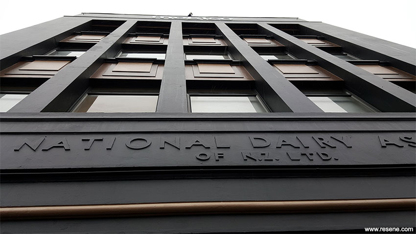
Find out more about this project
Cronulla House by Sonia van de Haar, Lymesmith
Neutrals colour schemes are often the hardest to get right. Too neutral and it becomes boring, too much contrast and it becomes uncomfortable. This home strikes just the right balance with a sophisticated well-crafted use of an achromatic spectrum. It’s a rhythmical scheme with continuity and flow as the colours easily transform from one part to another. The paint finishes are used to create spatial dynamism and 'brightness' rather than for introducing colour 'warmth'. Colour is used so well to create an impression of space. A very well considered project that has overcome the client’s ‘colour problem’.
Find out more about this project
Waiariki Institute of Technology Health + Science Building by Darryl Church and Tim Horne, Darryl Church Architecture + MOAA Architects.
Walking through this building feels like you have gone back to nature. The association of timber with green hues mimics the harmony in nature with the colour cleverly peeking out of the timber. Colour detailing is particularly appealing.
It captures the sense of a forest canopy, with elements allowing a filtering of light and shelter to play with the colour. Colour creates a dynamic and animated exterior, constantly changing in shadow and movement around the building.
Colours and interior materials are used in harmony and result in a building that is harmonious and easy to learn and work in.
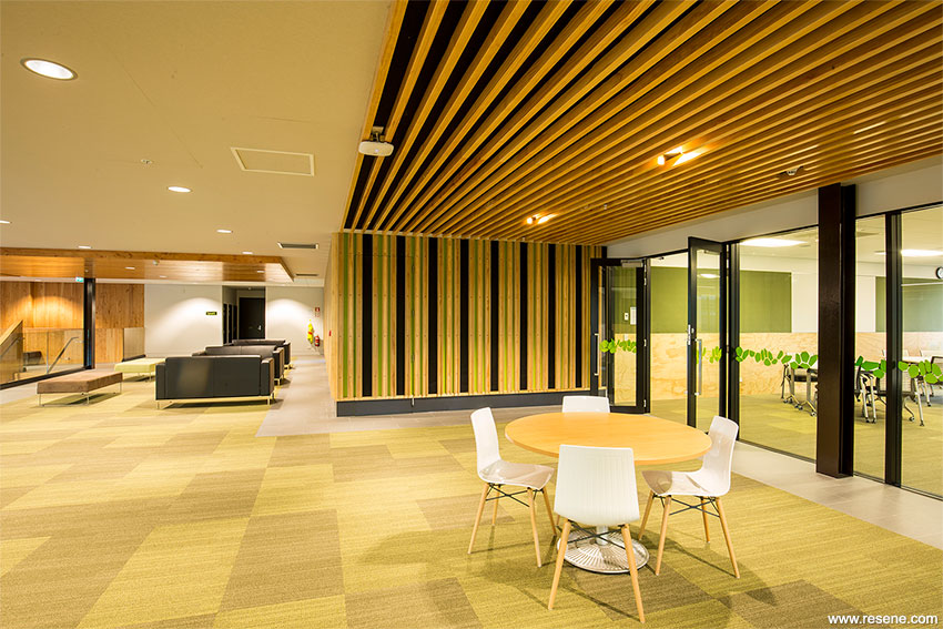
Find out more about this project
Massey University Wellington Library Redevelopment by Athfield Architects Ltd
This building is revealed and celebrated with the use of colour, layout and treatment. Colour is used to give the eye a grip on shape and provides a navigational coding device. Touches of colour are used with care to energise but not overpower the learning environment.
The palette conveys an indication of expected activity and makes points of transition to other levels highly visible. It’s fresh, modern and motivating.
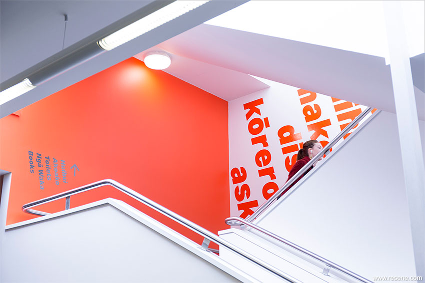
Find out more about this project
Ormiston Primary School by Kevin Sanderson and John Sofo, ASC Architects
Colour is used to reflect the history of the region bringing together the horticultural history and volcanic history.
It’s a playful colour scheme, like giant building blocks of colour. Coloured picture frames define the circulation stairs between the floors and provide a welcome to children and adults alike
The patchwork of vibrant colours is a striking contrast to the adjacent neutrally coloured residential streets. Children have a strong sense that they have arrived somewhere different, vibrant and stimulating, ready for a new day of adventures and learning to begin.
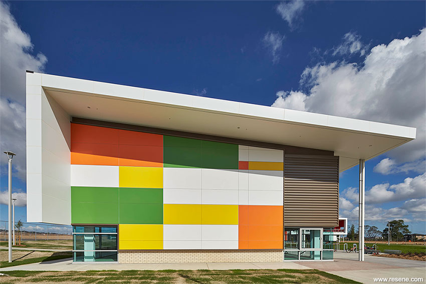
Find out more about this project
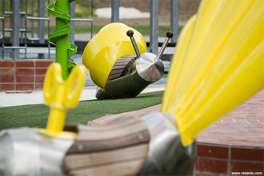
Makespace and learning centre by Brown Graham
This project shows that limited resources don’t need to limit your ability to bring innovation and colour to a project. The unexpected palette of colours, ranging from blues and greens to highlights of warm hues sparks the imagination and create inspiring spaces. By using elements of colour contrasted by timber, the timber becomes the neutral background and each colour appears more visible. The strength of structure is highlighted by colour. The use of engaging colours has instant appeal to children of all ages.
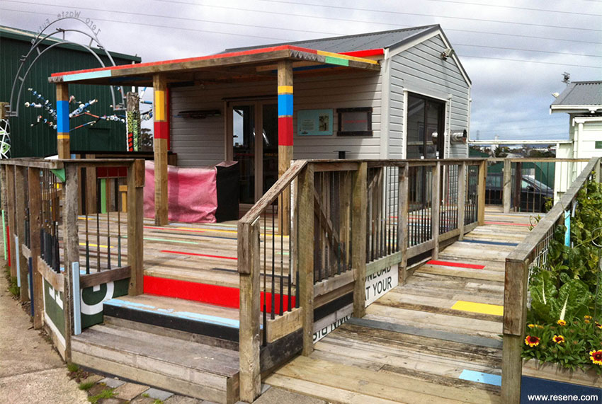
Find out more about this project
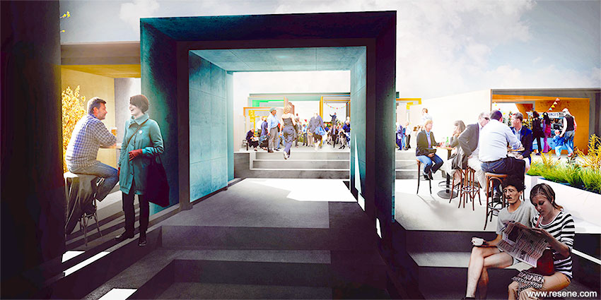
'Higher Ground' by Maser, a Sydney Festival commission
Lively and exciting, this project sizzles like Sydney. The colour contrast is exceptional and draws attention. Without colour, this installation would be completely ordinary; with colour it’s completely memorable.
The striking geometric patterns and use of a bold palette of primary colours works extremely well and is a spectacular effort for what was a fortnight of festival. The colour scheme does complete justice to the largest public artwork ever undertaken by Maser. A flawless use of colour.
Find out more about this project
Myers Park Playspace by Helen Kerr and Haylea Muir, Isthmus
This area has been transformed by colour. Oversized sculptures painted in bold colours meet a variety of areas to play. The colour selection is carefully considered to provide a playful escape. Colour was a key element used to instil an uplifting and cheerful feeling, creating and nurturing a positive social atmosphere, while highlighting the verticality of the pods. The colours are bright and quirky evoking feelings of overgrown backyard garden plots.
With colours like these, playtime is all the time.
Find out more about this project
Bridge with Coffee and Karaoke by Alasdair Mott
In this project, the power of colour stimulates conversation. The colour adds an informality and liveliness to the structure. The contrast between intimate spaces and extroverted spaces is emphasised through the use of colour. Neutral colours and vibrant colours chosen individually strengthen the juxtaposition of activities on the bridge. Dark colours contrast and accentuate the lighting to form cosy and intimate spaces.
The colours are intrinsic to the characterisation of intimate and extroverted spaces.
(selected by Resene)
Designer, paint finisher, writer, tutor, public speaker, decorator and more captures the 30+ year career of Sylvia Sandford. Her passion for house and home and making the most of space has inspired many a student and been enjoyed by many a client. Her colour expertise has touched homes all over New Zealand and her wealth of knowledge is sought after for published decorating features, such as for Mindfood Décor.
Sylvia has made colour and design study accessible to students all over New Zealand with her long running Open Polytechnic colour and decorating course. Sylvia was also the Resene Colour Ambassador for many years travelling the country and appearing in the media encouraging decorators to embrace colour in their projects when previously decorators had been used to a limited range of pastel and neutrals choices.
Sylvia lives and breathes colour and design and is always willing to share her knowledge and encourage others to discover, develop and indulge their love of colour and design too.
![]() Get inspired ! Subscribe
Get inspired ! Subscribe ![]() Get saving ! Apply for a DIY card
Get saving ! Apply for a DIY card
![]()
Can't find what you're looking for? Ask us!
Company profile | Terms | Privacy policy | Quality and environmental policy | Health and safety policy
Colours shown on this website are a representation only. Please refer to the actual paint or product sample. Resene colour charts, testpots and samples are available for ordering online. See measurements/conversions for more details on how electronic colour values are achieved.
What's new | Specifiers | Painters | DIYers | Artists | Kids | Sitemap | Home | TOP ⇧