Auckland
The event ‘Don’t Play with your Food!’ was part of the 2016 Sydney Design Festival.
The three course performative dinner aimed to take guests on a multi-sensory journey, using a unique collaborative practice that merged gastronomy, performance and spatial design practices.
Focusing on the tension between the senses a space was set up where food wasn’t just an addition to the experience but is in fact the experience itself. Through interactive elements, the space was activated through the body’s senses, manipulating and encouraging the body to act and react to certain stimulants. With edible architecture and gastronomic delights this was a dining experience like no other.
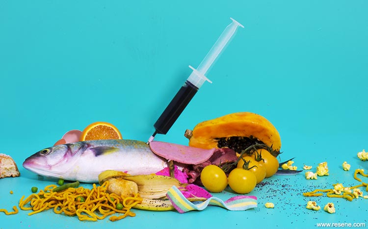
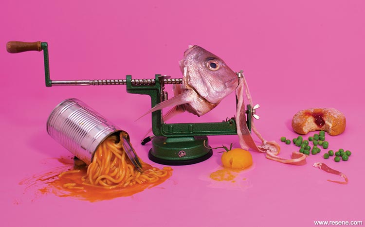
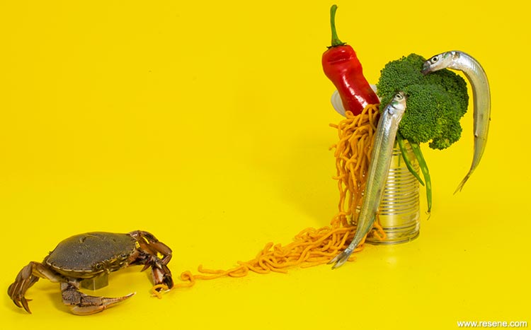
The team and advisors from The Sydney Design Festival used these images to promote the event through the program, website and ticketing. The images aimed to excite guests about what to expect at the event, without giving too much away. The photographs were curated to allude to aspects of tension between the senses but still leave guests a little baffled as to what they would be confronted with on the night. The tension is evidently displayed through the juxtaposition of the food with the Resene colours – Resene Dali, Resene Shocking and Resene Teddy.
Generally blue and orange always contrast well with one another but Resene Dali took this concept to another level, allowing for the orange ColdFusion food to really ‘jump out’ at the viewer. Initially favoring the warm feel of Resene Shocking and Resene Teddy, Resene Dali served as the focal colour of the hero image for the event.
Resene Shocking served as the ultimate foreground for snapper, frozen peas and popcorn. The conflicting visuals created a sense of confusion as to what guests should expect. Resene Teddy allowed for every object/food item in the ‘scene’ to contrast with the foreground. The warmness of the yellow created a striking image but also alluded to a sense of delight, which was not as evidently displayed in the other images.
Creative: Harriet Beex and Matthew Torr
Photographer: Andrew Lowe
Photography supervisor: Cornelius Generates
Project: Resene Total Colour Awards 2016
Resene case studies/awards project gallery
View case studies that have used Resene products including many from our Resene Total Colour Awards. We hope these projects provide inspiration for decorating projects of your own... view projects
Total Colour Award winners:
2023 |
2022 |
2021 |
2020 |
2019 |
2018 |
2017 |
2016 |
2015 |
2014 |
2013 |
2012 |
2011 |
2010 |
Entry info
Latest projects | Project archive | Resene news archive | Colour chart archive
![]()
![]() Get inspired ! Subscribe
Get inspired ! Subscribe ![]() Get saving ! Apply for a DIY card
Get saving ! Apply for a DIY card
![]()
Can't find what you're looking for? Ask us!
Company profile | Terms | Privacy policy | Quality and environmental policy | Health and safety policy
Colours shown on this website are a representation only. Please refer to the actual paint or product sample. Resene colour charts, testpots and samples are available for ordering online. See measurements/conversions for more details on how electronic colour values are achieved.
What's new | Specifiers | Painters | DIYers | Artists | Kids | Sitemap | Home | TOP ⇧