Onehunga, Auckland
Colour was a huge part of the success of this project. With a limited budget, the priority was to create complex space within a simple form.
The designer owner team asked themselves if we were our own clients – and footing the bill – what sort of architecture could we create? What would be abandoned, what would we prioritise? And is good architecture even possible in bland, hemmed-in suburbia with a first-home buyer budget?
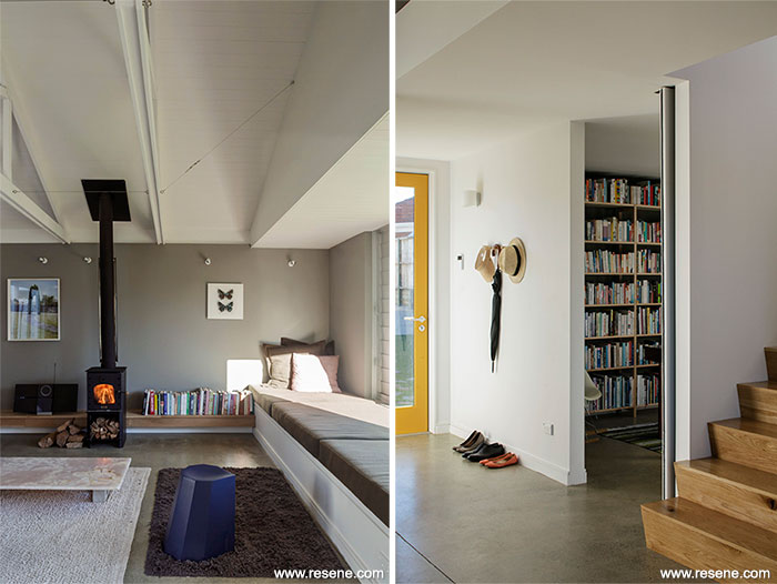
This 115 square metre home aimed to be small but perfectly formed. Rich, complex space was the priority but with the budget and site limitations it needed to be forged from a simple, rectilinear form. A barn-like structure with inverted trusses that hang into the double-height, open plan space demarcates rooms within – soaring over the dining area and levelling off over the living room. The trusses are expressed on the exterior in the cedar-clad triangular forms.
Moreover, they wanted to create a house that was playful but seriously designed, that was considered and considerate, and that didn’t use budget as an excuse but as a springboard. What has resulted is a light-filled home that responds to and challenges its suburban environment.
Colour was a huge part of the success of this project. With a limited budget, the priority was to create complex space within a simple form rather than spend a lot of budget on rich and textured interior materials or finishes. Colour then became essential in helping to delineate and define spaces as well as make the space feel playful and considered. Colour has been used to amplify and draw attention to architectural elements so there is synergy between the design and the paint.
They spent a great deal of time finding the right colour palette, which didn’t feel bright or garish, but still added personality and colour to the space. The colours chosen all have a muted, muddy feel so that they work well together.
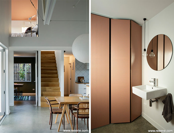
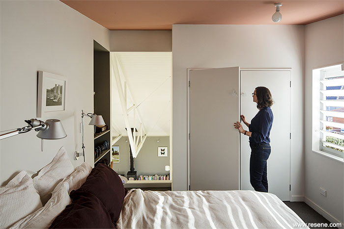
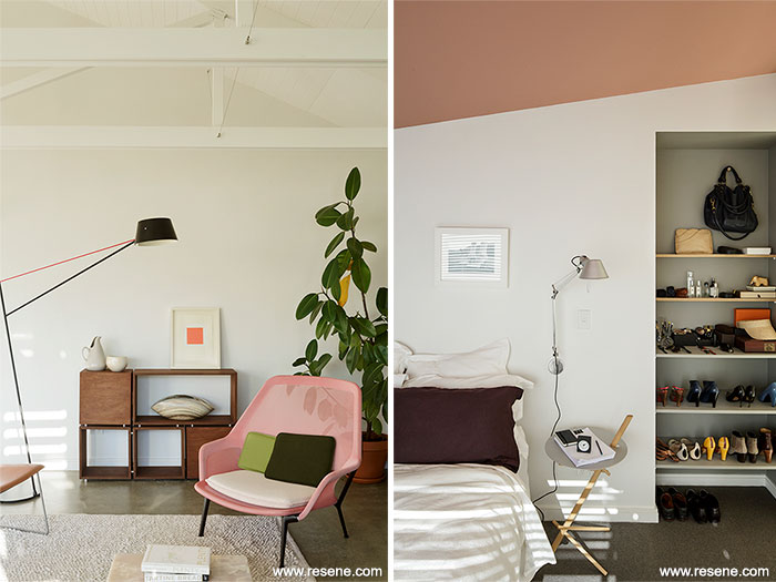
The main feature of the house is the lofty double height space with inverted trusses. All spaces connect with this central area including the upstairs bedroom. The view into the bedroom from below is up at the ceiling providing an opportunity to use colour in an unusual and distinctive way, which would add to the layering in the living spaces and highlight the view up through the trusses without overwhelming the bedroom. The choice of a dusty, rich pink Resene Bonanza in Resene SpaceCote Flat added some fun and whimsy to the space but kept it within a sophisticated, subdued palette. This same colour was used in the laundry/bathroom to highlight the floor to ceiling pegboard custom doors that shut seamlessly to hide the laundry. In the main living space, the living room was defined by the low back wall painted in Resene Friar Grey. The white trusses are brought into relief with this back wall in grey. This carries on and wraps into the window seat nook. This idea of articulating nooks through colour carries throughout the house so that a dressing table nook in the bedroom, the pantry and built-in shelves in the bathroom are all painted in Resene Friar Grey.
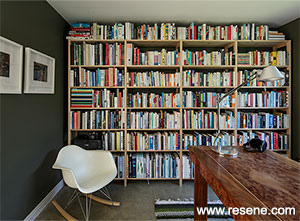
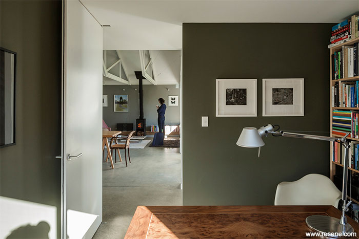
Downstairs the aim was to separate the downstairs study from the main living spaces even if the wide pivot door was open. Colour was used to make this feel dark and cosy. Resene SpaceCote Flat in Resene Raptor is a greeny-grey and felt particularly appropriate as an elegant backdrop to the library.
Resene Black White is used throughout because it is a clean, fresh white with that same grey base as the other colours in the palette.
The front door was painted with Resene Dixie Chick. This is a mustardy yellow and tones with the other muddy colours in the interior palette. The brightness works well against the soft grey of the exterior cedar and helps to identify the front door as well as setting a fun and playful tone for the house.
Architectural specifier: Henri Sayes
Building contractor: Koru Builders
Colour selection: Henri Sayes, Nicole Stock,
Amelia Holmes
Painting contractor: Leon Turner
Photographer: Patrick Reynolds
Winner: Resene Total Colour Residential Interior Award
Project: Resene Total Colour Awards 2014
Resene case studies/awards project gallery
View case studies that have used Resene products including many from our Resene Total Colour Awards. We hope these projects provide inspiration for decorating projects of your own... view projects
Total Colour Award winners:
2023 |
2022 |
2021 |
2020 |
2019 |
2018 |
2017 |
2016 |
2015 |
2014 |
2013 |
2012 |
2011 |
2010 |
Entry info
Latest projects | Project archive | Resene news archive | Colour chart archive
![]()
![]() Get inspired ! Subscribe
Get inspired ! Subscribe ![]() Get saving ! Apply for a DIY card
Get saving ! Apply for a DIY card
![]()
Can't find what you're looking for? Ask us!
Company profile | Terms | Privacy policy | Quality and environmental policy | Health and safety policy
Colours shown on this website are a representation only. Please refer to the actual paint or product sample. Resene colour charts, testpots and samples are available for ordering online. See measurements/conversions for more details on how electronic colour values are achieved.
What's new | Specifiers | Painters | DIYers | Artists | Kids | Sitemap | Home | TOP ⇧