Wellington
The brief for the new workspace was to create a secure testing lab, a fun and collaborative breakout environment and a strong brand presence throughout fit-out.
Catalyst was engaged to design a new office environment in new premises for Qual IT, an IT company who specialises in software testing solutions. Forced to relocate due to strengthening work in their existing location, Qual IT saw the relocation as an opportunity to step their workspace up to the next level. The existing offices were spread over two floors in a heavily partitioned building which isolated the teams from each other and lacked a collaborative hub.
The move allowed all the staff to be located on a single floor and brought the management team closer to the rest of the staff. In addition to this, the brief for the new workspace was to create a secure testing lab, a fun and collaborative breakout environment and a strong brand presence throughout fit-out. The founding directors had applied their own flair in the existing offices, strongly influenced by a passion for retro styling and a ‘star-trek’ culture. The youthful and fun sci-fi culture was to be reflected in the new offices but to be translated in a professional and contemporary way.
Our aim was to bring a contemporary crispness and continuity to the fit-out while retaining the ‘retro-treky’ culture. Importance was placed on the reception and meeting areas, IT test lab and a fun, social breakout space. Layout, colours, wall finishes, graphics, joinery and furniture selection were the key components used to express the company culture.
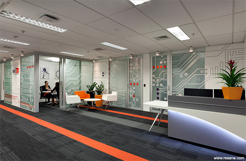
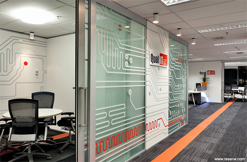
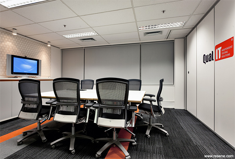
The reception was created to be a welcoming area with a strong brand personality. Sliding glass doors and an operable wall used in the adjacent meeting and training spaces allows the area to be opened up for flexible use of the space. A star-trek inspired reception counter and waiting furniture sit in front of the wall graphics inspired by computer circuitry and to reflect the star-trek ‘bridge’. To tie in the brand, all elements of this space reflected their branding colours of orange, purple, grey and white.
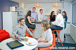
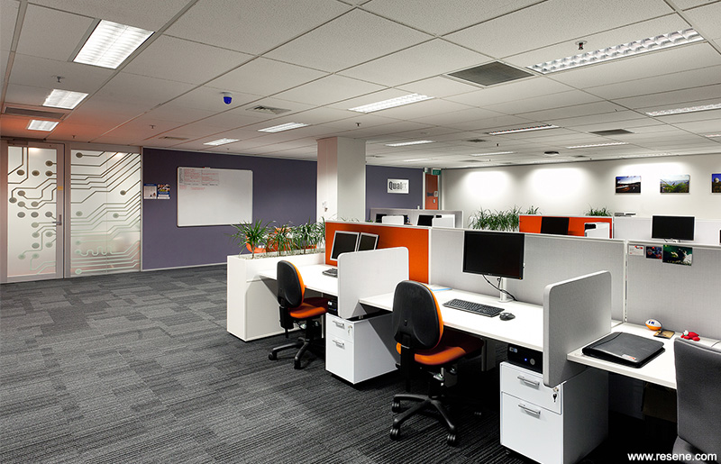
The IT test lab brought a number of teams together into a single work area, and a new linear workstation style was used to enhance collaboration. Planters on top of storage units were used to break up the space and add another dimension of texture and colour to the area. The breakout space with bar leaner, techie looking bar stools and chair, and bean bags creates the social hub of the floor and promotes a fun, social environment. An operable wall between the breakout area and adjacent project room allows the space to be enlarged for staff gatherings.
The star-trek brief provided a challenge as it needed to be translated in an appropriate way for a contemporary office environment without overdoing it. It was a fun brief to work with allowing creativity and produced the outcome of a strongly personalised company image.
The feature colour selection was based around the client’s existing brand colours of strong orange and purple that was used in all facets of the company’s branding. The brief from the client was to make use of these colours in the fit-out without these colours overwhelming the space.
Resene Quarter White Pointer was used as the main wall colour to create a crisp, clean, high tech background to the fit-out. Resene Mobster, a dusty desaturated purple, was used as a feature wall in the Test Lab area to break the expanse of white wall area and to define the part of the Test Lab used for informal meetings. It was also used on the walls adjacent to the lift core walls and one wall of the kitchen to make these walls sit back from their surrounding areas.
Resene Rose Of Sharon, a strong orange colour was used in reference to the corporate orange. The existing corporate orange paint colour was very vibrant and again, was not suited for use in the interior environment. It was modified to the slightly softer Resene Rose Of Sharon and features on a short wall in the test lab and as a feature wall in the toilets. It brings vibrancy to the space.
This colour palette of crisp white, strong orange and dusty purple was applied to the other finishes with the addition of silver and charcoal grey colours. The furniture and joinery are predominantly white and silver grey with splashes of orange appearing in the workstation screens, chairs and a detail trim in utility joinery units. Wall graphics in the reception area feature vinyl stripes and dots in orange and purple. Two white faux leather waiting chairs, contrasted by one upholstered in a slightly textured orange PVC fabric sit in front of the wall graphics.
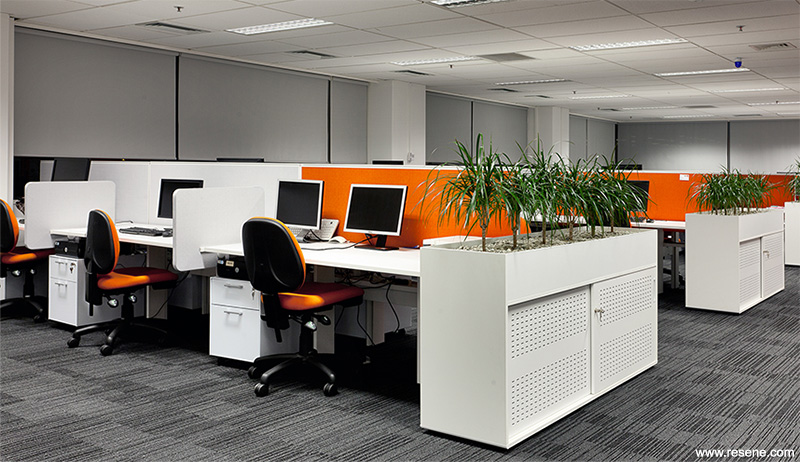
Black, silver-grey and orange stripes in the charcoal carpet tiles, assisted in linking the colour selection throughout the fit-out. The new offices were in a refurbished office space so the fit-out had to compromise with the challenges which came with the older existing layout. The project had to deal with existing site defects such as unlevel floors, and damaged existing surfaces.
All new and existing walls were painted in Resene Zylone Sheen, selected for a contemporary look and to minimise the appearance of any blemishes that were present in existing walls which remained.
Paint quality doors were painted in Resene Lustacryl, a semi-gloss waterborne enamel, tinted to Resene Half Friar Grey. It was selected for its durability and the absence of odours associated with enamel paints traditionally used for such applications. The semi-gloss finish was selected intentionally, to conceal blemishes where existing doors were reused.
Both the client and design team enjoyed the design process; the client offered up challenging briefing elements at times to which the designer responded by pushing the client’s boundaries. The feedback from the client is extremely positive – they enjoy their new workspace and are proud to showcase themselves to their clients. Thanks to the successful incorporation of their brief and colour scheme they have continued to use us for fit-outs around the country.
Architectural specifier: Catalyst Consulting
Client: Qual IT
Painting contractor: Le Prou Decorators
Photographer: Grant Heighway, Catalyst Consulting
Project: Resene Total Colour Awards 2013
Resene case studies/awards project gallery
View case studies that have used Resene products including many from our Resene Total Colour Awards. We hope these projects provide inspiration for decorating projects of your own... view projects
Total Colour Award winners:
2023 |
2022 |
2021 |
2020 |
2019 |
2018 |
2017 |
2016 |
2015 |
2014 |
2013 |
2012 |
2011 |
2010 |
Entry info
Latest projects | Project archive | Resene news archive | Colour chart archive
![]()
![]() Get inspired ! Subscribe
Get inspired ! Subscribe ![]() Get saving ! Apply for a DIY card
Get saving ! Apply for a DIY card
![]()
Can't find what you're looking for? Ask us!
Company profile | Terms | Privacy policy | Quality and environmental policy | Health and safety policy
Colours shown on this website are a representation only. Please refer to the actual paint or product sample. Resene colour charts, testpots and samples are available for ordering online. See measurements/conversions for more details on how electronic colour values are achieved.
What's new | Specifiers | Painters | DIYers | Artists | Kids | Sitemap | Home | TOP ⇧