Auckland
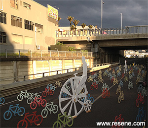
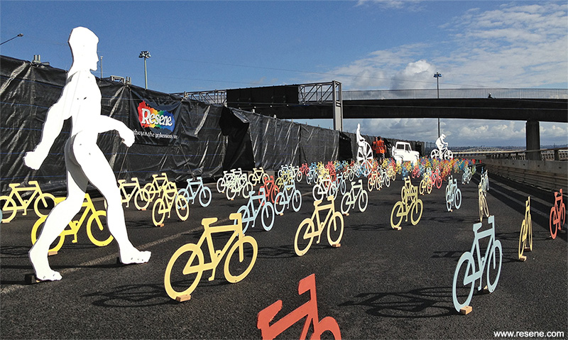
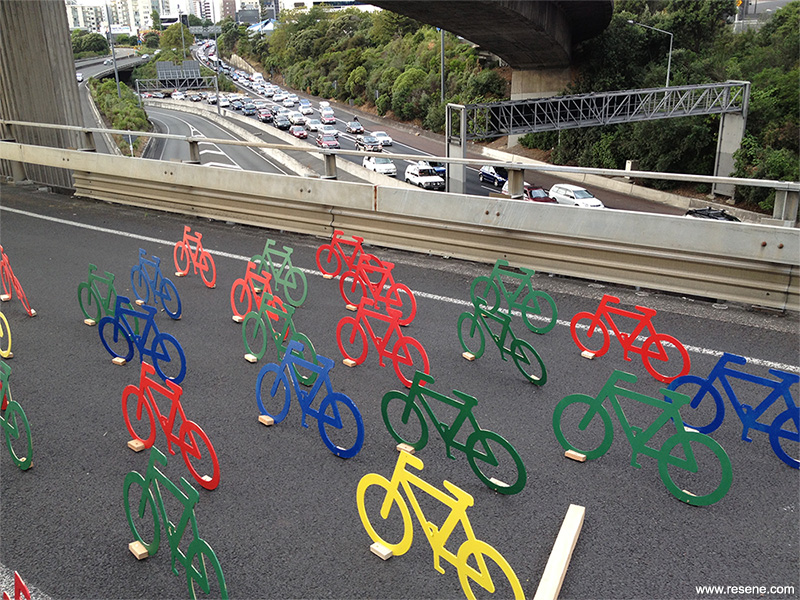
The visual statement was based around five moments, describing the evolution of transport. These five pieces would be surrounded by 365 stylised bikes identifying every day of each year that the off-ramp is not used to its full potential.
Over the last three years, matter have been working with several parties with the united goal of making Auckland a more user friendly place, releasing the ‘missing link’ document and being involved in the ‘cmj’ master plan based around creating spaces for both pedestrians and cyclists throughout the city. A particular area of interest has been the old Nelson Street off-ramp and the reuse of this existing asset.
Given the chance to use the off-ramp as a canvas on which to create an art installation, was an opportunity not to miss. Urbis Designday provided the forum through which the public would see the art piece, and also enabled us to collaborate with Resene.
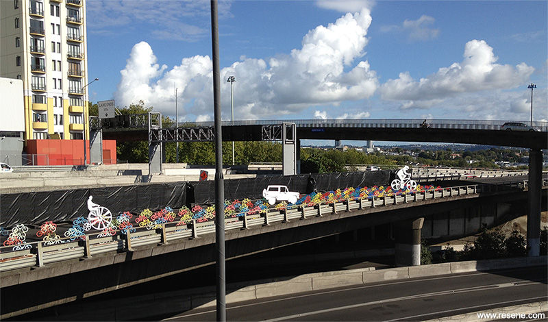
The question became how to engage with the public on an 800 metre stretch of abandoned concrete, suspended above and below their heads, in clear view but forgotten.
We approached the art piece with the idea that the general public was our client, and therefore we were very interested in obtaining as much involvement from them as possible. Through various mediums we posed the question ‘how would you like your city to move you?’ The vague parameters of the question resulted in some fantastic responses ranging from ‘better sunsets’ to ‘a more authentic ale culture’. All responses had the same feeling of the desire for a more involved community and human friendly spaces.
This social consciousness provided much food for thought during the conceptualising process. We went through many possible scenarios from prayer flags to catapults... after many safety meetings with the NZTA we decided the most achievable scenario would be a subtle yet engaging political statement based on future possibilities that may one day manifest on the motorway.
This idea materialised into a huge amount of work. The visual statement was based around five moments, describing the evolution of transport. These five pieces would be surrounded by 365 stylised bikes identifying every day of each year that the off-ramp is not used to its full potential.
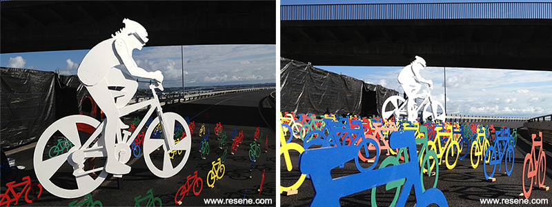
The colour scheme merged with the overall concept of the installation, collaborating with the idea of evolution through the use of vintage hues through to vibrant modern selections, suggesting the passage of time with the use of colour. The beautiful result of using such vibrant colours was the contrast they provided against the background of an industrial space where cars usually rule. The colour palette included Resene Lumbersider tinted to Resene Forbidden, Resene Smashing, Resene Red Hot, Resene Red Red Red, Resene Material Girl, Resene Southern Cross, Resene Elvis, Resene Captain Cook, Resene Wild Thing, Resene Flourish, Resene Koru, Resene Hemisphere, Resene Kandinsky, Resene Submerge, Resene Escape, Resene Robin Hood, Resene Kaitoke Green, Resene La Luna, Resene Melting Moment, Resene Spotlight, Resene First Light, Resene Sentimental, Resene Double Bianca, Resene Quarter Thorndon Cream, Resene Half Breathless, Resene Black and on the five large sculptural pieces, Resene White.
AUT students provided much needed assistance in preparing the elements ready for the installation.
Installing the bikes was like being in an old 80s rock band. All team members had fluoro high visibility vests on and were surrounded by heavy metal and speed. The views and energy of the offramp space are magic. After three days of installation, as the sun rose on Urbis Designday, the creation could be viewed in its entirety.
The entire art piece was in place for barely a day, vanishing in the evening, hopefully to live on as an engaging remainder of what could be.
Architectural specifier: matter
Other key contributors: Auckland Transport (allowed use of the old Nelson Street off-ramp),
AUT (space and student assistance)
Project: Resene Total Colour Awards 2013
Resene case studies/awards project gallery
View case studies that have used Resene products including many from our Resene Total Colour Awards. We hope these projects provide inspiration for decorating projects of your own... view projects
Total Colour Award winners:
2023 |
2022 |
2021 |
2020 |
2019 |
2018 |
2017 |
2016 |
2015 |
2014 |
2013 |
2012 |
2011 |
2010 |
Entry info
Latest projects | Project archive | Resene news archive | Colour chart archive
![]()
![]() Get inspired ! Subscribe
Get inspired ! Subscribe ![]() Get saving ! Apply for a DIY card
Get saving ! Apply for a DIY card
![]()
Can't find what you're looking for? Ask us!
Company profile | Terms | Privacy policy | Quality and environmental policy | Health and safety policy
Colours shown on this website are a representation only. Please refer to the actual paint or product sample. Resene colour charts, testpots and samples are available for ordering online. See measurements/conversions for more details on how electronic colour values are achieved.
What's new | Specifiers | Painters | DIYers | Artists | Kids | Sitemap | Home | TOP ⇧