From Habitat magazine - issue 28
A palette of coastal-inspired colours lends elegance to this historic villa.
One room in this elegant two-storey villa missed a colour conversion. It’s the only neutral space in a series of skilfully coloured rooms. Jokes the owner: “I sneaked it in through the back door. I had to have one white room just in case I hated all the others.” Luckily, she loves ‘the others’ – bedrooms, living areas and the exterior. Each are distinctive, yet are part of a harmonious whole.
Inside this historic home in central New Plymouth the dominant colours are soft blue and green balanced by navy and grey – all unified with Resene Albescent White as the main neutral colour.
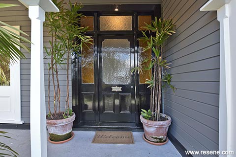
Outside, Resene Wireless is teamed with the same white and finished off with a black roof, gables and a Resene Black front door.“We used Resene Albescent White everywhere with both the exterior and interior,” says designer Mike Mansvelt, who has worked with the family on previous projects, advising on both the interiors and garden design. “It’s a really great go-to white – creamy, not too cold. You could put any colour with it and it would look good.”
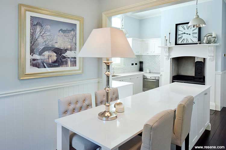
Restful Resene Quarter Duck Egg Blue was used in the kitchen where an island bench extends to look like a dining table. The existing timber joinery was painted over with Resene Albescent White and the old fire surround retained.
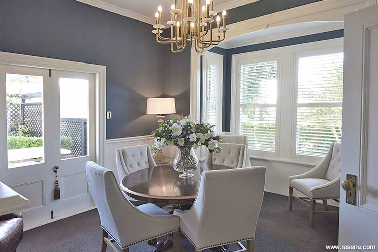
Michael’s favourite colour is used on the formal dining room – Resene Coast, a colour he describes as “inky, like a stormy sea”.
The family had restored another character home in Taranaki and wanted this one to reflect its location near the coast. The gardens enhance that impression with more formal hedges and established trees being joined by nikau palms and temperate-loving plants.
When she was young, the owner remembers walking past this villa with a childlike fascination about what the inside might hold. As an adult, her impressions of the interior were less favourable: “Dark walls and wood everywhere”, bordering on a look of student flat.
The house had been replumbed, rewired and overhauled in the 1990s but the over-abundance of timber, nice though it was, dated the interior. Deciding to cover it in white paint involved much agonising. “We had these debates… Someone had done a great job and put in panelling but after several decades it was watermarked and tired – it had lost its gleam,” says the owner.
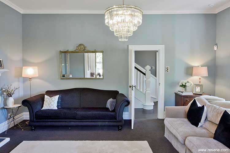
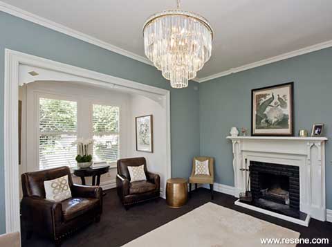
The walls of the formal lounge are painted Resene Inside Back, a classic dusky blue. Alternative looks for this home's living room: casual style and vibrant colour | drama and glamour
Painting it all – the skirting boards, panelling and ceilings – was time-consuming and expensive, but worth it. “I wouldn’t have it any other way,” enthuses the owner.
Character homes are a passion for her. The three bedroom, 200 square metre house had good bones, lovely grounds and a certain ‘cuteness”, but needed freshening.
Once the decision was made to swap natural wood for white, colour combinations for the interior fell into place. “I had to have classic but not boring,” says the owner.
Says Mike: “We didn’t over-analyse it. We went around with a Resene colour chart and had fun choosing in about half an hour.”
The walls of the kitchen and family room are painted Resene Quarter Duck Egg Blue, the existing timber joinery was painted over with Resene Albescent White and new stone benchtops added. An old fire surround remains. The effect is charming and crisp.
As well as being used on the exterior, Resene Wireless covers the hallway walls and continues up the stairwell. It’s a sometimes grey, sometimes green-brown blend depending on the light and surroundings.
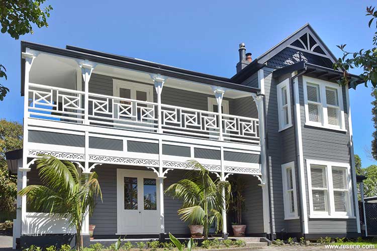
Rather than use a traditional villa scheme of up to six colours, Michael chose a simple yet striking scheme of Resene Wireless weatherboards (try Resene Half Baltic Sea as a more current colour alternative) with Resene Albescent White and Resene Black trims.
Using it outside as well as in, took some convincing. Initially the owner was sceptical but when the layers dried and the contrasting white was complete, she was sold. The additional black trim popped the combination into life.
Says Mike: “Traditionally a villa would have had up to five or six colours, which wasn’t the look we were after. These colours make it feel classical but simplified and striking.”
Back inside, the formal lounge and formal dining rooms are painted Resene Inside Back and Resene Coast respectively.
Resene Coast is Mike’s favourite. “I think it’s an amazing colour. It’s sort of inky – the colour of the sea on a really moody day with a touch of navy. It’s perfect.”
Looking from the lounge, through the hall, and back to the formal dining room, he muses on the colour combinations. “I think they all blend with each other and talk to each other – it’s beautiful. It’s light, medium and dark but also green, grey, blue.”
Achieving colour cohesion in a home without it looking ‘matchy-matchy’ requires skill. In this house that expertise is clear.
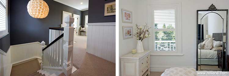
Left: Anchoring the interior colour scheme, Resene Wireless graces the hall walls and climbs the stairwell. Resene Wireless is from an older colour collection; try Resene Half Baltic Sea as an alternative. The decision to paint the timber balustrade in Resene Albescent White was debated long and hard.
Right: The master bedroom is the only fully neutral space, painted in Resene Albescent White.
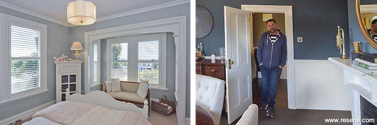
Left: One daughter’s bedroom is painted in Resene Half Periglacial Blue, a perfect colour to team with soft red and pink accents. Right: Designer Michael Mansvelt introduced a bold yet harmonious scheme to the home’s history-loving owner.
The master bedroom next door is the sole neutral space, in Resene Albescent White. Sea views are visible through french doors that lead out onto a relined veranda.
Across the hallway the girls’ bedrooms are finished in different variants of Resene Periglacial Blue – one in half strength, the other in quarter strength – creating harmony as well as individuality. One works well with pink, while the other has red accents.
Now the home is finished there is talk of another project, possibly one that blends the owner’s love of heritage homes with Mike’s design prowess. He talks about introducing her to a more contemporary look. “Homes like this are her passion, and her mind is constantly ticking over with ideas – with what she can do next,” he says.
Words: Sarah Foy
Pictures: Pip Guthrie
Casual style and vibrant colour transform this space
Designer Clem Wallace suggests this alternative scheme:
Before...
This new scheme focuses on a vibrant, encompassing and varied room, using watermelon pink walls in Resene Glorious. It’s a space for hanging out with friends or using the window seat as a reading nook to get lost in a new book. The fireplace has been removed which allows for the layout of the room to open up and become more inviting.
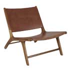
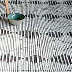
The use of soft, natural elements like wood, wool, leather and greenery makes this room feel like you’re safe and protected, and is anchored by the pale floor blonded with Resene Colorwood Rock Salt. There’s plenty of interest with the introduction of metals, both brass and stainless steel, concrete tiles and ceramics. The sofa adds a casual beachy vibe with its rattan frame and off-white upholstery helping to balance out the geometry of the coffee tables and the pendant light.
Email: clem@crwstudio.com
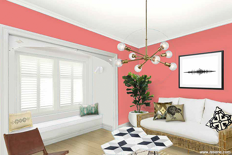
Alternative: Walls in Resene Glorious are tempered with a window seat alcove in Resene Half Sea Fog, and trims and ceiling in Resene Eighth Sea Fog. The floorboards have been blonded using Resene Colorwood Rock Salt Products featured include a Lexus Wall Light from Social Light, Hot Madison CH1249/420 fabric from Unique Fabrics on the window seat squabs, various cushions from Le Forge, Paxi plant pot from Palmers, shutters from Window Treatments and a Plantation Sofa from Soren Liv.
Before...

Did you know... that Resene is constantly assessing on-trend colours, like those used here, for use in future colour collections? Watch out later this year for the next The Range fashion colours fandeck, which will be available from Resene ColorShops and resellers.
Illustration: Malcolm White
Inky blue walls add drama and glamour
Resene colour consultant Sarah Gregory suggests this alternative scheme:
Before...
I wanted to give this room more drama by using an inky blue, Resene Zinzan, on the walls against classic white trims and ceiling. Navy blue is definitely one of this season’s stand-out trends. Resene Double Alabaster is my go-to colour for ceilings and trim as it has a slight warmth. It’s the perfect white in my opinion. Using Resene Double Alabaster on the trim and fireplace gives a crispness to the scheme and helps define the character details. I also took my colour inspiration from the Glenn Jones artwork hung above the fireplace.
The David Trubridge pendant is certainly beautiful during the day but I especially love how at night it creates patterns on the dark walls, adding more glamour to the room. The furniture I have selected gives the room a retro modern look. The armchairs give a tonal contrast to the walls and the touches of gold give the room elegance and sophistication.
Email: sarah.gregory@resene.co.nz
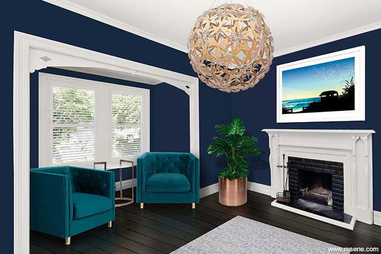
Alternative: This moody scheme is based on Resene Zinzan walls, with the ceiling, trims and fireplace in Resene Double Alabaster. The floor is stained with Resene Colorwood Dark Ebony and products featured include a Caliente planter from Freedom Furniture and a Monstera plant from Palmers.
Before...
 Manuka Pendant, David Trubridge 06 650 0204
 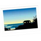 Rise and Shine Artwork, Glenn Jones Art
 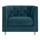 Boyd Armchair Vic Velvet, Freedom Furniture
 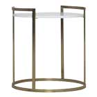 Butler Table in Gold, Freedom Furniture
  Breeze Rug in Raw Blue, Signature Rugs
 Top tip: Try using Resene SpaceCote Flat for dark wall colours such as this. It heightens the drama of the colour by adding a soft velvety finish. Matte paints like this also help camouflage any imperfections in older walls and can be used for a chalk-style finish on furniture.
Illustration: Malcolm White.
Search habitat magazine stories
Printed copies of habitat highlights are available from late March 2024 at Resene ColorShops and resellers, while stocks last. You can view back issues of habitat magazine online.
Specifiers:
If you have an idea, project or story that you think would suit habitat, we’d love to hear from you. Please drop us an email with your details and include photos if submitting a project.
Sign up for a DIY card and Save! Australia | New Zealand
![]() Get inspired ! Subscribe
Get inspired ! Subscribe ![]() Get saving ! Apply for a DIY card
Get saving ! Apply for a DIY card
![]()
Can't find what you're looking for? Ask us!
Company profile | Terms | Privacy policy | Quality and environmental policy | Health and safety policy
Colours shown on this website are a representation only. Please refer to the actual paint or product sample. Resene colour charts, testpots and samples are available for ordering online. See measurements/conversions for more details on how electronic colour values are achieved.
What's new | Specifiers | Painters | DIYers | Artists | Kids | Sitemap | Home | TOP ⇧