From Habitat magazine - issue 13
Have you ever felt drawn to some colours and repelled by others? Perhaps it’s your colour personality!
Do you love being enveloped in warm, earthy tones? Or are soft pastels more your taste? Have you ever felt uncomfortable with the colours in a room but didn’t know why?
As stylist Angela Stone of Styleyou says: “People gravitate towards colours that inspire and suit them, so nine times out of 10, they will choose colours out of sheer intuition for their homes.” For years she has used seasonal colour theory to help people determine what clothes to buy, and now your house decor can be matched to your personality season, too.
Resene Wellington colour consultant Carolyn Atkinson has seen the theory in practice many times. “Often people will keep a scrapbook of images and magazine clippings they like but not know why. I might point out, for example, that all the images contain timber. It’s often a surprise to people what the underlying attraction has been.”
She has observed that in the southern hemisphere, summer and autumn palettes are more common, influenced strongly by nature and organic elements like timber, stone, sand, mountains, forests. These are very autumnal elements whereas summer is influenced by exotic colours and Asian-Pacific tones.
Using the seasonal theory is a good way to avoid decorating mistakes. “Some people feel pressured to simply follow the fashion trends. If someone tells me they want to use the latest colour on their walls, I ask them if that’s because they like it or think they should,” says Carolyn.
No-one is purely one colour personality but focusing on your dominant one will help you put together interior schemes that feel right. Even introducing a few elements of your colour personality can make a room feel instantly welcoming.
Spring is the time for warmer weather, sunshine, lambs and flowers. Spring colour personalities prefer airy homes with lots of windows and natural light, using french doors, large sliding doors and lightweight curtains.
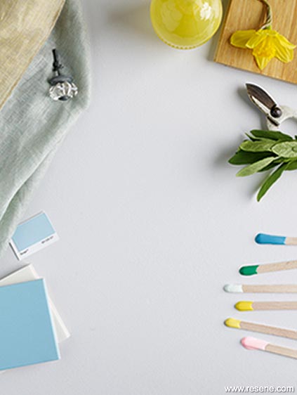
Hardworking and practical, spring people aren’t afraid to get their hands dirty. They love a bargain, are sociable, flexible and enthusiastic. Extroverted and quick-thinking, they make new friends easily, though will avoid weighty issues and conflict. Spring homes are usually contemporary, modern and well kept.
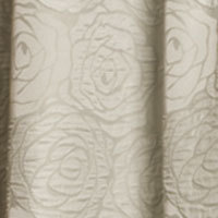
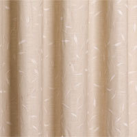
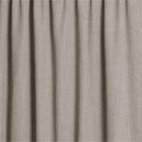
The spring palette is dominated by yellows, reminiscent of spring flowers and sunlight. Colours are fresh, bright, clean and warm complemented by light-coloured wood and indoor plants. Furniture, cushions and decorative accessories have rounded corners, making them easy on the eye. Warm neutrals of light greys, creams, ivories and beiges are used in place of pure white while crisp greens reflect new leaf growth. Any reds have pink undertones.
Fabrics will have small floral patterns and gingham checks, or be soft and translucent. Accessories include glass and crystal, brass and golden finishes. Displays of keepsakes are important. Artworks might be fresh, clean watercolours.
Stockists: Fabric swatches from Seneca. Tiles from Artedomus. Drawer handle and vase from Madder & Rogue. Bamboo flooring from Teragren. View the Resene Curtain Collection.
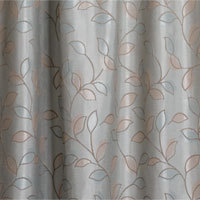
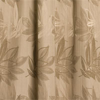
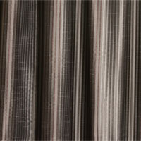
Hot sun, cool breezes, shady trees and colours that fade under the haze of the sun are all associated with summer. Blues and greens are important, contrasted with soft pinks and yellows. Primary colours are greyed off while neutrals are drawn from soft greys, taupes, oysters and whites. The summer decorating style is cool, elegant and understated. Furniture and furnishings have curved edges, and patterns are subtle, if present at all.
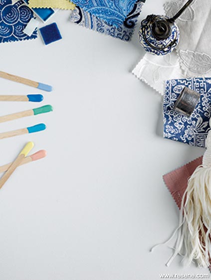
Summer people are perfect hosts, calm and collected, with every detail planned for smooth, elegant entertaining. Summer homes are usually tidy and formal, reflecting the perfectionist tendencies of their owners. Lofty ceilings, well proportioned rooms and careful architectural detailing are important as is room and accessory positioning.
Summers are nurturing, highly perceptive and natural peacemakers. Practicality mixed with a reserved nature leads to classic elegance, traditional decorating, antiques, fine china, music and the arts. Delicate luxurious fabrics and vases of traditional roses or fresh summer flowers reinforce the elegant atmosphere.
Stockists: Fabrics from CK Design. Serviette ring from Romantique. Fabric under ring from Martha’s Fabrics. Pink fabric and tie back from Seneca. Tiles and Chinese pot from Artedomus. View the Resene Curtain Collection.
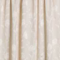
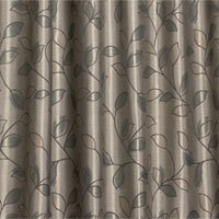
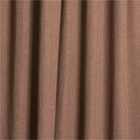
Thoughts turn to fireplaces, warm clothing and a sense of cocooning reflected in the fiery, warm and intense autumn colour personality. The autumn palette is a mix of spicy vibrant colours and rich mellow hues with yellow undertones – hot oranges, fiery reds, ochres and muted olives. Neutrals are from the brown family: warm and varying in intensity.
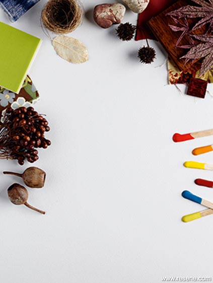
Autumn people are intelligent, curious and loyal with strong personal values. They are more impressed by content than by fancy packaging. Bursts of enthusiasm often sees them taking on too much work, but they will persevere until it is complete. They are excellent leaders but can be bossy. Autumns like time in the great outdoors with favourite pets.
Autumn homes will often be full of books and magazines, chunky oversized eclectic furniture built for comfort, antiques and all things historical. Accessories decorate all available spaces.
Autumn people are likely to select environmentally friendly alternatives. Dark wood, leather, copper, terracotta, natural materials and textures make these homes less formal. There may be ethnic prints and muted lighting.
Stockists: Fabrics from Martha’s Fabrics. Green tile from Artedomus. Bamboo flooring from Teragren. View the Resene Curtain Collection.
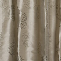
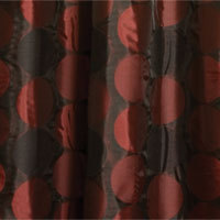
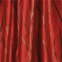
The winter palette is one of contrasts where vivid deep colours meet icy tones. The winter landscape is simple and streamlined. Not scared of strong colour, winter people often love reds and purples. Simple schemes in tonal variations of black, white and grey are common, perhaps with one strong colour accent for drama. Blues run the gamut of ice blues through to blue blacks, then merge into the strong aquas of the green palette.
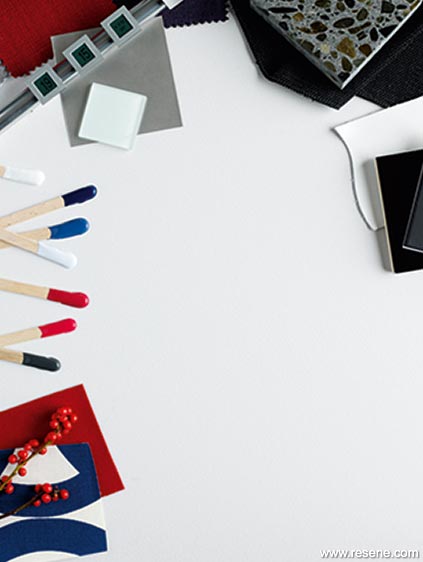
Winter homes are uncluttered with large windows, clean lines, square corners and expanses of shiny surfaces such as mirrors, stainless steel and glass tabletops. There will be cutting edge electronic equipment, sleek lighting and the latest kitchen appliances. Furniture is square, solid and high quality. Fabrics are single coloured; there will be just a few dramatic ornaments or artwork.
Winter people are self-assured, trendsetting and intense, drawn to the fast pace of city living. They quickly adopt new technologies. Confident, innovative, decisive and ambitious, winters are suited to the business world of quick decisions and objectivity. They prefer a small group of close friends rather than large circles of acquaintances. You can rely on a winter.
Stockists: Beo Time Clock from Bang & Olufsen. Tiles from Artedomus. Stainless steel, stone tiles and white leather from CK Design. View the Resene Curtain Collection.
So what happens when you live with others who have completely different colour personalities?
Let each family member decorate one room (bedrooms are ideal) to suit their colour personality.
Accessorise rooms with one item from each family member’s dominant season. For example, to appeal to an Autumn personality in a Spring room you might add an ethnic artefact.
Look for the common ground. For example, Springs and Summers both like curved shapes. Springs and Autumns both like warm palettes, creams, ivories and wooden furniture. Springs and Winters like large windows with simple window treatments and cool palettes. Summers and Autumns like mid-toned woods and muted colours, while Autumns and Winters enjoy intense dark colours and textures rather than patterns.
Take Resene’s quick and easy colour personality test online and see what colour personality you are.
Stockists: Artedomus. Bang & Olufsen. CK Design. Madder & Rogue. Martha’s Furnishing Fabrics. Romantique. Seneca. Teragren. All paint colours from The Range 2011/12 from Resene.
styling: Lianne Whorwood and Lisa Morton
pictures: Aaron McLean
Search habitat magazine stories
Printed copies of habitat highlights are available from late March 2024 at Resene ColorShops and resellers, while stocks last. You can view back issues of habitat magazine online.
Specifiers:
If you have an idea, project or story that you think would suit habitat, we’d love to hear from you. Please drop us an email with your details and include photos if submitting a project.
Sign up for a DIY card and Save! Australia | New Zealand
![]() Get inspired ! Subscribe
Get inspired ! Subscribe ![]() Get saving ! Apply for a DIY card
Get saving ! Apply for a DIY card
![]()
Can't find what you're looking for? Ask us!
Company profile | Terms | Privacy policy | Quality and environmental policy | Health and safety policy
Colours shown on this website are a representation only. Please refer to the actual paint or product sample. Resene colour charts, testpots and samples are available for ordering online. See measurements/conversions for more details on how electronic colour values are achieved.
What's new | Specifiers | Painters | DIYers | Artists | Kids | Sitemap | Home | TOP ⇧