|
Decorating inspiration gallery
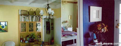
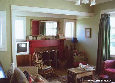
Graffiti be goneThe Ferguson family purchased their house in 1994 and moved in to find an amazing array of peeling wallpaper, holes, graffiti and painted wallpapers. Over the years as the budget has permitted, they have scrubbed, scraped, plastered and painted every wall surface, with a range of strong and soft colours to suit their tastes, mood and the use of the rooms.
The aspect of their home has an impact on the colour choices for each room. The house couldn't be turned physically towards the sun, so they compensated by painting warm colours on the south/westerly side and to go for impact in the living spaces on the north/east side of the house where windows were not in the 'right' places.
The two yellows, Resene Ronchi and Resene Golden Glow, selected for the kitchen and dining areas create warmth. A dynamic red, Resene Shiraz, was used in the kitchen and as a feature colour in the lounge, along with a calming soft green, Resene Coriander. Their favourite colour choice was the very strong blue, Resene Torea Bay, used on kitchen cabinets and on the front entrance walls. The strong blue makes the semi-gloss white trims glow against the powerful blue walls. It also kept costs down as the same colours were repeated in other locations.
Careful accessorising and soft furnishings tone in with the walls and calm them down. This combination has turned the 'graffiti, holey nightmare' into a place full of drama, colour and fun. Inspiration gallery 2005
Thanks to Robin.
Decorating inspiration gallery |
![]() Get inspired ! Subscribe
Get inspired ! Subscribe ![]() Get saving ! Apply for a DIY card
Get saving ! Apply for a DIY card
![]()
Can't find what you're looking for? Ask us!
Company profile | Terms | Privacy policy | Quality and environmental policy | Health and safety policy
Colours shown on this website are a representation only. Please refer to the actual paint or product sample. Resene colour charts, testpots and samples are available for ordering online. See measurements/conversions for more details on how electronic colour values are achieved.
What's new | Specifiers | Painters | DIYers | Artists | Kids | Sitemap | Home | TOP ⇧