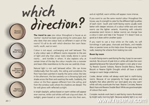
The trend to use one colour throughout a house as an ‘anchor’ neutral has been going strong for some years. But why does that one colour look so different in each of the rooms? It’s all to do with which direction the room faces: north, south, east or west.
Colour is not equal, unchanging and well behaved. This is why colour seen in different rooms responds to the axis of light and why that colour looks totally divine in some rooms... and horrible in others. It also explains why at certain times of the day the colour morphs into a monster and bears little resemblance to the one we carefully chose.
Natural light is not well behaved either. We can know intellectually that the walls, the ceiling and sometimes the floor have been painted in exactly the same colour. But late in the afternoon, the low westerly sun is throwing light and shade across the floor and washing the walls. Suddenly, the colour on the floor appears different from the ceiling, and from the window walls where the shadows are deeper. The far wall glows with reflected sunlight.
In bright daylight, yellow-based or warm whites will appear even warmer, while cool whites will look crisp and clean. At twilight, green-based or cool whites come into their own, and at nightfall, warm whites will appear more intense.
If you want to use the same neutral colour throughout the house, vary its strength to cater for the different light qualities of each room. South and north-facing rooms usually work better with deeper versions of a colour while east and west rooms use the lighter variants. Accenting with colourful accessories (and mirrors in darker rooms) can change how a colour is seen and help it be ‘forgiven’ if it doesn’t look as good as it does within another space.
If you want to use a true white on the walls, try soft furnishings in pale greys, charcoals and blacks, and metallic silver or pewter tones as this helps draw the eyes away from walls, keeping the scheme from looking too cold.
 Resene Ecru White walls.
In south-facing rooms used during the day, it pays to use warm neutrals. No amount of pale tints or white will make the room appealing because the natural light aspect is cool, grey or sour. Try Resene Quarter Solitaire, Resene Double Bianca, Resene Biscotti or Resene Eighth Drought which all have a subtle orange or warm beige undertone.
Cooler, denser whites will always work best in north-facing rooms. Because of our propensity for huge windows and skylights that allow plentiful sun (and glare) any very warm white will only accentuate the heat. Resene Concrete, Resene Black Haze and Resene Double Black White are good examples of colours that work.
Complex neutrals work best in east-facing rooms illuminated by bright early morning light. Because easterly light is so cool and clear, it may emphasis green-based or cool whites. The walls in east-facing rooms will be shadowy from mid morning onwards. Try Resene Half Spanish White which stays light even when the sun passes and doesn't develop too much green undertone. Or try Resene Half Tea.
West facing rooms that receive the low rays of sun will benefit from mid-toned muted colours as the rosy natural light will enhance cream, beige and taupe until they turn peach or terracotta. Look at using colours like Resene Half Fossil, Resene Perfect Taupe and Resene Eighth Malta.
A green cast may appear in rooms where natural light is filtered through trees growing close to the house.
Light coming through opaque glass will soften any colour. The same colour seen in a room with floor to ceiling picture windows will intensify. In tropical countries, pure white will take on an almost fluorescent tone.
In cold countries, natural light is filtered through layers of mist and cloud, and natural colours are grey based. If the same colours are used in countries with clear natural light they can look either ‘dirty’ or much brighter.
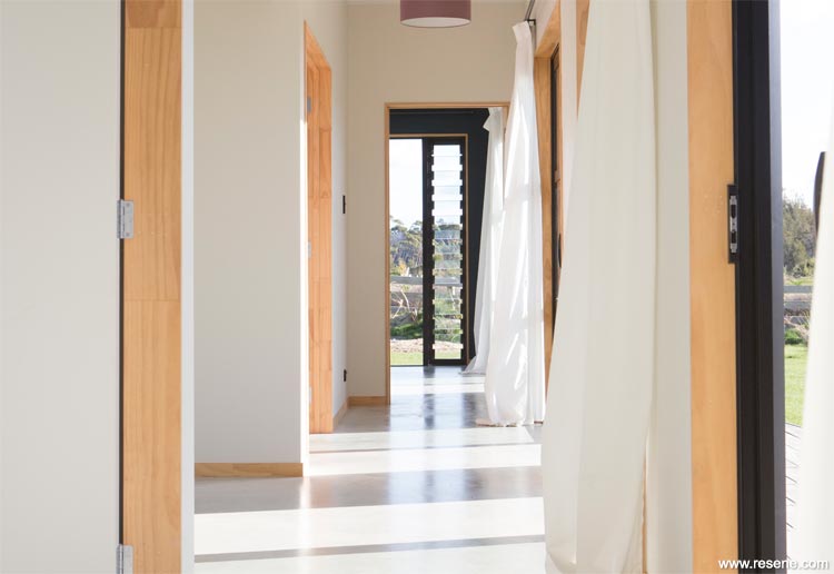
Extremely bright glare rooms may benefit from a flat (matte) paint finish, such as Resene SpaceCote Flat. Very dim rooms, and hallways, may benefit from low sheen or higher sheen paint finishes, such as Resene SpaceCote Low Sheen and Resene Lustacryl (semi-gloss).
The best way to see how colours react in different rooms is to test them. Using Resene testpots, paint two coats of your chosen colour onto a piece of A2 card (available from Resene ColorShops) leaving an unpainted border around the edges so your eye focuses on the reality of the colour. Move the card from wall to wall and from room to room, watch how it changes not only with the light but against other colours in the room. To see how one colour will look on all four walls, roll the card so the colour is innermost and look down into it. This will give you an idea of how the colour will intensify once it is on all walls. If you don’t like the effect that you see, talk to the staff at your Resene ColorShop about alternatives.
Search Habitat articles
If you have an idea, project or story that you think would suit Habitat plus, we’d love to hear from you. Please drop us an email with your details and include photos if submitting a project.
Habitat plus are not mailed directly. They are available free from Resene ColorShops and resellers while stocks last and available for viewing online.
![]() Get inspired ! Subscribe
Get inspired ! Subscribe ![]() Get saving ! Apply for a DIY card
Get saving ! Apply for a DIY card
![]()
Can't find what you're looking for? Ask us!
Company profile | Terms | Privacy policy | Quality and environmental policy | Health and safety policy
Colours shown on this website are a representation only. Please refer to the actual paint or product sample. Resene colour charts, testpots and samples are available for ordering online. See measurements/conversions for more details on how electronic colour values are achieved.
What's new | Specifiers | Painters | DIYers | Artists | Kids | Sitemap | Home | TOP ⇧